Please enter your email and website or LinkedIn to receive more information about our free and paid accounts.
Please enter your email address below and we’ll send you instructions on how to change your password.
Recently, we had the pleasure of working with one of our Florida-based photographers, Thomas Winter. Tom came to us looking for some refinements to his logo. His original had potential, but when viewed small it had some readability issues.

In the first round, we included an option that was very similar to Tom’s original mark as well as a few other options that were a little bit different but still had the same stylistic look. Here are a few of our favorites:


After the first round, Tom liked where we were going but wanted to move toward the option that looked most like his original mark. He suggested adding a hand-lettered element from his signature and sent a few samples over. While the idea was a great one—his initials, TW, were easily mistaken for either RW or TH. So, we decided for the second round that we would incorporate his initials into a hand-lettered option along with further developing a mark that was fairly similar to his original one. Here is a favorite of ours from the second round:

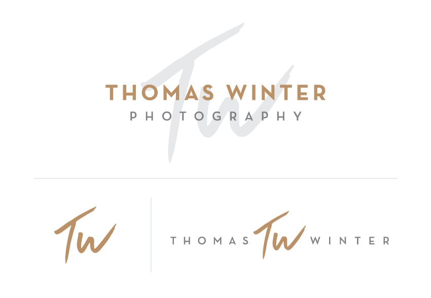
The hand-lettering option immediately stuck out to Tom, but he wasn’t 100% sure about the layout, so we experimented with a couple of options before settling on one. Afterwards, we did a bit of tweaking to Tom’s orange and grey palette and came to a palette that included copper, granite, and silver grey. Here is Tom’s new primary logo, mark, and secondary logo.

As always, it was a joy to work with Tom, but we will let him speak for himself.
It had been about 3 years since my last logo tweak, and I wanted a fresh look. Samantha, a designer at WM, took it totally out of the box and came up with a design inspired by how I initial everything. She completely embraced it, and I love the design. You can’t skimp on certain things, and brand/logo design is one of them.
Need help designing a new logo? Reach out!