Please enter your email and website or LinkedIn to receive more information about our free and paid accounts.
Please enter your email address below and we’ll send you instructions on how to change your password.
Austin, Texas-based photographer Liz Moskowitz came to us earlier this year wanting to refine her marketing materials to appeal to brand narrative and editorial clients. After a discussion with Liz, we decided a BaM! (Branding and Marketing) plan would be the perfect fit. The plan offers comprehensive feedback on a photographer’s brand identity and provides areas for improvement on how to transform websites and promotional materials to better appeal to a photographer’s ideal clientele.
Liz’s background in documentary work has given her a beautiful and rich portfolio of images, and part of the challenge was to find a way to present her work in a way that would help give her brand more appeal to larger clients, namely, to be hired for brand-narrative, and to work on more editorial work for cause-driven clients.
We began by covering the graphic identity of her website, where the existing site used plain grey text and typefaces that just didn’t convey a sense of personality that clients love to see. We recommended that she introduce a muted color scheme to match the soft emotional tone of much of her work. Color schemes also encourage interaction with a website. Photographers can use color strategically to direct the visitor’s eyes to the most important pieces of information on a web page.
We also noted that the majority of work on Liz’s site was portraiture. While consistently beautiful, we suggested the selection of images be more diverse to help avoid her visual brand becoming pigeon-holed as a portrait specialist. This is particularly important for seeking brand-narrative work when assignments often call for more narrative-driven images and spreads.
We continued with feedback on Liz’s website by suggesting a re-categorization of her galleries, which were grouped by project name rather than type. We recommended the use of drop-down menus that could help distinguish her personal work from her commissioned work, as any client visiting a website will want to know what a photographer has been getting hired to shoot.
In her gallery layouts, Liz was using a clean, minimal grid-based theme, which looked elegant but also did her the disservice of cropping all her work square, giving the impression that she shot all her work in a square format. Given this, we suggested she find a layout format that lets viewers see the entirety of each frame without having to click the images one by one to see the full picture.
When we reviewed Liz’s about page, we took note that she did not include a client list. Client lists can be valuable selling points that immediately demonstrate a photographer’s experience to new potential art buyers. They function as an easy-to-read resume of sorts and lend the brand of a photographer much greater credibility when new clients can see what other clients have placed faith in that photographer in the past.
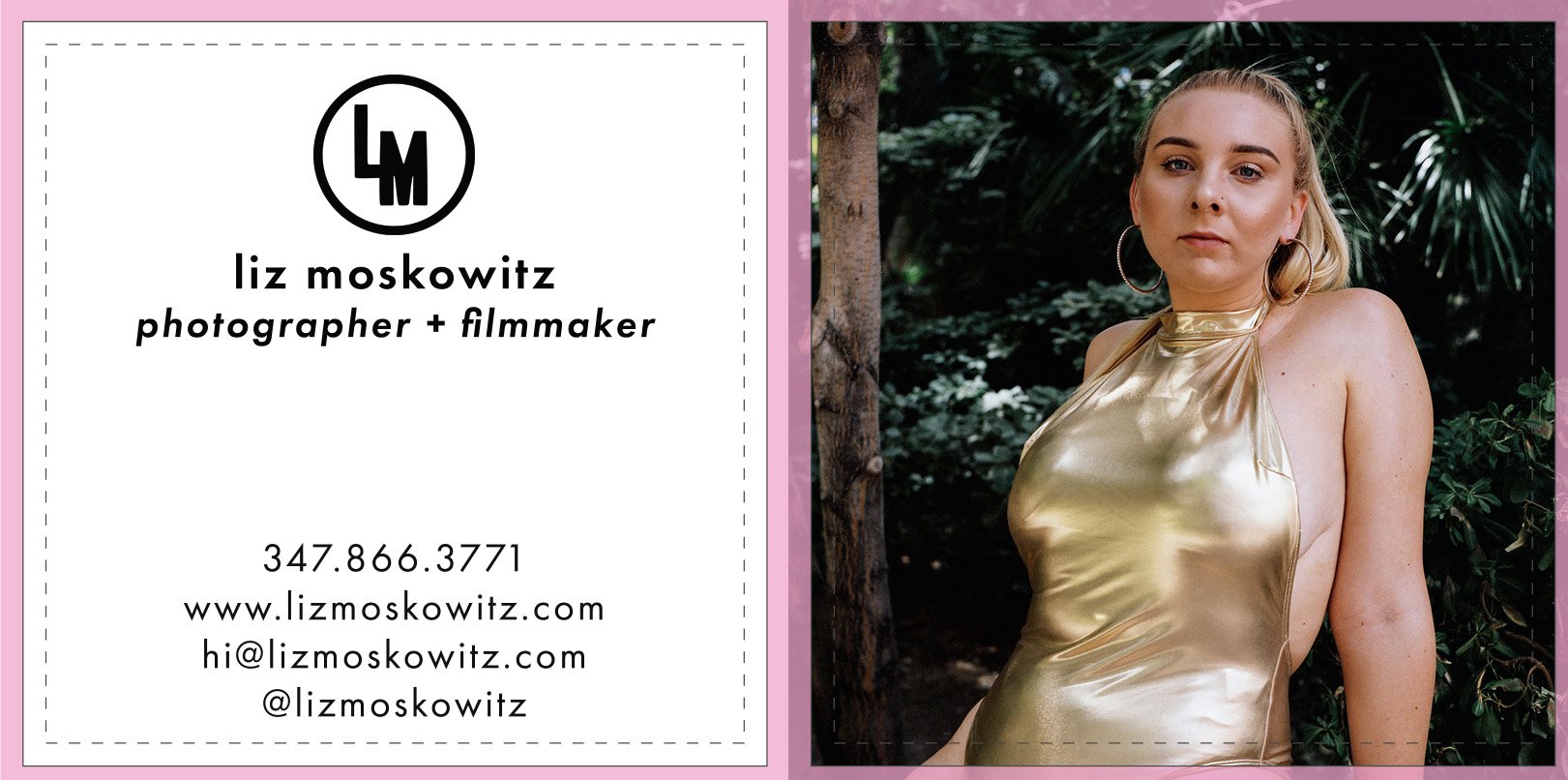
When we took a look at Liz’s existing promo material, her business card was beautifully designed, but the email address on the card was different than the one on her website. We recommended that she use the same email throughout all her promotional pieces to achieve as unified a set of information as possible to avoid confusion. Beyond the email address, we also found inconsistencies in the formatting of her phone number along with the general color scheme used to convey her brand personality.

In addition, Liz’s postcards described her as a “documentary photographer.” An apt description of her previous work, however, it’s a title that could give clients the impression that Liz only shoots personal work. We suggested her tag line be a more general one, such as “photographer + filmmaker” or “visual storyteller for brands and organizations.”

After the BaM! plan was completed Liz went on to implement many of our suggestions, and we invite you to visit her website and browse the many beautiful projects on display.