Please enter your email and website or LinkedIn to receive more information about our free and paid accounts.
Please enter your email address below and we’ll send you instructions on how to change your password.
For Luke Copping, a Buffalo, New York-based photographer, the average portrait won’t do. Whether mastering light, smearing cake on a face, or burying someone in oyster mushrooms, Luke explores beyond the limits of creativity and, as a result, has some pretty beautiful photos. Yet looking at his overall branding, something wasn’t adding up. Luke’s work is so bold that his logo felt just a bit too simple in comparison. While the minimal look was clean and precise, it didn’t represent the aesthetic that Luke wanted to convey. We worked together to redesign his brand identity, so it would both stand out and fit his photographic personality.
Over the past couple of months, I’ve been working with Wonderful Machine on a visual reinvention for myself. The goal was to create new brand elements that align with my work’s energy, color, and style – something that I could have a lot of fun with in terms of pairing it with my imagery online and in print promos.

The first step was to jump on a call, meet the photographer, and understand his work and goals for the project. We also passed a few references back and forth to get a gauge of what he was looking for. While Luke wasn’t entirely sure what outcome he wanted, he knew he wanted something bold and eye-catching. And that was enough for me; I decided to show a lot of variety in the first round, all exciting to look at, but no logo quite like the other.

Concept 1 features what I like to call — and I think most professional designers would agree — gritty scrabble blocks. Each letter filled a box, which could stack in various ways, allowing Luke to play with his logo as if it were a game.
Concept 2 showed a diagonally aligned/3D logo. This logo played with space while maintaining the bold lettering.
Concept 3 featured a brushstroke as a background. Luke sent a few brushes as a reference, and this option allowed for a hand-painted element while holding onto clean lettering.
Concept 4 was done in Procreate, so I had the opportunity to create a new typeface while playing with details, such as paint splotches and lines.

While coming up with the four concepts, I also experimented with various other designs, which I didn’t want to leave out. I don’t typically include those rough sketches, but since we didn’t have too much direction initially, I wanted to show every option possible.
Ultimately, I’m glad I did include those sketches, because that’s what Luke was drawn to the most. The first round of revisions did its job of giving us a much clearer idea of what Luke was looking for: a hand-written logo in a cool brush-stroke font. With that in mind, I researched fonts and created several more options myself. Since we wanted these to be bold brushstrokes, I even tested out what I could do if I physically drew/painted out the name before digitalizing it.
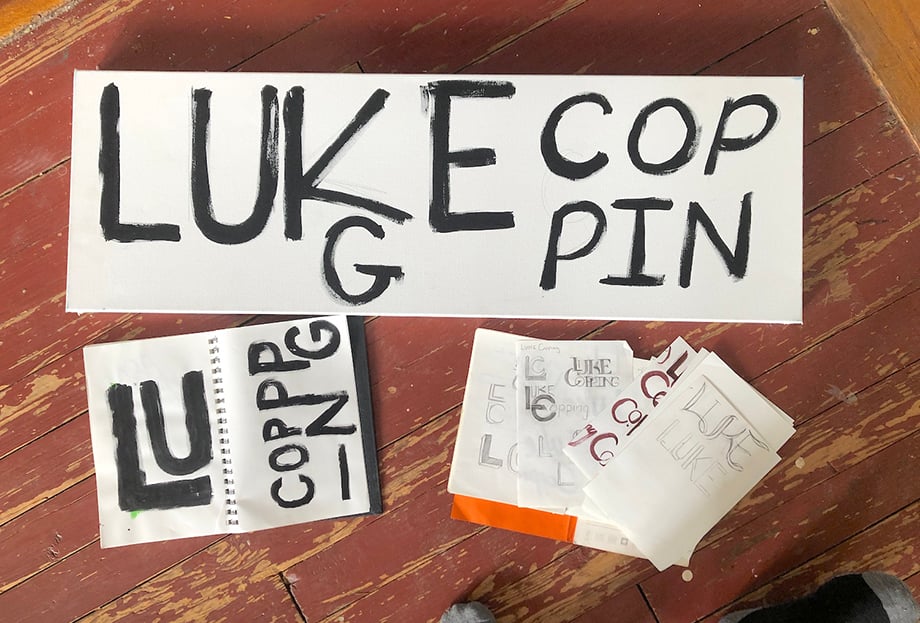
I felt a little like I was back in Junior High, writing a name repeatedly in my notebook — but hey, that’s the case for every logo I make — and Luke’s excitement for this project motivated me to get it right. So if that means writing his name over and over again, well, so be it!
I took my favorite hand-drawn logos and one found font, and not only laid them out for Luke but incorporated them on top of a single photo so he could see how they would work with his work. I also compiled a list of fonts I thought he’d like (mostly provided by Creative Market) so he had every option available.

Hand-Brushed Logo #1 is what won Luke over, a font from Creative Market called Avallon. We both loved how it worked with his imagery and the variety offered with this font. Avallon offers standard and SVG fonts (SVG shows more texture in the lettering than your average font).

So with that significant detail down, the final step was to choose a color palette. The color might be my favorite part of Luke’s brand, as his palette is warm, bright, and fun, and stands out from the other brands you’ll see with his logo style.
I sent various neutral and bright options — all colors I got from sampling his photos. He ultimately picked a warm sunset-like palette with lovely purples, reds, and yellows. As a designer, I was excited to see how it all came together.

If Luke were a painter, his work would be big bold strokes, not small tight marks. Now he has the logo to capture that energy and passion for his work. It was a pleasure working with Luke and establishing his new brand, and we’re about to embark on a new project to apply this style in his marketing materials!
I went through several revisions with designer Lindsay Thompson to arrive at this new logo and color scheme. The hand-brushed logo and the colors are bolder, more attention-grabbing, and wonderfully imperfect (a lot like me and my work). Lindsay did a fantastic job on this one — I could not be happier with the results.
I’m already having a blast updating everything to match this new brand – including my website, my print portfolio, and even some new swag for my clients and crew!
Further Reading
Wonderful Machine: Expert Advice: Visual Identity for Photographers
Wonderful Machine: Expert Advice: Photographer Logos
Wonderful Machine: Expert Advice: Web Design Basics for Photographers
Need help with your Brand Identity? Reach Out!