Please enter your email and website or LinkedIn to receive more information about our free and paid accounts.
Please enter your email address below and we’ll send you instructions on how to change your password.
I recently had the pleasure of working with Richard Silver, a travel, architecture, and fine art photographer based in New York City. Richard worked with us on Branding & Marketing (Bam!) Plan, which is a consulting service where we revamp a photographer’s brand from head to toe. After speaking with Richard about his career goals, we decided that the first step towards a new-and-improved brand was to collaborate with me on his Brand Identity, a service that includes designs for a new logo, business cards, an email signature, and a full set of stationery.
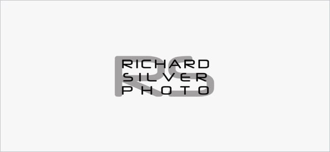
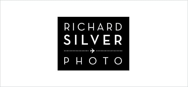
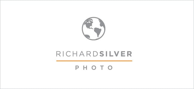
Step one in creating a new visual identity is to design a solid logo. Richard knew from the get-go that he wanted a modern, luxurious and masculine mark. He also wanted his branding to clearly illustrate his passion for travel photography, which makes up most of his body of work. With these guidelines in mind, I got working on the first round of logo options. Here are a few of my favorites:
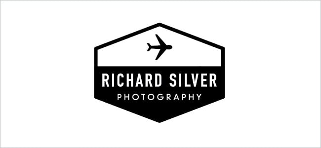
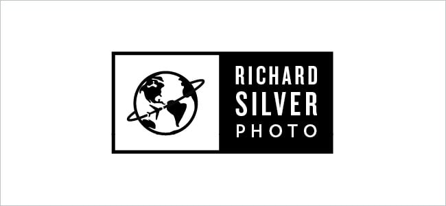
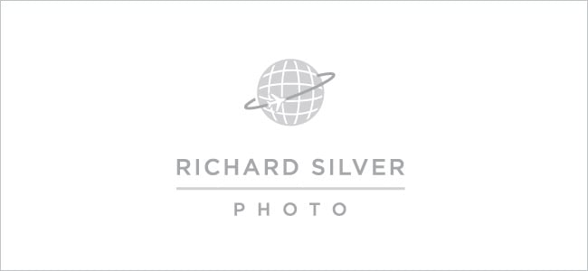
While Richard liked the options, he felt that they didn’t have the modern quality that he was looking for. Like any design team, we don’t always hit the ball out of the park on the first swing— so I got back to work and started designing a second round of logos that had more of a modern feel. Richard had mentioned that the globe and plane icons from the first set of designs had caught his eye, so I knew I wanted to use those in the next set of concepts I sent over. Here are some of the designs I came up with:
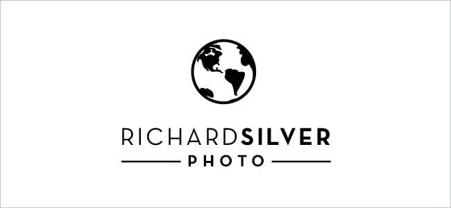
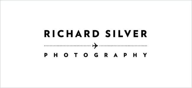
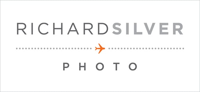
After the second round we still hadn’t quite hit the nail on the head, but we were definitely headed in the right direction. For the third and final round, we stuck with the globe and plane iconography and also introduced the orange and grey color palette that Richard had in mind from the beginning. Here are a few of my favorites:
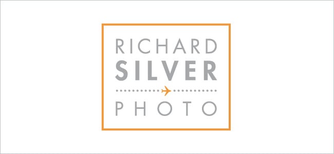
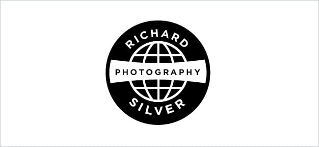
After Richard selected the one he liked best, I implemented a few type and color adjustments and arrived at his final mark:
Once we had settled on the final logo, we jumped right into designing his Business Cards and Stationery. When creating a full set of stationery, it’s often best to start with one piece and build from there. After we established what Richard’s business cards were going to look like, we carried that feel into the rest of his stationery, which featured a bold use of pattern on the back of all of his materials as well as the use of his trademark orange.
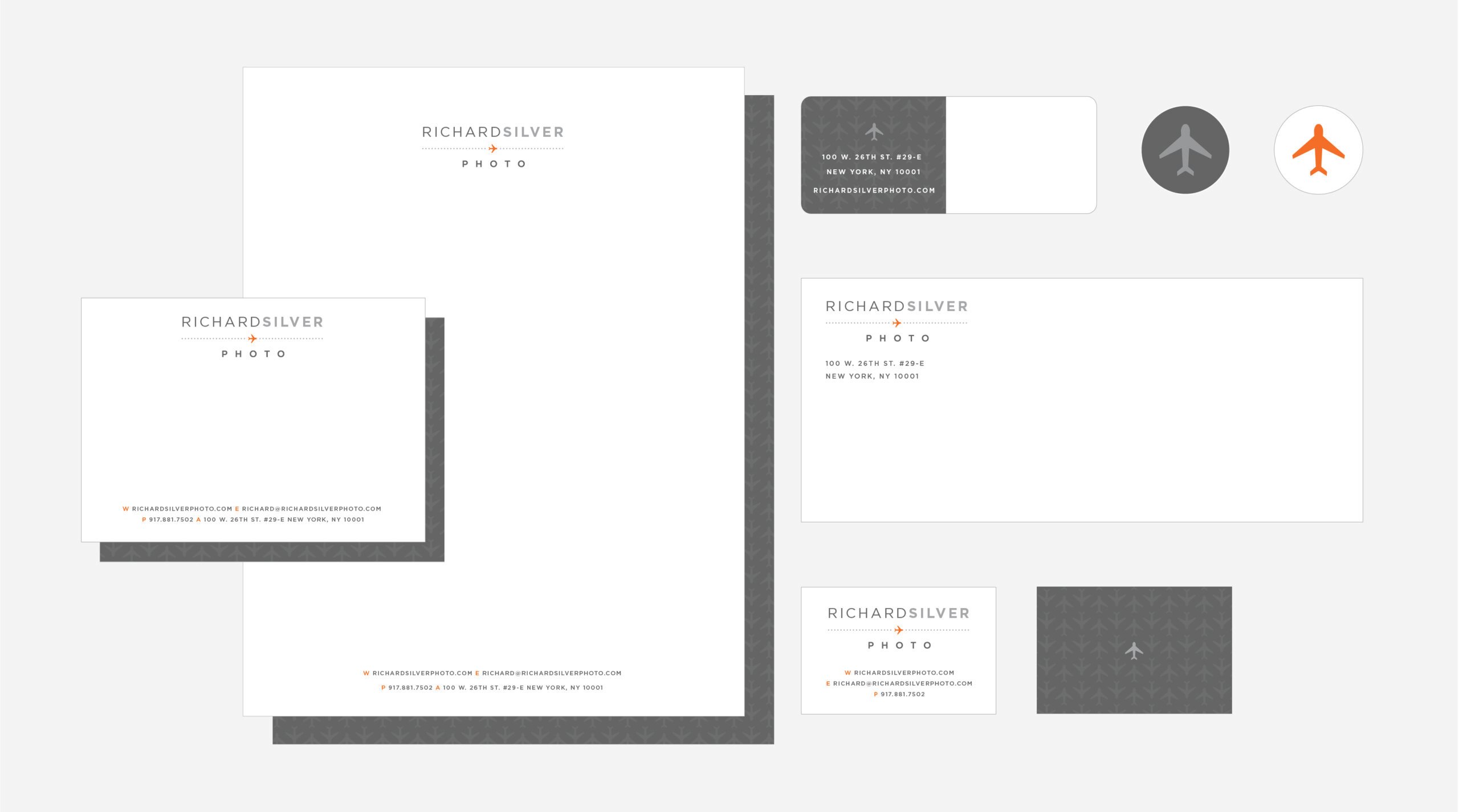
The same theme carried into his email signature, as well:

When all was said-and-done, Richard was thrilled with his new look:
[I was] looking for a new direction in my photography: moving more towards travel, away from my fine art. Samantha came up with an amazing logo design with an orange plane, which I love. It hits the point right on the head for me, you see the plane and you think to travel. All of the design aesthetics are cohesive and sleek, again, just the type of design I was looking to accomplish.
Further Reading
Wonderful Machine: Bam! Plan: Liz Moskowitz
Wonderful Machine: Logo Design: David Meaux Photography
Wonderful Machine: Expert Advice: Visual Identity For Photographers
Need help with your Design? Reach out!