Please enter your email and website or LinkedIn to receive more information about our free and paid accounts.
Please enter your email address below and we’ll send you instructions on how to change your password.
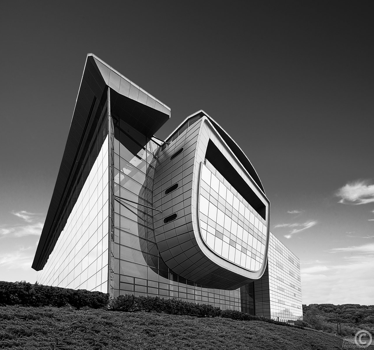
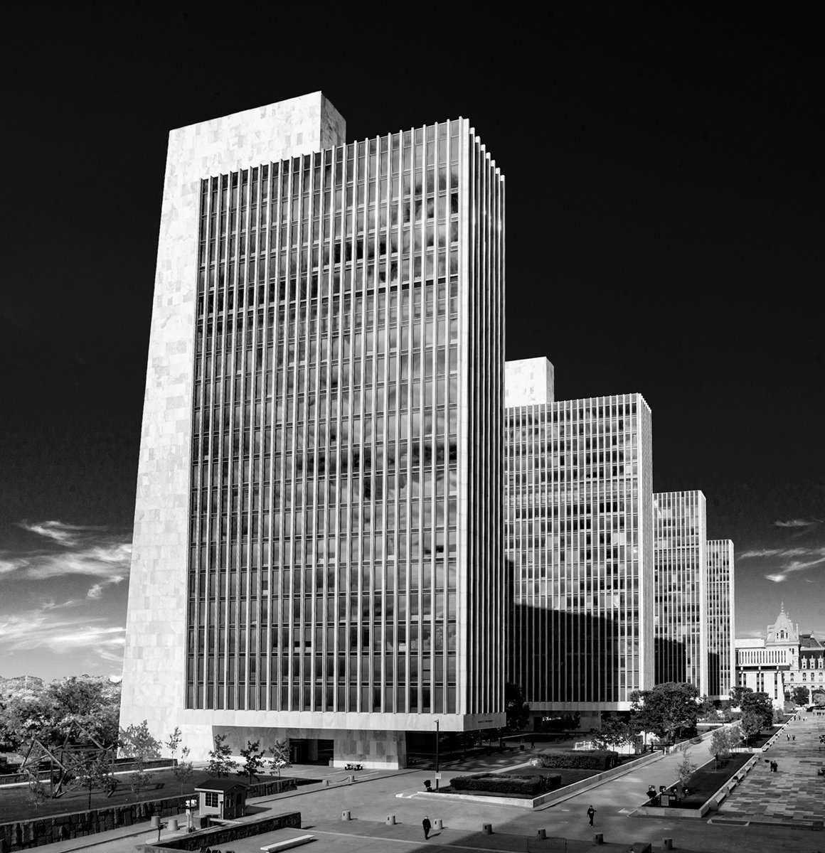
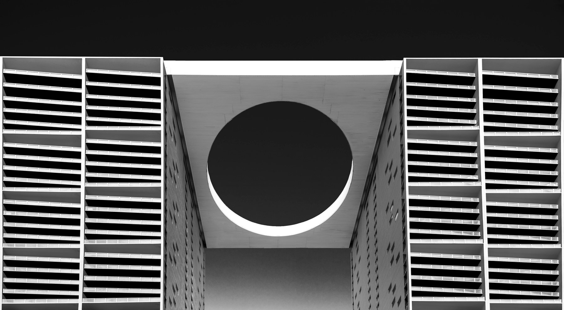
Philadelphia-based architectural and interior photographer David Fonda is no stranger to the finer side of art. Earning his BFA from Ohio University, he mainly lived and worked in the realm of black-and-white photography. After graduating, he spent the next few years working for newspapers, relishing in what was at the time his status quo.
Soon, David moved into his more corporate and industrial photography, requiring him to use almost exclusively color.
All of my shooting for the first ten years of my career was in B&W. Almost all of my work since — the last 35 years — has been in color. While I’ve always had a very graphic eye with a strong focus on composition, I hadn’t been seeing in black and white in many years.
When the usual photography lull during the winter months hit, combined with the unusual pandemic-induced restrictions, David got back to his roots.
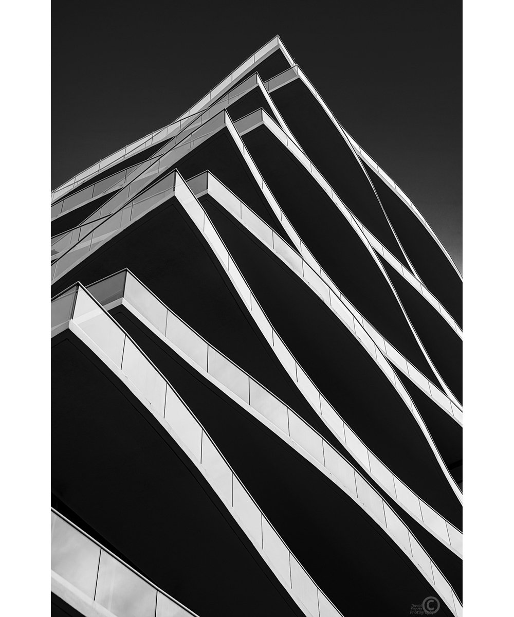
I had some images of a building that I’d shot after the sky had clouded over. At the time, I was disappointed with the results and never got back to it. With this extra time on my hands, I thought I’d see if there was anything I could do to salvage those images.
“Salvage” is the perfect term as David went on a repurposing spree. Taking discarded images from previous shoots, he began converting them into black and white and playing with the specs.
I was pleased with the results, especially because I was creating something new from a shot I’d given up on. The more I played with them, the more I was able to refine the process.
Of course, many corporate marketing efforts are not in black and white, but David hopes this newer, more “fine art” aspect of his work can be part of what he offers clients.
I think that I’ve come up with some unique and beautiful images, and there might be a market for architects who’d like to have a different take on their buildings — maybe even to hang in the office or something similar.
David’s process, however, is no small feat — some of the images even take as much as 8-10 hours of photoshopping.
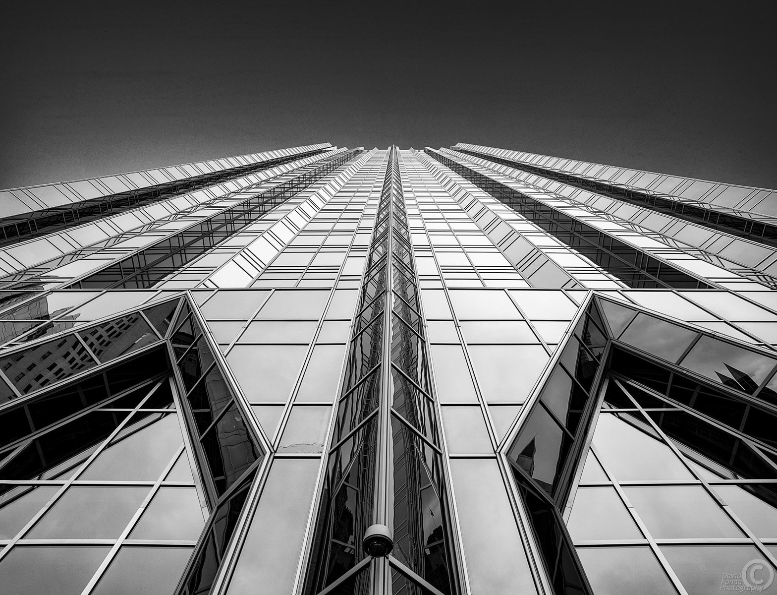
The images that work best for this are ones with strong graphic composition, which has always been a strong point of my work.
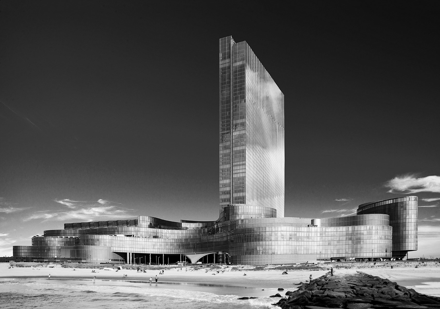
He started with discarded images with relatively flat lighting, something David never typically wants in architectural photographs. However, with this concept and some modifications to his process, he can make it work — as long as, structurally, there’s still a solid graphic component. When comparing his color work to his black-and-white photographs, David notes one major distinction aside from the actual process.
Within my regular post-production work, it feels like the completion of a vision. But with this work, it feels more like two separate creations, two creative acts.
See more of David’s work on his website.
Photographer: David Fonda
Further Reading:
Read more articles about David Fonda on our blog.
Read more articles related to Architecture on our blog.
Let us help you Find Photographers, source Stock Photography,
Produce Your Shoot — or just reach out to hear more!