Please enter your email and website or LinkedIn to receive more information about our free and paid accounts.
Please enter your email address below and we’ll send you instructions on how to change your password.
Wouter Kingma is a Dutch commercial photographer based in Doorn, Netherlands. When Wouter first started capitalizing on our consulting services, he began with a Branding & Marketing Plan. For many photographers, a Branding & Marketing Plan is the best place to start — our team evaluates all of your current branding and marketing efforts, critiques what you’re doing well, and what could be better in order to bring you closer to your goals. We also create a month-to-month schedule for the following year, which breaks down our recommendations into bite-sized pieces. One of the recommendations we made as part of Wouter’s BaM! Plan (as we affectionately refer to them at WM), was that he consider creating a new Logo.

Logos (in conjunction with images) are the foundation and voice of a photographer’s brand. Wouter’s existing logo scored points for uniqueness but we didn’t feel that it had the same sophistication as his images, and as a practical matter it didn’t include his actual name. Wouter agreed, so we were off and running.
To start the logo process, I sent our usual branding questions over to Wouter. I was particularly struck by one word, which he wanted to be the mood and focus of his brand, and how he described his perspective of it:
RAW. Just that … RAW. Strategically strong yet unpolished, crafted images, seemingly un-staged, moody and easy to connect with, a bit of dirt perhaps but not dirty, a blend of motion & unfiltered energy. Sure, the focus may be a little off or there may be an added strain of lens flare which might otherwise render a shot an imperfect picture, but RAW is a lifestyle and an approach to how we see the world.
With this in mind, I got to work gearing Wouter’s logo options to that unique, custom and raw mood he described so well. The first two rounds contained a balance of rough brushstrokes, hand-lettering and modern sensibilities.


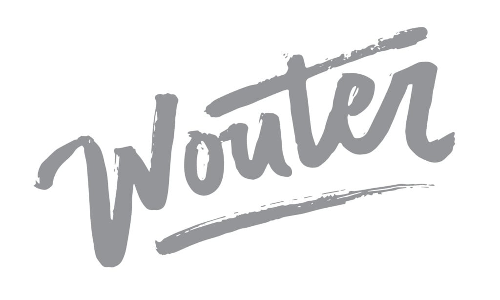
This last option seemed like the perfect balance between a rugged touch and a sleek sophistication. Wouter’s first and last name both contain the same number of characters, so this presented me with a unique design opportunity that I couldn’t help but take advantage of. Wouter agreed that this design was a good fit for him, but thought that the “W” wasn’t quite right yet, so I sent over a few different options:

After some back and forth with various hand-lettered “w’s”, we finally struck gold with the logo below. We went through a couple of rounds of color options, and Wouter settled on a masculine palette with the main colors being charcoal and red.

Wouter also wanted a secondary logo to use in his emailers that featured only his first name in the same hand-lettered style as his “w.” Here’s how that turned out:
And here’s a preview of the final emailer template I designed (with the secondary logo in the header) in Mailchimp:

Further Reading
Wonderful Machine: Web Edit & Web Template Customization: Wouter Kingma\
Wonderful Machine: Photographer Logo: Chris Edwards
Wonderful Machine: Expert Advice: Photographer Logos
Need help with your Design? Reach out!