Please enter your email and website or LinkedIn to receive more information about our free and paid accounts.
Please enter your email address below and we’ll send you instructions on how to change your password.
Javier Pierini is a photographer based in Buenos Aires, Argentina specializing in lifestyle, conceptual, and travel photography. When Javier first approached Wonderful Machine, he began with our Branding & Marketing (BaM!) Plan to evaluate all of his current marketing efforts. Our feedback on his existing branding was that while it wasn’t hurting his brand, it wasn’t really adding anything to it either. We suggested that he work with a professional designer to rework it, creating a memorable reflection of both Javier and his work. He chose to begin with a new logo design.

Javier was looking for a mark that was sleek, modern, and distinctive, so I dove right in with this in mind. Javier’s name presented some unique opportunities in that his first and last name share three consecutive letters, and his initials—when treated right—can reflect or allude to one another. Exposing and showcasing these little details are what makes a logo distinct and memorable, so I had a lot of fun experimenting and creating Javier’s first round of options.
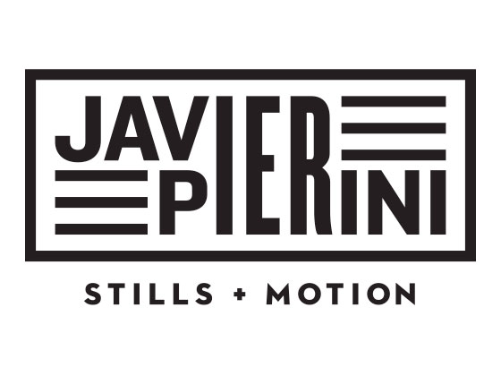
Javier ended up selecting this last option, which is both sleek and futuristic-feeling, much like Javier’s conceptual work. This option uses the form of the ‘P’ in Pierini to create the ‘J’ in Javier, which is one of those subtle details that makes you take another look. We did some additional exploration with the weights and variations of the letterforms, opting to emphasize Javier’s last name more than his first.

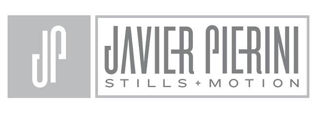
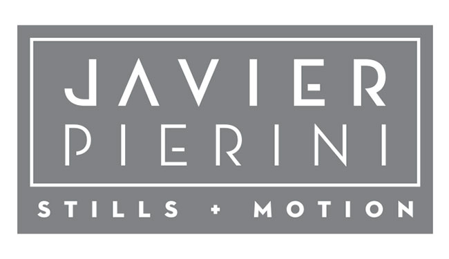
Once he’d made a final selection, we moved into color options. I showed Javier several color options for his logo, and while it’s most common for people to select a logo palette of 1-2 colors, Javier selected a complimentary palette of 3 colors. I also created an inverse version of his logo and some secondary marks to accompany his work in various contexts. Javier was extremely pleased with his brand new identity, and I can’t wait to see it implemented on his website and other marketing materials.

Further Reading
Expert Advice: Photographer Logos
Expert Advice: Words for Photographers
Brand Identity: A New Graphic Identity For Matthew Carden