Please enter your email and website or LinkedIn to receive more information about our free and paid accounts.
Please enter your email address below and we’ll send you instructions on how to change your password.
Rochester-based portrait photographer, Mike Bradley, came to Wonderful Machine to update his look. To begin, we focused on a new logo to better suit his brand, as his old one wasn’t on par with his work’s clean, sophisticated style.
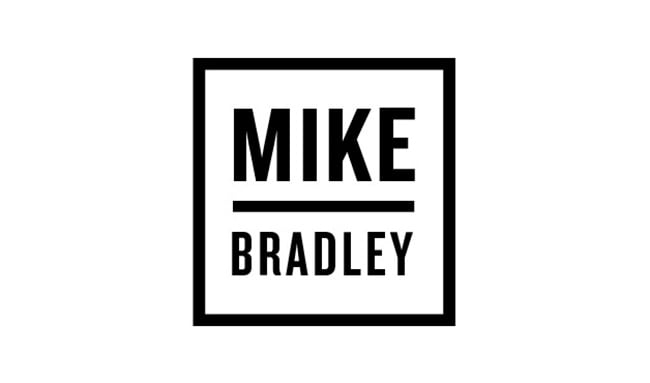
Here’s Mike’s original wordmark:

We always ask photographers to answer a series of branding questions. As soon as I read his answers I knew Mike and I were going to get along famously — we both share a love of classic, clean strong logos such as the Gap, which is a personal favorite of both of ours. I immediately knew the feeling that Mike was going for and already had a selection of strong, masculine, clean fonts I wanted to use. I then got to work creating a series of logo options for Mike to browse through. Here are some of the options from the first round:
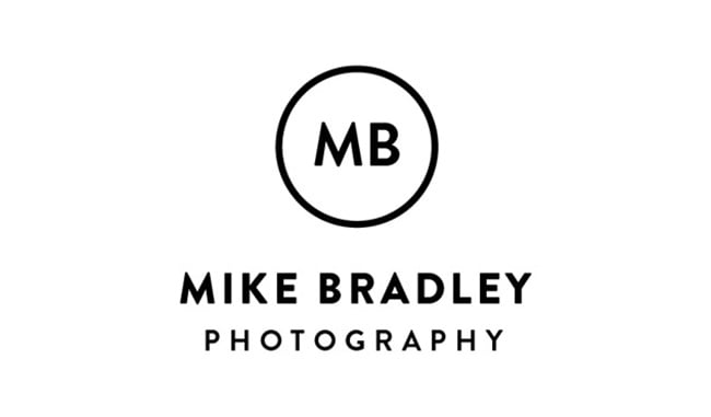
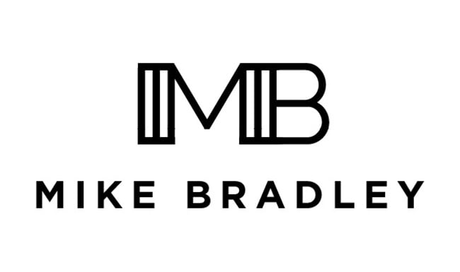
And Mike picked these two marks as his favorites:

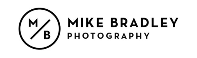
After a few small revisions as well as some color exploration in the second round the winner was…
We were both thrilled with how the final mark turned out, so we decided to work together on some business cards! I immediately knew this logo would look great on the Luxe business card line from Moo.
The Luxe line is different than typical business cards: the cards are created using Moo’s “quadplex technology,” which sandwiches together four layers of Mohawk Superfine paper, including a color of your choice in the center. The end result is a thicker, more tactile card with a pop of color. Mike sent us an image of how the final cards came out:
Mike also used the logo on the cover of his new portfolio. Check it out below:
Mike was a pleasure to work with, and in the end he was very happy with his new look:
The last time I hired a designer, it was my college roommate and I paid him in beer. I came to Wonderful Machine looking for a more professional wordmark that would pair well with my style of photography. Samantha delivered exactly what I knew I wanted, but couldn’t come up with on my own. The process was just as good as the final product; every new round of edits was like Christmas morning all over again. I’m thrilled to get my new wordmark out there, starting with a new set of business cards that Samantha also designed!
Further Reading
Expert Advice: Photographer Logos
Expert Advice: Business Cards
Specialty: What Is Portraiture Photography?