Please enter your email and website or LinkedIn to receive more information about our free and paid accounts.
Please enter your email address below and we’ll send you instructions on how to change your password.
Sometimes you need a web promo, and sometimes you need a print promo. But what do you do if you need both? Houston-based architectural photographer Gary Zvonkovic was faced with this question last April. So he reached out to Wonderful Machine for some assistance, and after discussing his needs, I got right to work.
Gary let me know that he wanted to create a marketing campaign that would target local architects and developers in the Houston area. Both an emailer and a postcard needed to be created, with designs that expanded on his current branding. He wanted an area to include a bit of information about each photograph but otherwise requested as little text as possible. I decided that the emailer would be the first phase of the design followed by the postcard.

I wanted to make sure that both pieces matched Gary’s brand while standing on their own. Sometimes the desire for consistent branding can create designs that are too safe, and things start to look monotonous. The best brands contain elements that match when viewed as a whole but have some variation from piece to piece. You don’t want to lose your audience’s interest by using the same layout on multiple pieces.
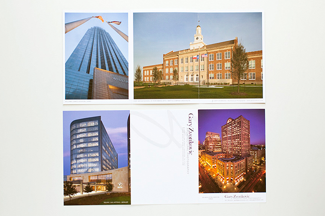
Looking through Gary’s brand materials, I took an interest in his logo. The large, script “Z” contained a lot of movement, and I thought it had great potential as a design element. I planned to integrate it into the design in a way he hadn’t done before—as a large, light watermark.

Once I’d sent over the first three drafts, Gary knew immediately which design he wanted to use. After a few small edits, as well as a careful photo selection from our photo editor Sean Stone, I delivered the final version of the design, along with the coded emailer. I also gave Gary a brief tutorial, so he would be able to update both the picture and caption on his own in the future—this way, he won’t have to commission a whole new template right away.
Next, we moved on to the postcard. For the initial mock-ups, I provided three versions of differing proportions and layouts. Gary picked a tri-fold postcard as his favorite, and Sean assisted with the image selection once again. Of the edit, Sean says, “Gary shoots a lot of large, institutional spaces, unlike most architectural shooters I’ve worked with, who shoot primarily homes. So for Gary, it was important to show a variety of approaches to really, really big buildings. We ended up with a selection of images that worked together quite nicely while incorporating educational, office, and hospitality spaces.”
Once the designs and edits were in place, Gary contacted our friends at Modern Postcard to print the final tri-fold cards.
Once the project was finished, I asked Gary for his feedback on the experience. He replied:
I came to Wonderful Machine to promote myself as a photographer in a professional manner. Amanda made the process easy and the results are beautiful as well as effective. My email campaign has already produced several jobs, and now I’m following it with a round of tri-fold postcards. Amanda provided me with a template for the email campaign so all I have to do is change out the photo for a new mailer once a week. Thank you Wonderful Machine for a job well done!
Check out more of Gary’s work on his website.
If you’re looking for help with your portfolio, design, copy, marketing, or to learn more about our services, please visit our consulting page or shoot us an email!