Please enter your email and website or LinkedIn to receive more information about our free and paid accounts.
Please enter your email address below and we’ll send you instructions on how to change your password.
Josh Anderson is the perfect client: cool, calm, and collected. He had an idea of what he wanted when he initially approached me about designing a Print Promo, but it needed some bending and molding in order to bring it to life.
Josh didn’t have a logo, which is necessary to create marketing materials, so before we moved forward, this had to be taken care of. I looked through the work, ideas, and notes Josh sent over. I understood the style he was trying to achieve with his graphic identity and was confident that I could design a logo that embodied the simplicity of his work. I also kept in mind the clients he wanted to go after– Bloomberg Business Week, Design Bureau, Vice, Apartamento, The Fader, Urban Outfitters, and Vans, to name a few.
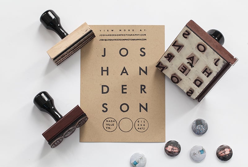
We went through a few rounds to determine the proper layout. The logo started with his first name on top and his last name underneath. We eventually decided to organize the 12 letters of his name as three-letter rows with four columns. This proved to be the best way to keep things balanced. One initial concern we had was the possible struggle of distinguishing between his first and last name, which we later solved by adding color.
When it came to designing the postcards, I kept in mind something Josh said in his first email:
I think what I would like to be promoting right now is more of a specialty than a project. I’m interested in marketing myself as contemporary editorial and youth culture-ish. I’m also a big fan of “odd” images. I’d like to present myself in a way that maybe reads “odd” but not in an off-putting way that might seem inaccessible but more in a way that seems unique.
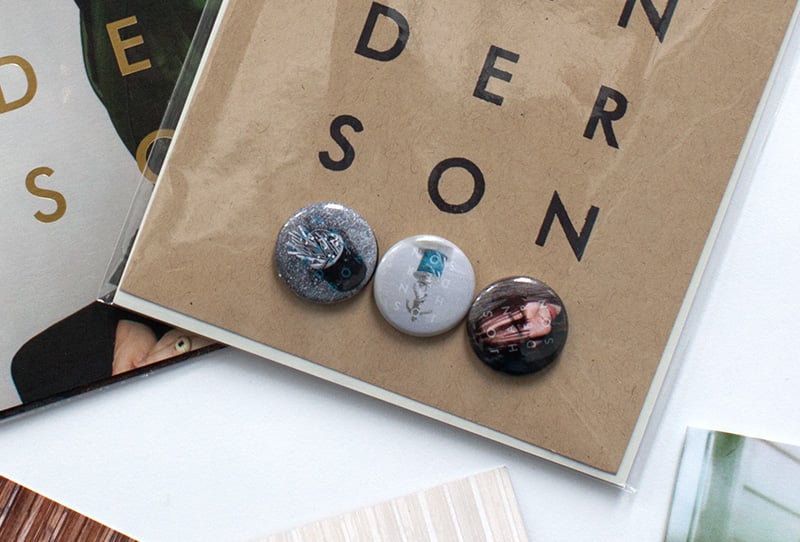
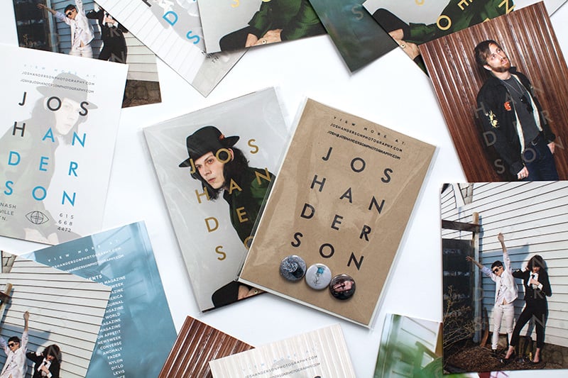
The “odd” aspects came naturally to me (so I might be naturally odd?)–I just knew the proper direction for the logo. Seeing how Josh uses lots of frontal lighting on his subjects, my thought was that Josh’s name could almost be like a flash over his pictures. For the back of the cards, I mirrored the front image and lightened it slightly so Josh’s information would be the most prominent. Because his name was not only in a geometric typeface (Futura), but also organized typographically into a square, I decided to let the rest of the text follow the same rule. I used simple geometric shapes on the whole package. Josh’s website link, email, and “view more” tag are organized in a rectangle, while his client list is in a triangle and his pins are circular.
As for printing, Josh knew he wanted to do a spot varnish on all of the cards. I convinced him to do the extra gold foil on the first card. My reasoning behind this was to add value, which I attempted to do even more by adding a client list to the back of the fourth card with a blue overlay to support the brand. A client list acts as a track record for potential clients to view. The list also added diversity and avoided redundancy.
The addition of the stamp and pins came later, when we both agreed it would make the package more memorable. I’m happy that everything came together the way it did. I didn’t spend time over-thinking the project–the flow between photographer and designer was effortless.
Josh gave us some feedback once the final product was complete:
I recently worked with Mark Harris on the design of a new promo card. I had a general idea of how I wanted the card to look but wasn’t sure how to get what I was looking for. Mark was able to take my ideas into account, get exactly what I was trying to say and turn it into a beautiful looking promo. His suggestions were things that I never would have thought of and that I ended up loving. That is exactly why I originally decided to get Wonderful Machine’s help with this project. When I got the cards back from the printer both the woman at the counter and myself said, “wow” when she opened up the box with the finished cards in them.
Further Reading
Wonderful Machine: Expert Advice: Photographer Logos
Wonderful Machine: Expert Advice: Visual Identity for Photographers
Wonderful Machine: Print Promo: Francis Hills
Need help with your Design? Reach out!