Please enter your email and website or LinkedIn to receive more information about our free and paid accounts.
Please enter your email address below and we’ll send you instructions on how to change your password.
Donna Dotan is a commercial photographer based in New York City. Not only is she a darling to talk to and work with, but her craft is impeccable. Donna came to us because she wanted to bring her marketing materials to the next level. She liked her logo, but wasn’t thrilled with how it was translating throughout her brand. One thing she was passionate about, however, was the elegant way her logo was presented on her new portfolio, which our talented Photo Editors had helped her out with. Therefore, by using her portfolio as a jumping-off point, we decided we would help Donna refine her logo and create sophisticated new business cards and a print promo booklet for her.
We began by addressing her logo. Everyone really liked the way Donna’s name was presented in it, and the mirrored “n’s” had a simple but modern sophistication that really spoke to her images, especially the architectural work. However, in the full version of her logo, the word “photography” wasn’t treated as delicately as we would have liked and it felt a bit clunky.
Addressing this first, we refined the word “photography” by choosing a more elegant font and setting it in small caps. This created a more solid foundation for Donna’s name to sit on, without all the inconsistent heights that come with setting type in lowercase letters. We created a secondary mark for Donna, mirroring the two d’s of her initials in the same way the n’s were treated in the primary logo. Finally, we decided that black and white was too harsh for Donna’s marketing materials and that the elegant grays of her portfolio (below) would be much more refined and appropriate for her.
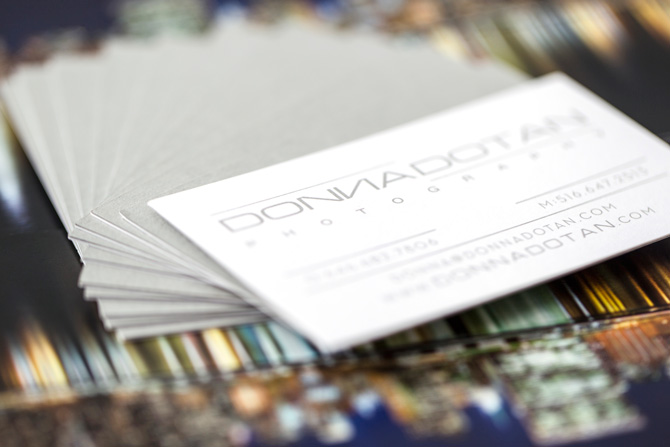
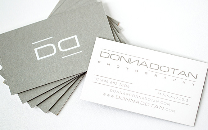
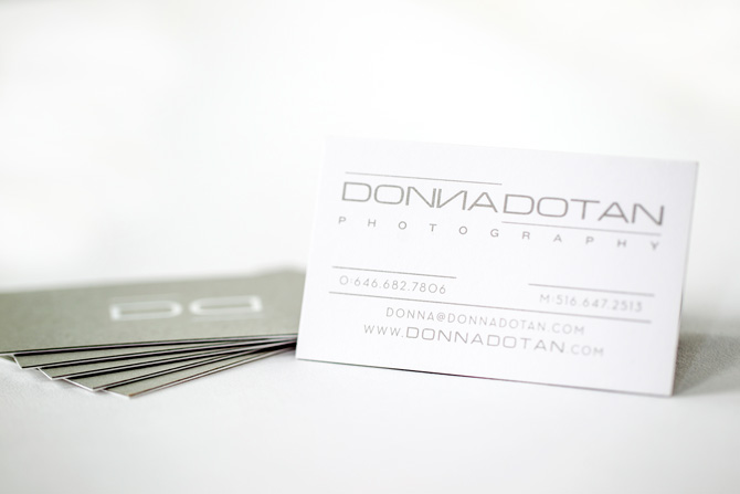
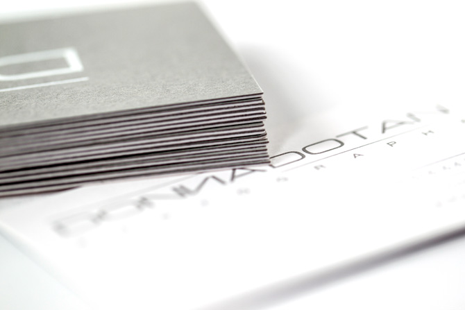
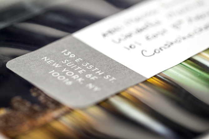
We presented these logo updates to her and Donna was 100% on board, so with that settled, we moved on to her business cards. She wanted to make a really sophisticated impression with her new cards and, being a print enthusiast, we had a lot of ideas. Our favorite was a double-sided business card made up of, not one, but two paper stocks — gray and white — duplexed together. We wanted to play off of that same idea of reflection in Donna’s business cards that was implemented in her logo, and inverting the colors on either side of the business card seemed like the perfect way to do it.
We decided to use Donna’s new secondary logo foil stamped in a matte white on the gray side of her cards, then her primary logo and contact information printed in gray on the white side. Originally, we planned to have the gray ink foil stamped as well, but since Donna was planning on having a second version of her cards printed for her producer/husband, offset printing the information side of her cards was one way to cut down on costs and still have unique business cards that looked and felt great.
A lot of times, photographers think they absolutely need to show their images on their business cards, and while this can be a great solution for some, you can create a card that speaks just as highly of you and your craft without including any photography at all. We’re huge advocates of letterpress and foil stamping on business cards because, though they are more costly and time-intensive print methods, they’re highly tactile, utterly gorgeous, and unique in that the process (pressing ink or foil into paper) is showcased in the final product. We’ve also seen it evidenced time and time again that more tactile cards like these are the ones people hold onto.
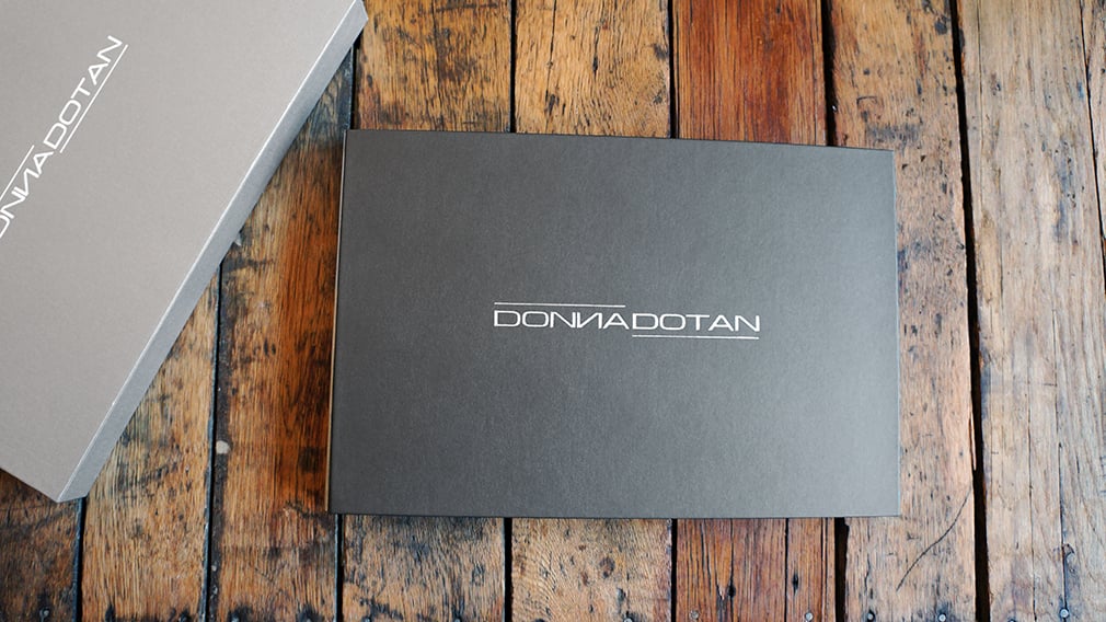
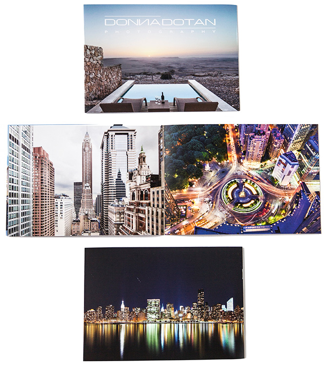
Once Donna’s business cards were designed and in the queue for production, we moved on to her print promo. At first, we started designing a pack of postcards that would be held together with a foil-stamped belly band, similar to the business cards. It would have been a beautiful presentation, but we knew that once the promo was opened and viewed, the cards would be scattered and separated, and the promo would lose its impact. It was highly unlikely that it would be put back together for someone else to experience that way again. As a result, we instead decided on a promo booklet that would act as a mini portfolio. That way, we could remain in control of the client’s experience with it, ensure that the promo would stay together, and Donna could choose to include as many images as she liked.
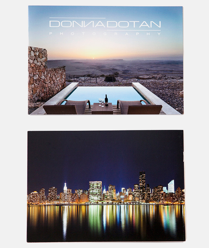
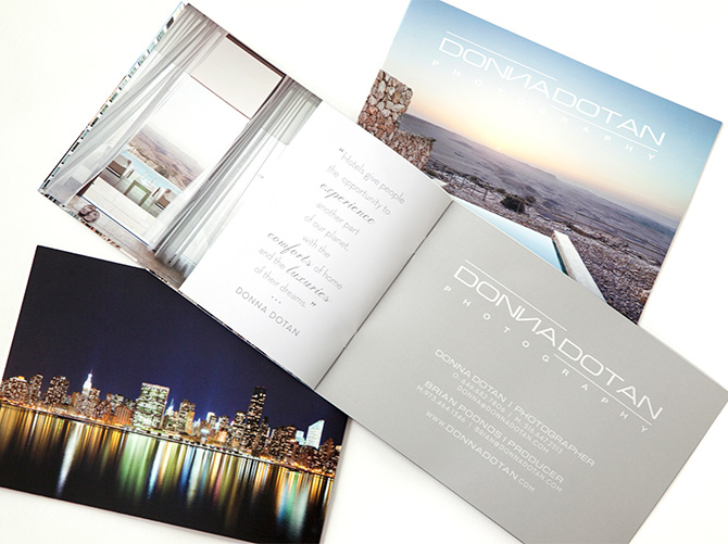
We infused the book with big, beautiful full-bleed images and used Donna’s branding subtly and elegantly, presenting her logo over one of her images on the front of the booklet. We opted for a clear envelope so we could showcase Donna’s images from the first instant, and paired it with a mailing label I designed that echoed Donna’s brand color palette.
With her brand new business cards and promo booklets in hand, Donna was thrilled, and had this to say about her experience working together:
I had previously worked with another graphic designer to create this promo piece, and when I received the final design after several revisions, I still wasn’t in love with it. After a brief conversation with Melissa of Wonderful Machine, I felt like she understood what I wanted to achieve with the brochure. I showed her the portfolio book that Scott Mullenberg of Mullenberg Designs created for me, which I absolutely love, and asked her to model my entire brand around the book. She then cleaned up my logo and sent me a few options for my business cards and print mailer. I instantly felt like everything was finally coming together, like I finally had a brand! We decided to go with the booklet for the promo piece because it had the ability to showcase the most images. I liked the idea of sending out a mini portfolio book that was specifically designed for the hotel industry.
My experience working with Melissa was great. She understands what it is people want to see when checking out a photographer, and also what they don’t want to see. The most difficult part for me was selecting the final images for the mailer!