Please enter your email and website or LinkedIn to receive more information about our free and paid accounts.
Please enter your email address below and we’ll send you instructions on how to change your password.
A few months ago, I was approached by Miami-based photographer Rolando Diaz about redesigning his logo. Rolando wanted to attract high-end travel, hotel, and lifestyle clients and needed a mark that would appeal to them. He requested that his new look reflect not only simplicity but elegance to it as well. I was happy to take on the challenge and soon got to work.
First, I took a look at his current branding. This was the wordmark he was using:
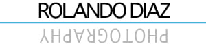
According to Rolando, the inspiration for this had been “a reflection of the sun on the water.” Although it was a cool idea, the execution could use some help to attract the high-end clients he’s after. While it fits the simplicity bill, it didn’t quite hit the elegance mark.
With that in mind, I set out on my journey to design a better logo for Rolando. I began the process by first creating everything in black and white. I’d recommend anyone designing one to start in black and white, as this will assure it has structure. You want your logo to be strong enough to stand on its own and not be dependent on color. You want the logo to be able to be reproduced over several mediums, without the color washing out. If color is not available, you want it to not impact your design.
I initially wanted to keep everything simple, using Rolando’s initials with his name. I was considering future design opportunities for other elements of his brand – like letterhead or business cards. Once we reviewed the options, Rolando and I decided to remove the initials. Using his full name felt like a more elegant approach.
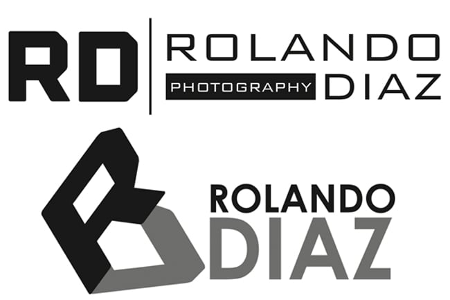
I hammered out another round of concepts. This time, I connected the “O” and “D” in Rolando’s name. In my mind, this represented travel, romance and worldliness. It was like his first and last name were holding hands so they wouldn’t lose each other through their adventures. Romantic, I know! I continued this idea. My second option used a more elegant swash cap to connect the “O” and “D” in Rolando Diaz. In my mind, this was like a father holding the hands of his children.

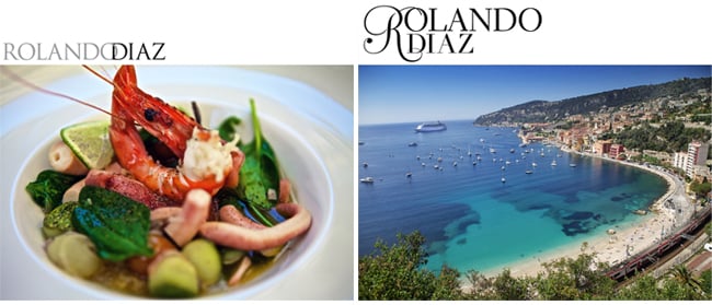
In this round, I also grabbed a few of his photos and inserted the marks above them. This was to help Rolando visualize how it would be presented on his portfolio site.
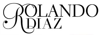
After seeing both options, Rolando chose a mark different than what he originally thought he would want.
[The first one] actually looks better. It’s always best to view it with an actual image in the layout.
After choosing his favorite logo, we moved on to playing with color. We deliberated over several color schemes before finally deciding on a blue/gray palette. Here is the final logo we both agreed on:
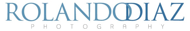
Rolando originally liked the straight black and white logo. It took some convincing, but once he saw it in blue hues, he replied:
Great job man! I really like it. You were right on the blue, it works nice.
The finished product is definitely a step up from his original logo. I believe it will attract the clients he’s looking for. Rolando is now working with Photo Editor Sean Stone on a web edit. Once completed, he’ll update his website with new images and his simply elegant logo.
Here’s a preview of his new website:

Further Reading
Print Edit: A Portfolio for Rolando Diaz
Expert Advice: Photographer Logos
Expert Advice: Visual Identity for Photographers