Please enter your email and website or LinkedIn to receive more information about our free and paid accounts.
Please enter your email address below and we’ll send you instructions on how to change your password.
The last time we spoke about Minnesota-based photographer Thomas Strand, we showed off the brand new emailer template that we designed for him. As a refresher, Tom first came to Wonderful Machine looking for a new brand. We started with a graphic identity in which Tom received a new logo and full stationery package, including designs for business cards, a letterhead, notecards, envelopes, mailing labels, and even a dvd envelope. Being print crusaders ourselves, we were thrilled when Tom opted to have his business cards letterpress printed. We then moved on to his print promo design, and Tom promised to send us samples of everything once all of his marketing pieces were printed.
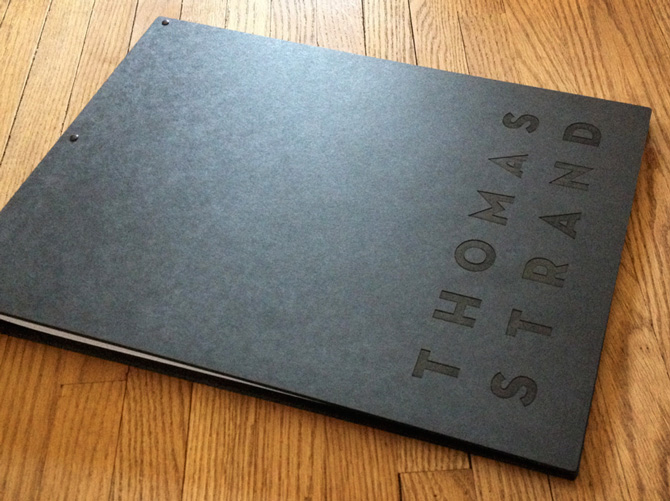
We decided to go with an accordion-folded booklet for the promo, and Tom sent us an image of his new portfolio as inspiration, which he had based on the front of his business cards. We loved how the cover of the portfolio alluded to his logo in a really clean and subtle way and wanted to pull this idea into the promo.
We got to work on some options— a vertically-folding accordion, one that folded to a square, and a 4-panel landscape-oriented fold-out version. The landscape option was the favorite, and once Tom approved the design, photo editor Sean Stone did the image selection.

Tom initially expressed some concern about having the cover of the promo be black with no image but we assured him that it complemented his brand, made for a nice reveal once opened, and we had some great ideas for making that front panel really pop. Once we had the high-resolution images and final files to work with, it was time to nail down the finer details of printing. We were set on offset printing for optimal image quality, and matte paper stock for the tactile but authentic feel, and due to the extra-long format, we had to pull out the big guns and print these on a large-format printer. To top it off, we decided to print Tom’s logotype in a spot varnish on the front cover, which would really help his name stand out in a unique and eye-catching way.
It takes time to coordinate the production of such an elaborate promo, so we weren’t surprised when it took a few months to receive samples of all of Tom’s marketing materials, but these were definitely worth the wait. Included in the package were all of Tom’s stationery we had designed from the graphic identity, the postcard we had done, and the accordion-folded promo we’d been dying to get our hands on.


It was so great to see how Tom’s brand had really come to life and felt so dynamic as it adapted for each new marketing piece. We couldn’t have been more pleased, and to top it all off, Tom wrote us an amazing note about how happy he is with his new brand (on his notecards, of course)!


Designing all your various marketing materials can be overwhelming when you consider stationery, print, web, and email promotion altogether. However, one of our favorite things about being designers and working with brands is helping to bring them to life and to give them a sense of cohesion in every context. Each new piece is an opportunity to make an impression and make something that people will want to hold on to. Don’t be afraid to get nerdy about your stationery and put your heart and soul into everything that leaves your desk (or studio), even the mailing labels. We do it every day.
