Please enter your email and website or LinkedIn to receive more information about our free and paid accounts.
Please enter your email address below and we’ll send you instructions on how to change your password.
By Peter Clark
Back in October, Charlestown, South Carolina-based marine photographer Richard Steinberger came to me looking to create some marketing materials for the new year. In addition to his architecture and travel, Richard shoots for a pretty niche market: marine-based clients for whom he’s shot a ton of boat exteriors and interiors. Since his audience was so limited, he told me up until this point, his marketing efforts have been mainly from word of mouth, emails, and some in-person meetings. Richard knew he had to step up his marketing if he wanted to start generating new business in all the specialties he shoots.
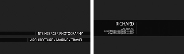
Richard’s old business card
We started off by Richard showing me his current wordmark and business cards, which were all black and white with a spot color accent on both sides. It was ok, but felt a bit dated and the color didn’t really match the personality of his work. After letting him know my thoughts, we decided I should work on new wordmark ideas for his business cards. It was exciting working with Richard because he was open to different forms of printing for his new cards. I suggested we should try a letterpress printer to really make them pop. One of the concepts we came up with was to do a deboss effect on both sides of the cards. That meant having to use really thick paper.
After getting about a dozen different quotes from letterpress printers across the country, Richard settled on using a small shop in Boulder called Sweet Letter Press. He liked seeing the paper in person before settling on a selection I had originally recommended (Crane Lettra 220# Fluorescent White). We also decided on getting the edges of the cards painted (it’s called edge painting). That had to be outsourced to get completed. As for the final design, we went through half a dozen revisions before we settled on the final layout. He was debating what colors to use, aside from black, as his new overall brand color. I told him everything from his business card to his website had to use the same palette to keep things consistent. He eventually decided on a light orange, white, and black color palette, which worked well with the work he shoots. Our goal for the card was to have them convey timeless craftsmanship, with a bit of a contemporary touch.

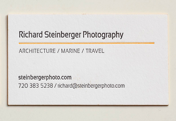
Richard’s new business cards.
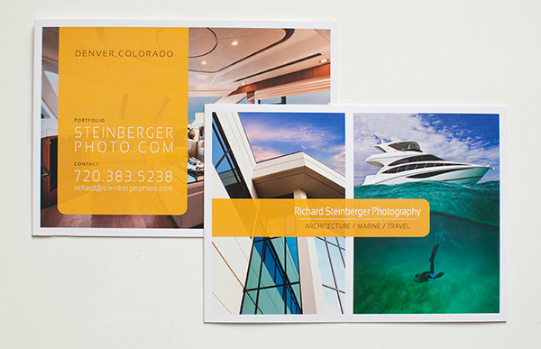
After his business cards were finished up, I starting working closely with Paul, our photo editor, on Richard’s print promo. We decided to go with Modern Postcard’s panoramic Triple (tri-fold) card. Paul first came up with some ideas for the layout of the imagery, which looked great. After seeing the initial design and image selection, Richard was psyched with the direction it was going and only had a few minor tweaks. To finalize the presentation of the mailer, I suggested he put them into sealable classic sleeves.
Once the two printed pieces were completed, I worked on Richard’s email promo template. I started off with some basic designs, and after some feedback, we settled on a design that worked well with his other pieces. I added in the hand drawn arrow to give the piece a bit more ‘color’ and emotion. I also made the emailer’s images easy to update/switch so Richard can reuse the design.
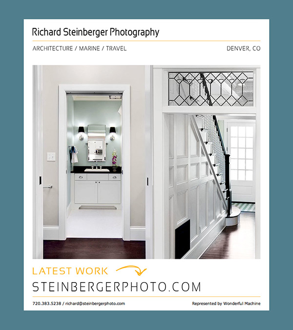
Richard’s new email promo
Once everything was completed on our end, Richard had this to say about the project:
“I couldn’t be happier with the results. Peter did an amazing job, not just with coming up with something great, but also for putting up with my crap.”
If you’re ready to take your marketing to the next level with print or email promos, reach out!