Please enter your email and website or LinkedIn to receive more information about our free and paid accounts.
Please enter your email address below and we’ll send you instructions on how to change your password.
Scott Galvin, a higher education, sports action, and local government photographer approached Wonderful Machine looking for a new graphic identity to represent himself. Scott had tried on his own a few times but couldn’t quite get it right. He explained:
How can I expect clients to ask me to keep their brand in mind on photo shoots when I don’t even have a cohesive brand? So at the beginning of the year I set five major goals for my business. At the top of the list was to create a cohesive brand with supporting collateral materials. While I know enough about design to be dangerous, I also know when to call an expert. I am after all a photographer, not a designer. So I asked Wonderful Machine for help.
To start the process, I asked Scott a few questions to better understand him as a person and a photographer, along with the clients he was targeting. Scott sent over a very informative document that answered my questions and outlined his overall thoughts on branding and what he expected to make of his. The document proved to be very useful during the creative process.
I designed a few different options for Scott to choose between.
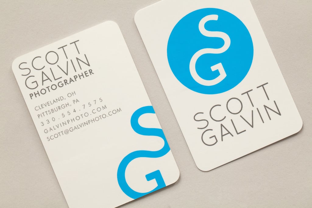
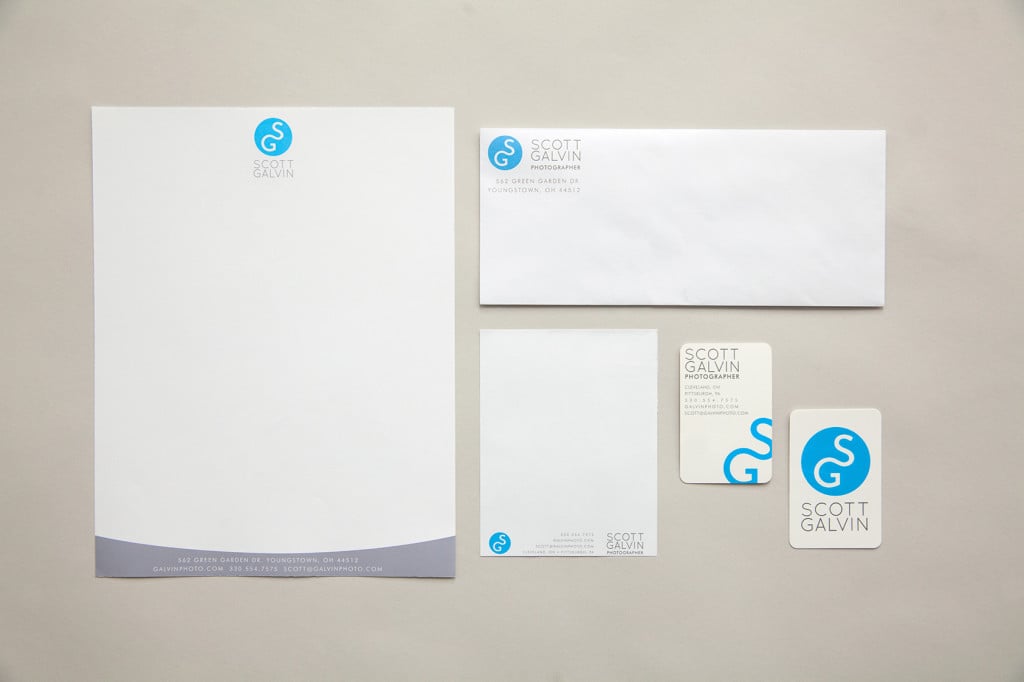
Scott’s new logo needed to be visually flexible since he has a handful of different types of clients–we didn’t want it to lean one way and not the other. Our goal was to keep his current clients intact while making it interesting enough to invite new ones to come aboard.
A hand-drawn element was also of interest, so I combined his initials of SG to give it strength and structure to blend in with what was otherwise a whimsical logo. Scott chose to go with a blue, associating the color with calmness and his laid-back personality.
When the project was done, Scott shared these kind words:
My experience working with Wonderful Machine has been great, and my membership has paid for itself in the first year alone. Before he even started on the design he sent me a questionnaire that helped him understand myself, my business, as well as current and future clients/markets among other things. Following that was the wordmark. It was clean and simple, which is how I view my brand and the images I create for clients. My absolute favorite part of the package is my business cards. I constantly get compliments about the simplicity, quality and feel of them. I can definitely say I am proud to put my brand and materials out there now, thanks to Mark.
See more of Scott’s work on his website.
Further Reading:
Expert Advice: Web Design Basics for Photographers
Expert Advice: Photographer Logos
Specialty: Portraiture Photography