Please enter your email and website or LinkedIn to receive more information about our free and paid accounts.
Please enter your email address below and we’ll send you instructions on how to change your password.
The visual identity of a photographer is no different than that of any other company. Although you may have spent years creating a photographic style that is uniquely your own, your images are only part of the elements that compose your photographer branding.

Have you ever purchased a bottle of wine because you liked the label? Was the logo scripted and elegant in a way that you associate it with a fine-tasting pinot noir? Perhaps you selected a particular bottle because the label’s clean-lined contemporary design reminded you of sipping wine with friends on a summer evening? If these examples hold true for you, then you have experienced how visual identity works at its best.
A photographer’s visual identity reflects your core values through colors, pictures, and graphics. It is the consistent and powerful visible message you present to the world describing your brand. If you want to attract quality clients, you’ll need an identity that appeals to them. While your photographic style may attract clients, your visual identity should reflect that same level of high-level design.
The purpose of a visual identity is to:
Before you can create your visual identity, your photography brand must be transparent. In his book Start With Why, Simon Sinek uses a circle analogy to show the relation of the why, how, and what of branding.
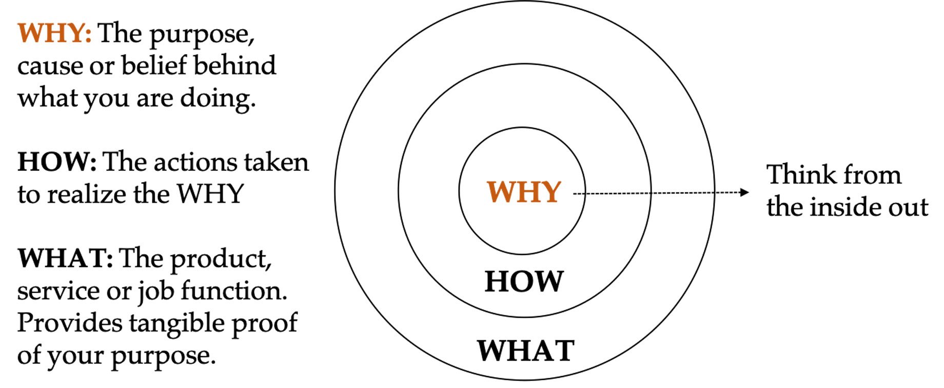
Sinek describes how a brand should approach these questions from the inside out — why, then how, then what. He uses the example of Apple’s “Think Different” slogan — two words that define the core of the brand. Everything made by or communicated from Apple encompasses “Think Different,” from packaging to product performance. Sinek explains, “Customers buy your service or product because of why you do it, not what you do.”
Once you’ve identified your brand as the set of abstract ideas, including mission, vision, values, and how you want customers to perceive you, these character-based components will be used to shape your identity. Sometimes called graphic identity, it is the graphic expression of the company communicated in a logo, stationery, packaging, signage, website, emailers, etc.
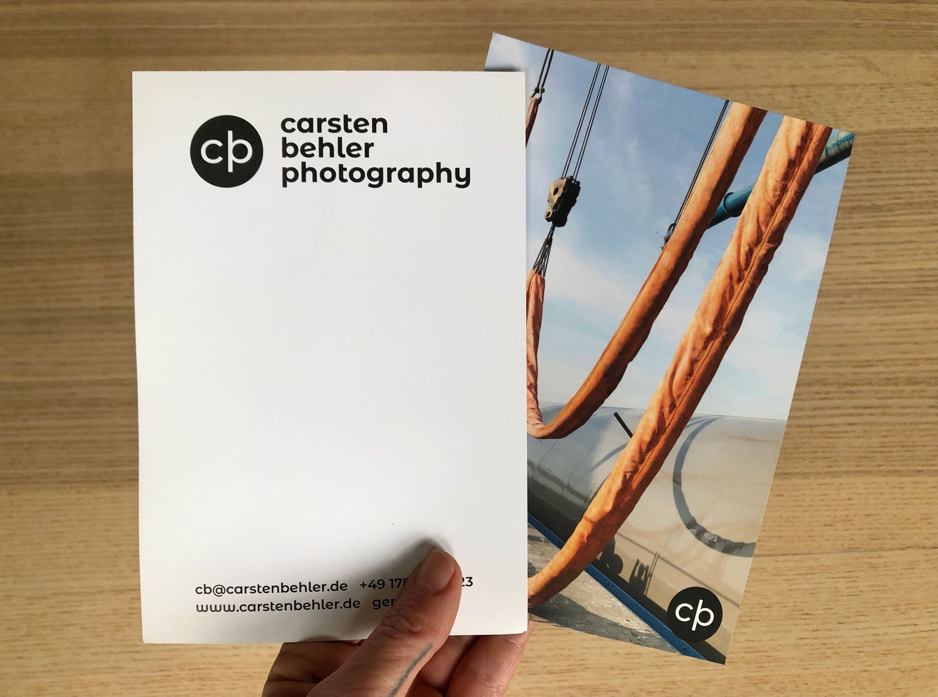
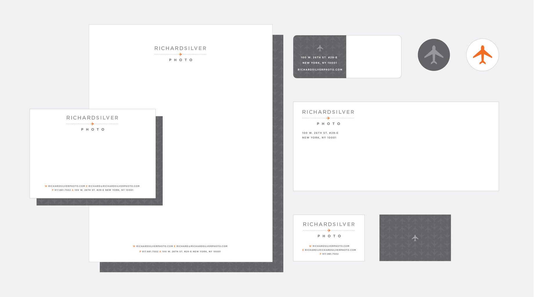
Start with a solid logo design and apply it across your marketing materials: stationery, business cards, emailers, print mailers, website, and more. A logo is the cornerstone of your brand’s visual identity. It’s worth spending the time to get it right as it defines the other graphic elements that fall under your visual identity. That includes your typography, color palette, and the marks or illustrations that make your marketing materials stand out. A strong visual identity stands the test of time and is flexible enough that you can use it over the years, with only minor updates.
If you feel overwhelmed by the thought of the depth of graphic design involved or don’t have the time, hiring a graphic designer may be worthwhile. Wonderful Machine also offers graphic design consulting services and our experts can easily guide you through the process of creating a new brand identity or brand overhaul, which includes working on all the elements of your visual identity.
A graphic designer will typically ask you for detailed information about your brand and apply it to all the visual elements needed to create a cohesive design. They will also help determine if your logo should be a wordmark (your name) or non-wordmark logo like a pictogram (identifiable symbol) or ideogram (abstract symbol). For more in-depth information on types of logos, read our companion article here. A good designer will understand your brand’s core values and be able to bring them to life cohesively across marketing materials.
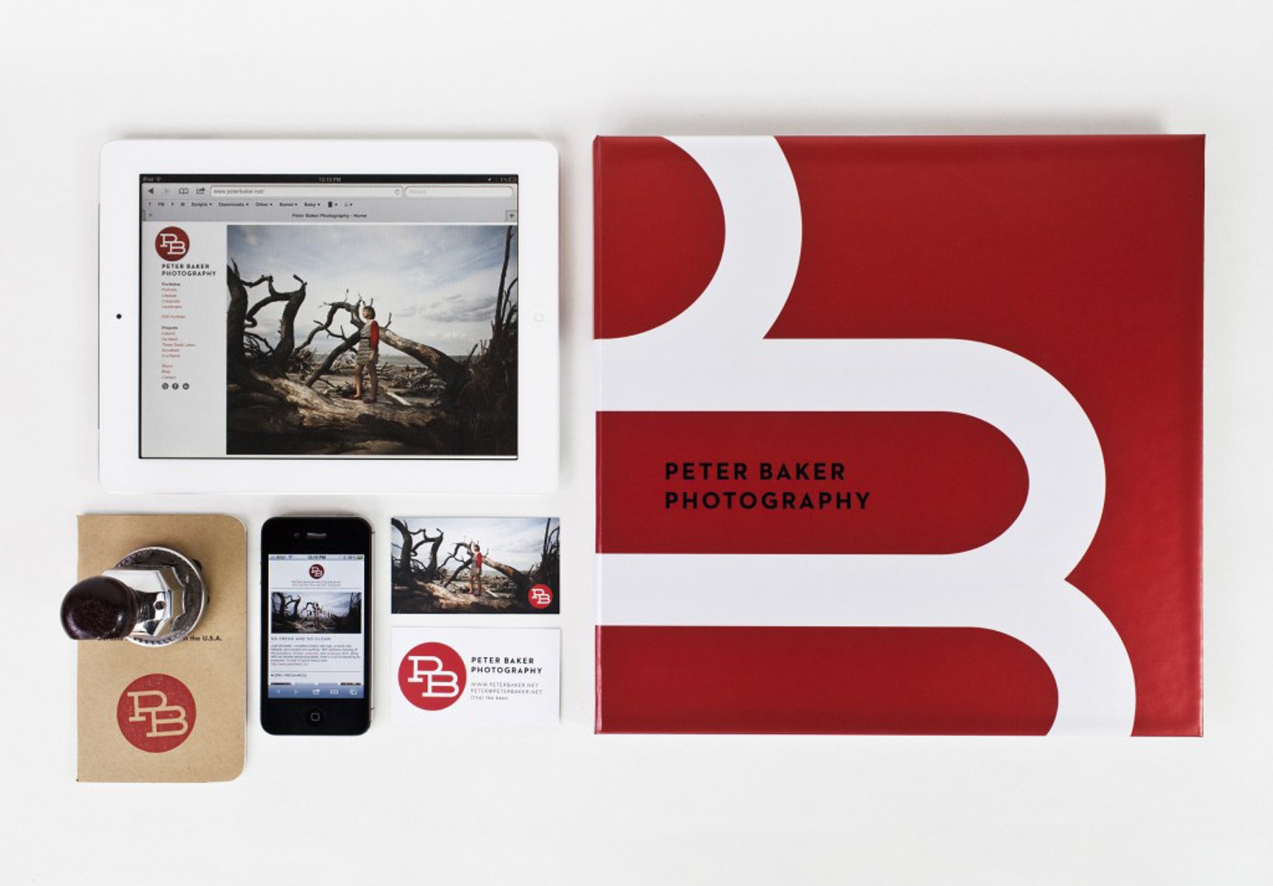
You should determine your needs for additional marketing materials based on tools and channels that will reach prospective clients. Any brochures, website, stationary, emailers you develop should be cohesive and utilize the same typefaces, color palette, and graphics. A graphic designer will think of how the graphics and images work together from the smallest element (business card) to the most prominent (your website and print materials). Many companies will also develop a brand style guide with their graphic elements to maintain consistency.

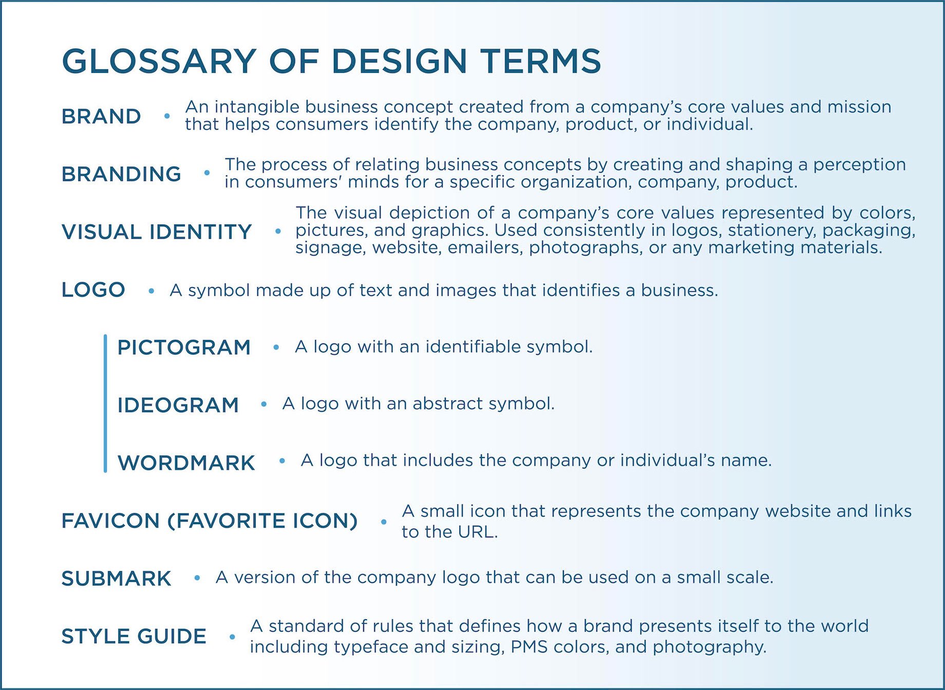
A style guide is a standard of rules that define how your brand presents itself to the world. It’s used for internal and external company purposes so that anyone using your logo or graphics will have accurate information about typeface and sizing, PMS colors, and photography to name a few.
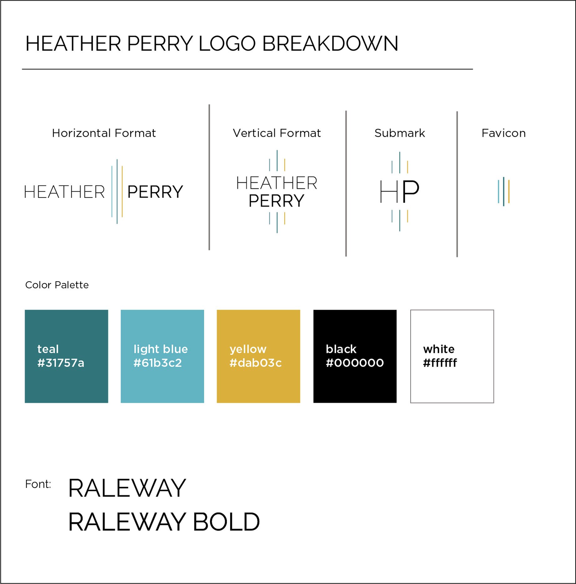
Fun Fact: A favicon (favorite icon) is a small icon that represents your website and links to your URL. If you bookmark a site, you’ll see the favicon as part of the favorite bookmark list. Favicons are usually based on your logo so that it maintains a consistent look for your brand.

Google icons are an excellent example of good favicons – these icons are immediately recognizable in shape and color with minimal design elements.
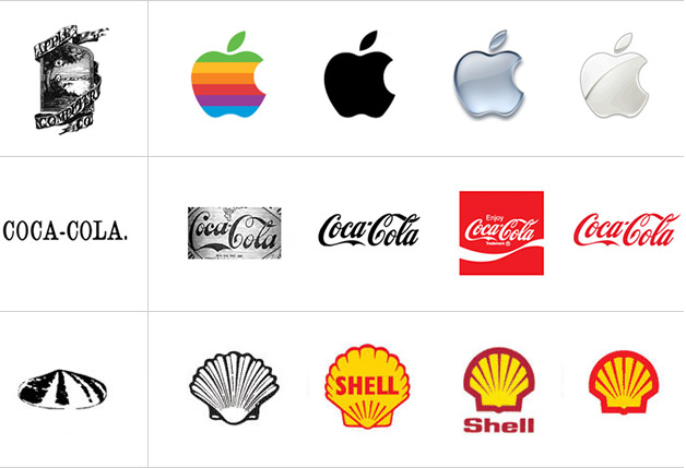
Although you may need to tweak your logo and visual identity in years to come, creating a lasting design begins with combining interesting elements with simplicity. Design trends will come and go, so it’s best not to get caught up in what’s popular now. Instead, think of timeless design elements from shapes and fonts to colors. However, be open to reevaluating your visual identity after periods, as even the most recognizable brand identity needs revamping over time.
HubSpot: How to Develop a Unique (& Memorable) Brand Identity
Adobe: What’s In A Brand? How To Define Your Visual Identity
Bynder: Brand Guidelines Definition
99 Designs: Visual Identity
Belvg: How to Create a Favicon for Your Website