Please enter your email and website or LinkedIn to receive more information about our free and paid accounts.
Please enter your email address below and we’ll send you instructions on how to change your password.
Greg Vore, a New York-based photographer, has a knack for still life—the clean lines, bright/perfectly paired colors, the fresh style. He often shoots big brands such as Madewell, J. Crew, and Kate Spade, but his recent work for the vintage-inspired glasses brand, Warby Parker was especially eye-catching.
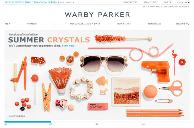
Warby Parker is an eyewear start-up that sells high-end, retro-style glasses online. Although only in a business for a short time, they’ve already gained a large following and are selling tens of thousands of glasses each year. They’ve quickly become successful, partly thanks to their collaborations with the marketing and branding agency, Partners & Spade.
It was Partners and Spade that reached out to Greg about their new project for Warby Parker, a creative launch for the brand’s Summer Crystals line. Greg had worked with Partners in the past for the Kate and Jack Spade brands so they knew he would be a great fit for the project. They first presented Greg with their concepts to gauge his creative interest in the assignment. He was immediately hooked after seeing the creative swipes they sent over, saying
I am a huge fan of collage and love arranging objects and playing with the possibility for character, story, and humor that can come from creating a relationship between props and product.

As for the actual shoot and styling process, Greg added,
With the initial direction being crystal clear, and the restrictions of the web banner size, we had a nice set of limits to work freely in. Randi Brookman Harris, the stylist, played a huge role and always brings great ideas and style to the table. We’re both big collectors of ephemera and objects. She brought tons of her own props and we used many items from my studio as well, but the majority were brought in by the agency as Partners has quite a prop fetish. We had a great group of creatives for the shoot.

The shoot took place in Greg’s Williamsburg, Brooklyn studio. In just one day they shot seven set ups, two of which had homepage versions with different compositions—which made for nine total photographs, all of which included heavy propping/styling.
It looks sort of effortless in the end but ten hours of arranging, composing, and straightening little items with a bunch of perfectionists, is anything but effortless.

The effort paid off though with the photos coming out beautifully. They’re already up on the Warby Parker website and Facebook page. Greg says the client was very happy with the results.
There has been a huge response since the launch. They exceeded their own expectations, so what’s not to love?