Please enter your email and website or LinkedIn to receive more information about our free and paid accounts.
Please enter your email address below and we’ll send you instructions on how to change your password.
We’re always telling our photographers to be mindful of their brand and make sure their look is consistent through all channels, from their website to their leave-behinds. That’s why we were excited when Jonathan Chapman, a photographer/videographer based in Minneapolis, sent us a spiffy new portfolio to keep in-house. Jonathan, his team and a couple of designers worked in tandem to create a professional presentation of his work that integrated his still and motion projects into one attractive package.
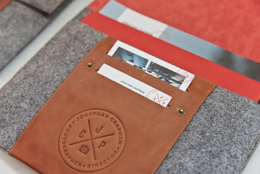
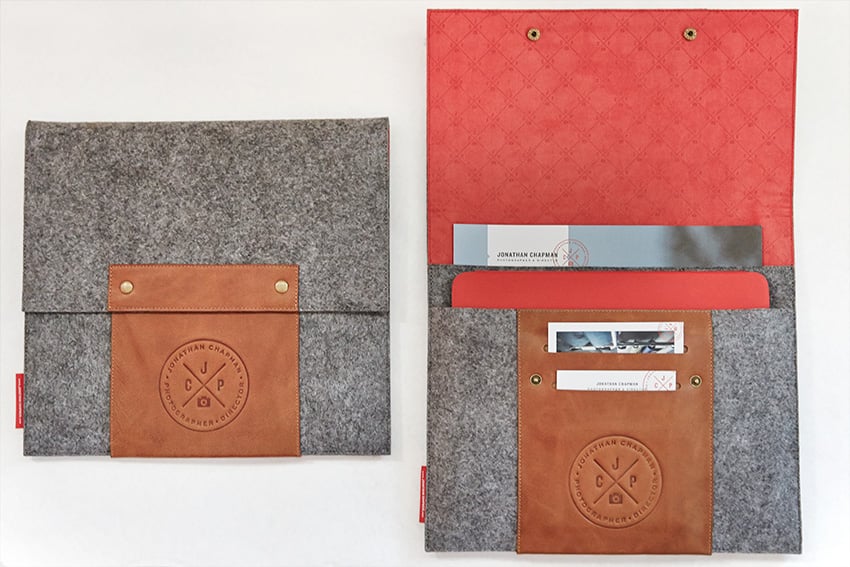
Jonathan’s new portfolio is a customized iPad case with dedicated sleeves for an iPad (which features both motion and stills), a couple print books (small books focused around a few projects), a stack of postcard-sized leave behinds and a set of business cards. The case is made of felt and leather, lined with red, seamless patterned suede that emphasizes his logo. Each print book features a few different projects that also doubles as leave-behind portfolios for clients. I caught up with Jonathan to chat more about the thought process behind his new book:
As we’ve gotten more into motion work we’ve tried to have a print book where we could fit an iPad in the case and make them friends, if you will … we wanted to create something unique that might have a little bit of a splash when hits the table, and really bring our motion and print portfolios together.
Jonathan and his team worked with graphic designer Nathan Strandberg of Eight Hour Day, and industrial designer Travis Read to conceptualize and craft the portfolio. The project was a little obscure for Jonathan and the designers, and they saw it as an opportunity to really exercise their creative abilities. All-in-all, the portfolio took the better part of a year to create, from conceptualization to the final product:
We would have a meeting, talk about some ideas. People were drawing and sketching. Everybody’s doing it in between their projects. You get a prototype and go back to the drawing board. Getting the fabrics and textures to all line up was a little bit of a challenge.
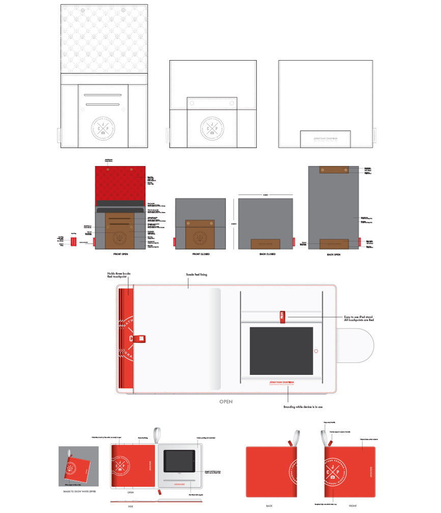
A post on Jonathan’s blog features a Q&A with Travis about crafting the final book. Below, Travis comments on balancing form and function to create a user-friendly final design:
From the beginning of the Project, I knew that I wanted to make a custom form factor for the case that would address the unique needs of the end user. There are plenty of cool looking cases in the marketplace, but none of the cases adequately addressed the need for this type of functionality. Understanding the end user was my biggest driver. At first, I went overboard with the functionality and didn’t focus on the style of the case enough. But as I learned more about the end user’s role as a creative director, the style and simplicity became equally important. It took some time to find the balance, but I think we finally found the balance with our final case.—Travis Read
The book is still new, so Jonathan’s reps are just beginning to show it off, but so far he’s gotten nothing but positive feedback. The new iPad case is just the beginning of Jonathan’s effort to take his brand to the next level, and he’s looking forward to seeing a promising return on his investment.
It’ll be good to support the brand. In the world of everybody kind of needs something new to talk about. It’s all about just reminding people that you’ve got new work, and being able to show it.