Please enter your email and website or LinkedIn to receive more information about our free and paid accounts.
Please enter your email address below and we’ll send you instructions on how to change your password.
by Peter Clark
Originally from New York state, now Glendale, California-based food photographer Kathryn Russell headed towards Colorado for the great skiing. It was there that she fell in love with taking pictures and ended up a state away, attending the Art Center College of Design in Pasadena. After graduating, she opened her own studio in the Los Angeles area, where she specialized in food and product work for clients ranging from Target to Random House. Kathryn said after spending 20 years in the industry, she has learned a thing or two about communicating with clients and how to manage a budget fairly efficiently. Kathryn meets with Wonderful Machine Design team for new print promo. She shared some veteran insight with me:
The industry has changed tremendously since I started. Just the cost of doing business is insane, let alone all the new tech stuff you have to know. It is going to continue to change, so I have learned to embrace “new” as much as possible. Marketing has gotten very complicated. When I first started, you could reach potential clients very easily. I think it is very difficult to reach your audience in the modern day. Also, there is way more competition, so you have to stand out.
In the past, Kathryn had been savvy enough to create her own promos and send them out to a personal mailing list she’d built up over the years. However, she came to realize that it was time to change the way they actually looked. Her old type treatment and promos felt a bit bland and lacked the emotion that a lot of her work had.
That’s where I came in. Kathryn wanted a new brand and felt that doing an email promo using the new look would be a great start. I was excited to help her create something eye-catching that a lot of potential clients would really enjoy receiving in their inboxes.
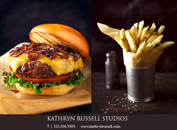
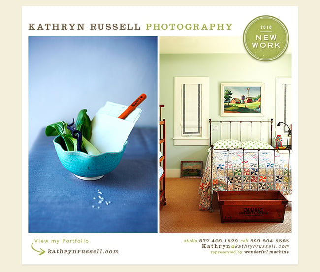
For Kathryn, simplicity is key. Her photographic goal is to make simple things look beautiful; I certainly didn’t want to get in the way of that objective. She had noted that she liked the look of serif fonts and showed me a few type examples for inspiration. I knew I wanted to use two typeface families in her new brand to give her a greater flexibility in design options. The two typefaces really needed to complement each other so I settled on Clarendon as the serif and Trade Gothic as the sans serif. These fonts are known in the industry to work well with one another.
From there I started to experiment with all the different variants of the typefaces until I got a good contrast between the elements she wanted to include. Next came color—I always tackle that last when doing type work. Choosing the right colors can really make for some interesting contrasts to the photography. I chose an earthy brown and green since I felt it fit a lot of the subject matter she shoots. I also used a cream color to accent them both in the background.
Kathryn was happy with the results and is looking forward to showing off her new look. Next up for her: create some print promos and a website to match.
If you’re ready to take your marketing to the next level with print or email promos, reach out!