Please enter your email and website or LinkedIn to receive more information about our free and paid accounts.
Please enter your email address below and we’ll send you instructions on how to change your password.
Maine-based photographer, Heather Perry underwent a full brand overhaul with us, and boy, was it a pleasure working with her. In fact, after realizing how much we both love swimming and the combination of orange and teal, we may be the same person. This made it easy and exciting to move from one stage to another to create a new logo.
We began the process by sending over a questionnaire to learn more about Heather’s aesthetics and personality. I learned that she was a nature-loving, ocean-enthusiast, a Coldplay (the early days) fan with a passion for mid-century modern furniture in just a few answers. With these details in mind, I aimed to make a sleek yet playful logo that I felt represented her personality well.
I wanted to play with the structure as well as the type. For the first round, I presented four clean mid-century style fonts with several variations in design. I arranged for them to show the different designs with each font. And, to give something extra, on the very right of the attachment, I made one design (at the top) that could be paired with various extra graphics to add more personality.
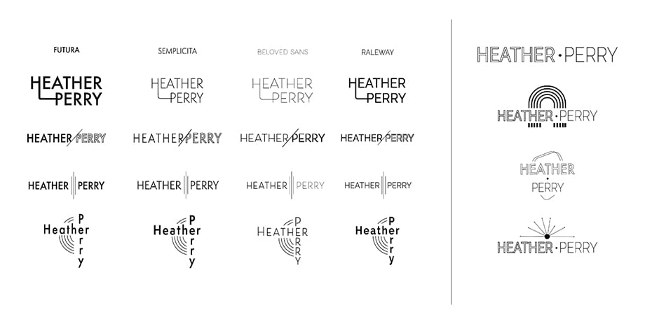
Heather was torn between the third line down — a design we named “Three Lines” and the fan graphic from the right column. While she liked the font from the right column, she felt the three lines were more subtle and universal.
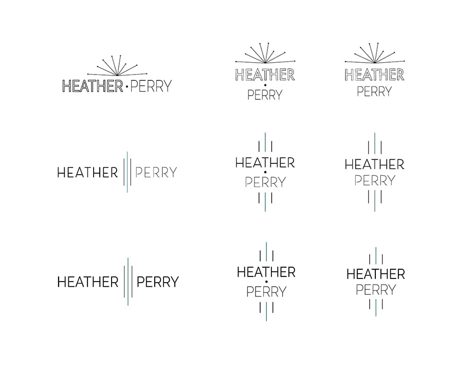
Heather also wanted her name “Perry” emboldened instead of Heather in the name, so I made that switch as I headed into the next chapter of the logo design. In this round, my focus was the color palette. I knew Heather liked the color teal. I didn’t know that teal is a major component of her fantastic underwater painting series of swimmers.
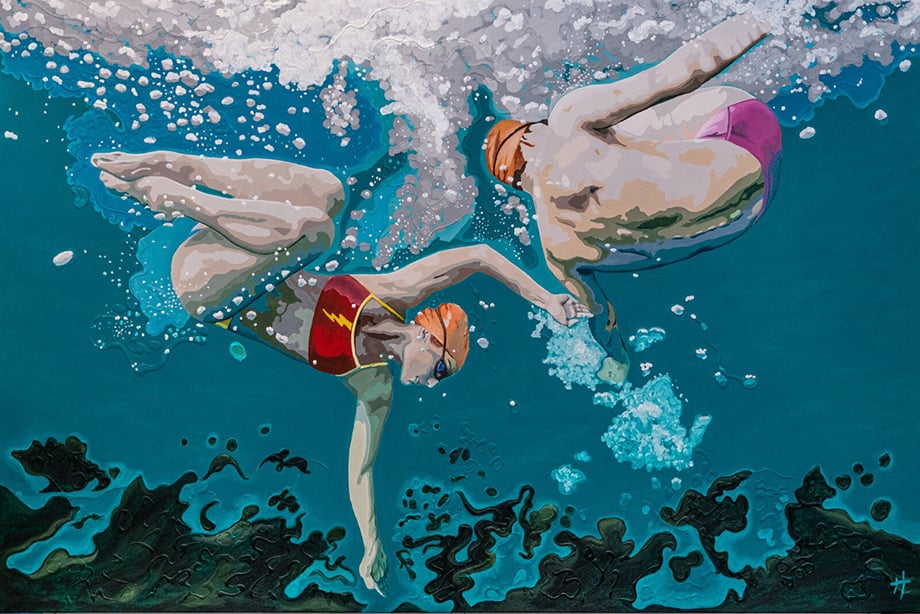
The second I saw these, I knew I wanted to use color samples from her paintings for her brand colors. I made a few color combinations, and it turns out that option 1 is a palette she uses for a separate business. So we decided to go with a few shades of teal and yellow.
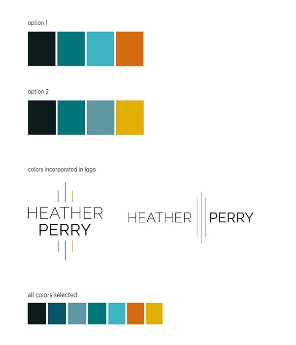
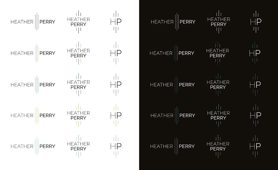
The last stop was to incorporate the colors into the logo, but how could we choose what color to put where? It was predetermined that the three lines would feature the color. We decided that we’d have three options — one logo with all teal lines, one logo with all blue lines, and one logo with all yellow lines. These she could pair with a different specialty (teal with underwater, yellow with portraiture, light blue with lifestyle). One more logo would feature a different color for each line. She would use this one to encapsulate her entire collection.
Heather’s final product included pdfs, jpegs, pngs, and eps for all the logos below — a collection that includes a horizontal, vertical, and submark version of the logo, in all colors, as well as an all-black and all-white option.
.
As for Heather, she had this to say:
Thank you so much. This process has been fun, smooth and easy thanks to your guidance and creative work.
See more of Heather’s work on her website.
Further Reading:
Expert Advice: Visual Identity for Photographers
Expert Advice: Photographer Logos
Specialty: Underwater Photography