Please enter your email and website or LinkedIn to receive more information about our free and paid accounts.
Please enter your email address below and we’ll send you instructions on how to change your password.
Brooklyn-based commercial photographer Michael Marquand has a knack for seamlessly blending color, composition, light, and texture when creating high-quality product imagery. Having worked for major brands like Coca-Cola, Lipton, and St. Ives, Michael is skilled at capturing rich and polished photos for boosting brand awareness.
As part of his work for premium tea company Pure Leaf, Michael created digital assets for their online ads, social media campaigns, and packshots.

The agency that produced the shoot for Pure Leaf emailed Michael about working together on projects for them in general. Roughly a month later, they booked him for a collaboration with Pure Leaf.
They must have been happy with my work as they booked me for many more shoots after this one.

The first project took place in a corporate building where a room was converted into a makeshift studio. In order for the photos to mimic someone enjoying a refreshing cup of tea at home, each element of the shoot was brought in and created by the prop stylist.
Working with new people and on a brand/product I had never shot before is always exciting. Martha, the prop stylist was great at building out these little scenes that felt like they existed in someone’s home and It was great to work with her and see each one come together.
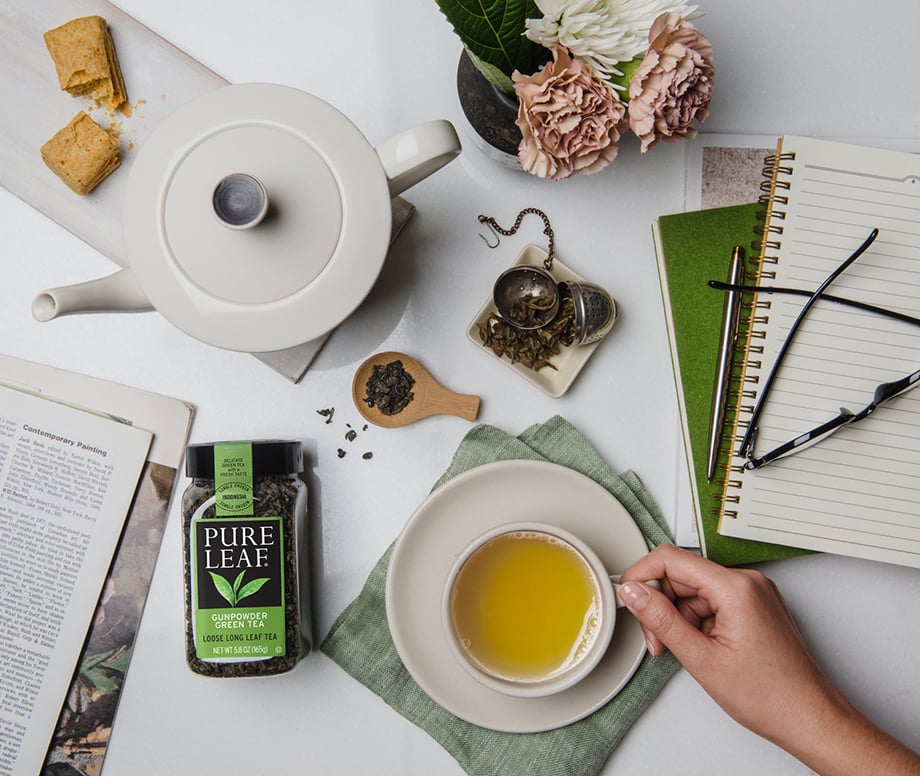
The client wanted shots with natural lighting, but unfortunately for Michael, the space had very little daylight. As many of the photos contained a human element, shooting shots at slow shutter speeds was not an option. As a result, Michael ended up lighting all of the shots to resemble soft daylight.

Additionally, the lighting in the building was on a schedule and couldn’t be turned off since it was controlled by a panel in Amsterdam. To improvise, Michael had his assistant put black tape over all the ceiling lights that were interfering with his shots. Ultimately, he was able to create an inviting and warm atmosphere that made the images come to life.
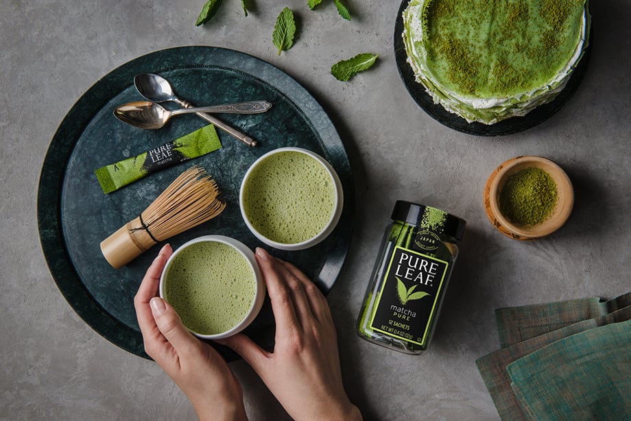
In addition to the standard retouching that always needs to be done for commercial shoots, the client required the product to have different labels for different countries/markets where the photos would be advertised.
After the shoot, they sent me the vector art for each label variation and I was able to composite the labels for each version they needed.
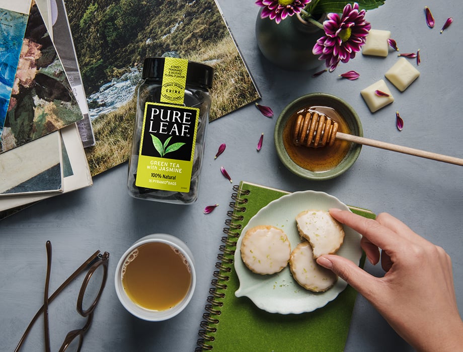
The second shoot was centered around the brand’s packaging and incidentally much more ingredient-focused. The art director wanted to create these very colorful, but monochromatic scenes with each package where the food and ingredients would just fill up the page.

Michael worked with food stylist Nicole Twothy, who has a very technical, architectural style to her work and she was able to help create sets using blocks, pins, and various tools to hold everything in place.
The agency had already designed layouts, so we were composing each image around the layouts/copy they already had.

Michael had to mix up the lighting for each one to keep the packaging consistent throughout the campaign. To get the right level of texture on the matcha or the right reflection on the liquid, Michael would light an image for the package and another one for the ingredients or tea.

Then we would shoot ‘plates’ where we would remove the package and get a clean version of the background/ingredients so that we had plenty to work with when retouching.

By combining his signature composition and bold use of color with earthy, organic tones, Michael’s images beautifully depict Pure Leaf’s commitment to only using the finest ingredients in their tea blends.
I learned a lot of random details about tea, specifically how Matcha is made.
Credits
Prop Styist: Martha Bernabe
Food Stylists: Cindi Gasparre & Nicole Twohy
Hair & Makeup: Cat Chung