Please enter your email and website or LinkedIn to receive more information about our free and paid accounts.
Please enter your email address below and we’ll send you instructions on how to change your password.
There’s a tendency to think of one’s portfolio as a collection of past professional projects, presented in such a way as to attract more projects of the same nature. This tends to work out fine for many, but where’s the growth? It’s becoming increasingly important to think of one’s portfolio not as an archive of the past, but as a projection of the future. This means that in order to alter the projection of a photography career, it is crucial to incorporate personal projects that reflect the photographer’s goals and are also strong enough to present as professional material.
Enter Matthew Rakola. Throughout his career, Matthew has specialized in portrait, corporate, and institutional photography. Some time ago, Matthew approached me about a personal project he was working on known as “The Learn Project.” In this series, Matthew expressed a passion for the human learning process (and for the process of learning about learning itself) by documenting an array of somewhat non-traditional and highly intriguing hobbyist classes, including urban beekeeping, outdoor survival skills, and musical instrument crafting. Over the course of several months, Matthew would pass along his latest batches of imagery from this project looking for feedback and favorites. Each round came through with bold new images that hummed with energy. Matthew was also making a point to take some environmental portraits of the instructors in each scenario, and in the process was producing some of the finest portraits I’d ever seen from him.
A few shots from Matthew’s “The Learn Project”:


There came a point when Matthew had enough new imagery to pull together a fresh print portfolio. It became vividly clear to Matthew and me that this portfolio would be largely based on work coming out of his personal projects. The challenge would be blending his personal work seamlessly with his assignment photographs in order to present him in the strongest possible light.
A second challenge to maintaining fluidity was the fact that Matthew had really nailed the perfect look/style of his photography for each unique class/subject that he was shooting. Considering how different these classes were from each other, this generated a broad range of styles to string together.
Rather than fight the grain, I sought to keep these projects together as microcosms of a continuous portfolio, while stringing one on to the next using visual bridges. Among these microcosms were bubbles of his assignment work. The end result was an edit that takes a viewer through quite a ride without jarring their seat.
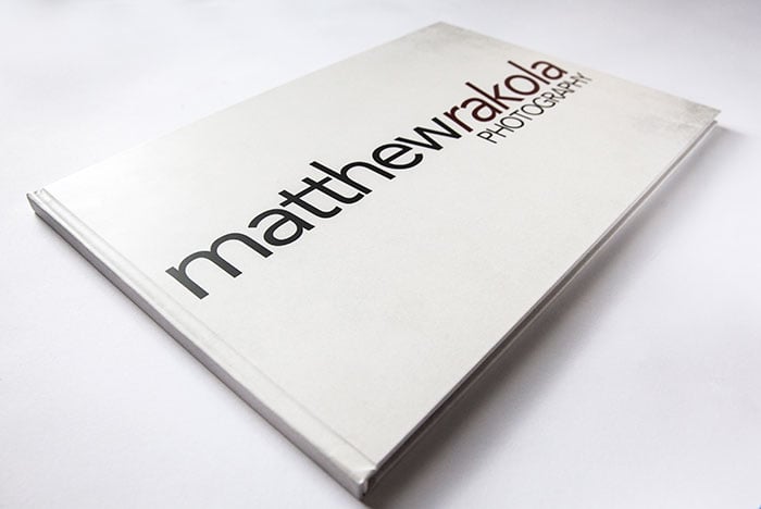
Now we needed a physical manifestation of the edit. After checking out different options, we arrived at a 10×15 hardcover Zen Layflat from AsukaBook. This provided the potential to have as many as 4 portrait-format images spanning across two 15” wide pages, which was quite conducive to giving each “microcosm” its own spread for housing.

Once I’d designed the layout for the book using AsukaBook’s software, all that was left was the perfect cover to draw the viewer inside. Having previously worked on a few portfolio covers, I was happy to do a bit of design work.
Matthew had been making use of a bold wordmark on white as his logo. I wanted to stay pretty true to this branding, with a bit of extra flavor.
There was one detail of his wordmark that stood out to me as a tiny tweak that could help it feel a bit more whole. Here’s his previous wordmark:

Some obsessive parts of my mind wanted to see the tilt of the italicized “Rakola” match the final angle of the “w” in “Matthew,” creating a stronger form of parallel lines. So, with his permission, I did a bit of skewing, and arrived at:

Now that I had given him a slightly modified wordmark to implement through his branding, I got to work on adding the aforementioned element of “flavor” to the cover. Matthew’s work beautifully incorporates both pristinely clean photos and images with a bit of grit to them. I wanted to subtly explore that dichotomy on his cover. My first instinct was to “grunge up” his actual logo a bit and leave it on a solid white background. However, a change of heart had me doing just the opposite: I left his wordmark crisp as it is, and developed a bit of texture in Adobe Photoshop to lay over the white background behind it. Et voila:


The initial response to the book has been so positive that we’re now working on shaping his web edit more toward the imagery of the print portfolio. As always, I’m thrilled!
If you’re looking for help with your portfolio, design, copy, marketing or just want to learn more about our services, please visit our consulting page or send us an email!