Please enter your email and website or LinkedIn to receive more information about our free and paid accounts.
Please enter your email address below and we’ll send you instructions on how to change your password.
When Wonderful Machine photographer Wade Griffith first approached me about building his print portfolio, I was excited. Wade, who is based in Dallas, TX, worked for nine years as a successful graphic designer before transitioning to photography full-time; I knew working with someone with this background would be a fun and collaborative experience.
I’d label Wade’s photographic style as versatile, as he tackles numerous specialties—so looking through his catalog and choosing a specific direction was challenging at first. With print portfolios, it’s very important to first map out a path. You want the final product to put forth a cohesive collection that emphasizes the photographer’s strengths. Recently, Wade has spent a lot of time shooting architecture and interiors. This was the work that jumped out to me and felt fresh, so that’s the direction I decided to go in.

When sequencing photos, I like to build a flowing narrative. I find this storytelling visually more engaging and it helps keep the attention of the viewer. This is a challenge when you’re dealing primarily with structures. I decided to approach Wade’s architecture portfolio edit from a simple aesthetic, and began pairing photos based solely on how well they complemented each other. There were some very logical pairings, like placing an exterior of a church with an interior emphasizing the buildings stained glass details. Others, like the lobby of an office paired with an interior of a nightclub, were less obvious, but the visual symmetry between the two images made them work together.

After pouring through hundred’s of Wade’s best photographs, I finally arrived at a 40-page layout. This wasn’t going to be Wade’s first book, but he wanted to make sure it was his best. Up until this point, he had relied primary on the services of Blurb and Apple. Both companies offer perfectly viable options, but this time around, Wade was looking for something exceptional that would stand out in a crowd of books.

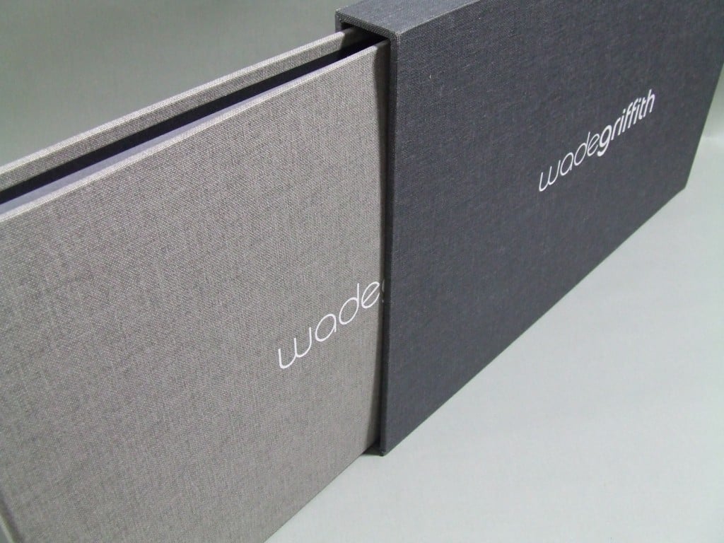
Therefore, I turned Wade on to Mullenberg Designs, as I thought their 11” x 17” layout option would present his long sweeping horizontal shots and detailed interiors in the best way possible. He agreed and was happy to offer guidance on book styling. As with any presentation, you want something that complements your work and doesn’t overshadow it. The cover design shouldn’t be the most eye-catching element. It’s the work beneath the cover that should be the most unforgettable aspect of the book.
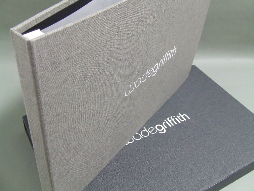
Since Wade’s website features a grey color scheme, we thought it best to use this palette on the book, to keep it consistent with his online presentation. He chose a cloth cover that would hold up over time and wouldn’t show fingerprints or scratches. As print portfolios carry a fairly hefty price tag, Wade decided on screw post-construction, which allows for flexibility as you can swap images out. His logo was added to the cover and slipcase and was then ready to share with the world.
Further Reading
Wonderful Machine: Wade Griffith’s Images of Lewisville Thrive for Barker Rinker Seacat Architecture
Wonderful Machine: Print Edit: Amy Rose Productions
Wonderful Machine: Web Edit: Robert Granoff’s Website Reaches New Heights
Interested in our Photo Editing service? Reach out!