Please enter your email and website or LinkedIn to receive more information about our free and paid accounts.
Please enter your email address below and we’ll send you instructions on how to change your password.
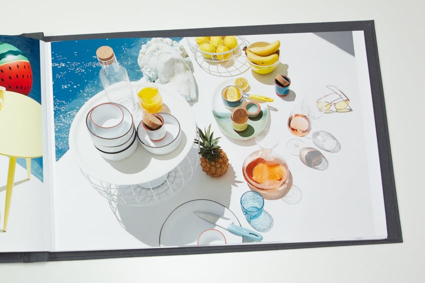
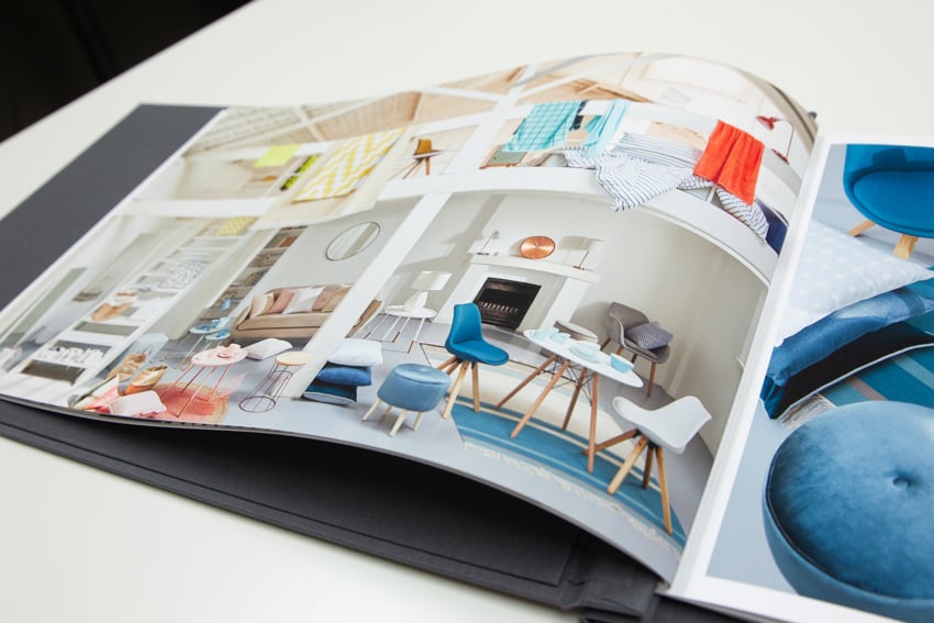
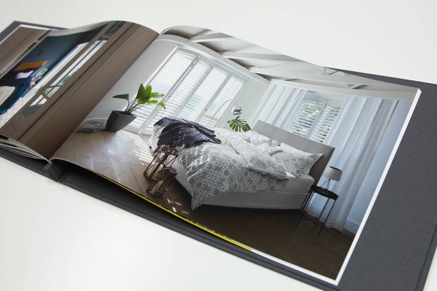
Cape Town, South Africa based interiors and still life photographer Inge Prins has a style that’s clean and airy, with an eye for design that reflects her years of experience. She came to us in January, wanting to build a portfolio for us to keep in-house and show to clients during our portfolio events.
I sat down with Senior Marketing Consultant Erika Siegfried for a Skype call with Inge (with only minor technical difficulties,) where we chatted about water conservation during the record-breaking drought in South Africa. After a crash-course in the changing climate, we talked about Inge’s book and the possible ways we could design an object to represent her style and skill.
I regularly handle print edits, selecting and sequencing images and helping to design the book from start to finish, but I’m also happy to take an existing edit and use some printing prowess to bring it to life. Since Inge’s strong sense of style and design comes through powerfully in her work, it made sense for her to add that personal flair to the design of her book. She decided to sequence her book page-by-page, while I would ensure her images could look their best on our 11×17 Moab Lasal Matte paper.
Of course, Inge’s busy life as a photographer didn’t stop just for us, and we spent a few months exchanging emails whenever she had a spare moment to talk layouts and solidify the plan for her Pina Zangaro screwpost book.
There were a few areas in Inge’s book that needed special care and attention: the first was making sure that the files she was sending me for each page would print without falling into the gutter or sitting misaligned. Inge also wanted the book printed full-bleed. Because most printers are finicky about printing edge-to-edge, I keep a specially formatted template for just this situation, which leaves less than ⅛ inch border on each page. I then carefully trim down each page for the perfect full-bleed without any dripping ink or smudged paper.
In May, Inge’s book arrived at the office. She had ordered it custom from Pina Zangaro, in beautiful gray linen with her logo blind debossed on the cover. With her book sitting in house ready to be filled, I readied my supplies and sat down to print.
As I worked, each new page made me more excited to see the final product. Inge’s work is full of clean lines and pops of bright color, and even in her moodier images, she has a real grasp of lighting and careful staging. I appreciated the level of care and creativity that Inge put into designing her book, and I’m glad I was able to help translate her design to the printed page.
Once the pages were dry, trimmed, and the binding on her screwpost book carefully set into place, I sent some final images and a video along to Inge. It can be difficult to have a book created without the ability to touch the final product, so I make every effort to show both details and the book as a whole.
I LOOOOVE the book. I am so very excited about it. Thank you so much for the great prints – you got it spot on! I am such a perfectionist so that’s just great to be able to say that.
Inge appreciated our extra care and showed her excitement via her Instagram. Printing is genuinely one of my great joys, and I am always happy to see photographers as excited about their new books as I am.
Need a portfolio or print edit? Give us a call at 610.260.0200 or reach out!