Please enter your email and website or LinkedIn to receive more information about our free and paid accounts.
Please enter your email address below and we’ll send you instructions on how to change your password.
Missouri-based photographer John Fedele is no stranger to Wonderful Machine. Having worked with him on marketing and production over the years, we were thrilled to learn that John wanted our help with a print edit and portfolio production for his updated book. This would be a two-part project, the first part being a print edit that I, Honore Brown, would help with and the second part is the actual printing of the portfolio, handled by print guru extraordinaire Mike Hoover.
From our first conversation, John had a very clear sense of the overall direction that he wanted to take with his book. As a photographer with a robust body of work encompassing lifestyle, brand narrative, automotive, and agricultural work — to name just a few of John’s areas of expertise — the challenge with the edit would be to get the right balance of imagery.

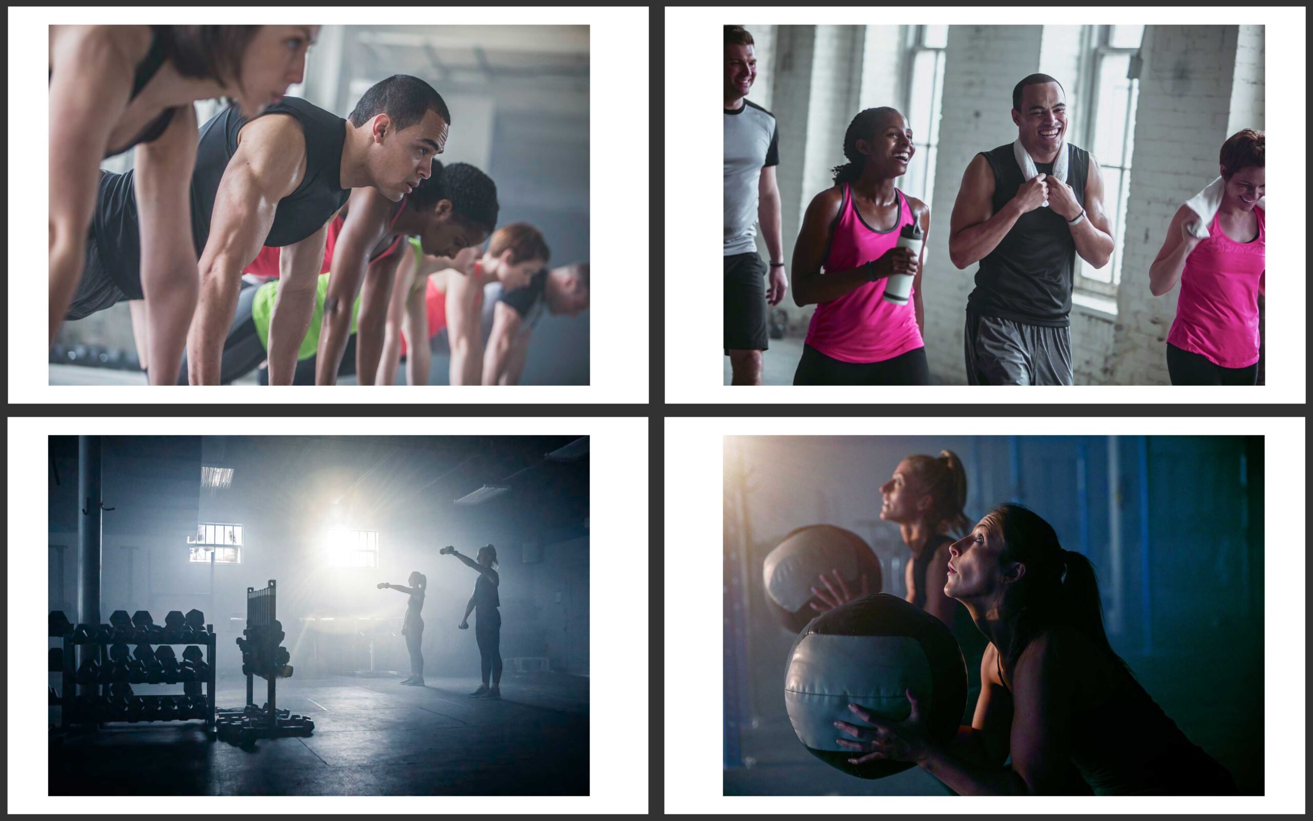
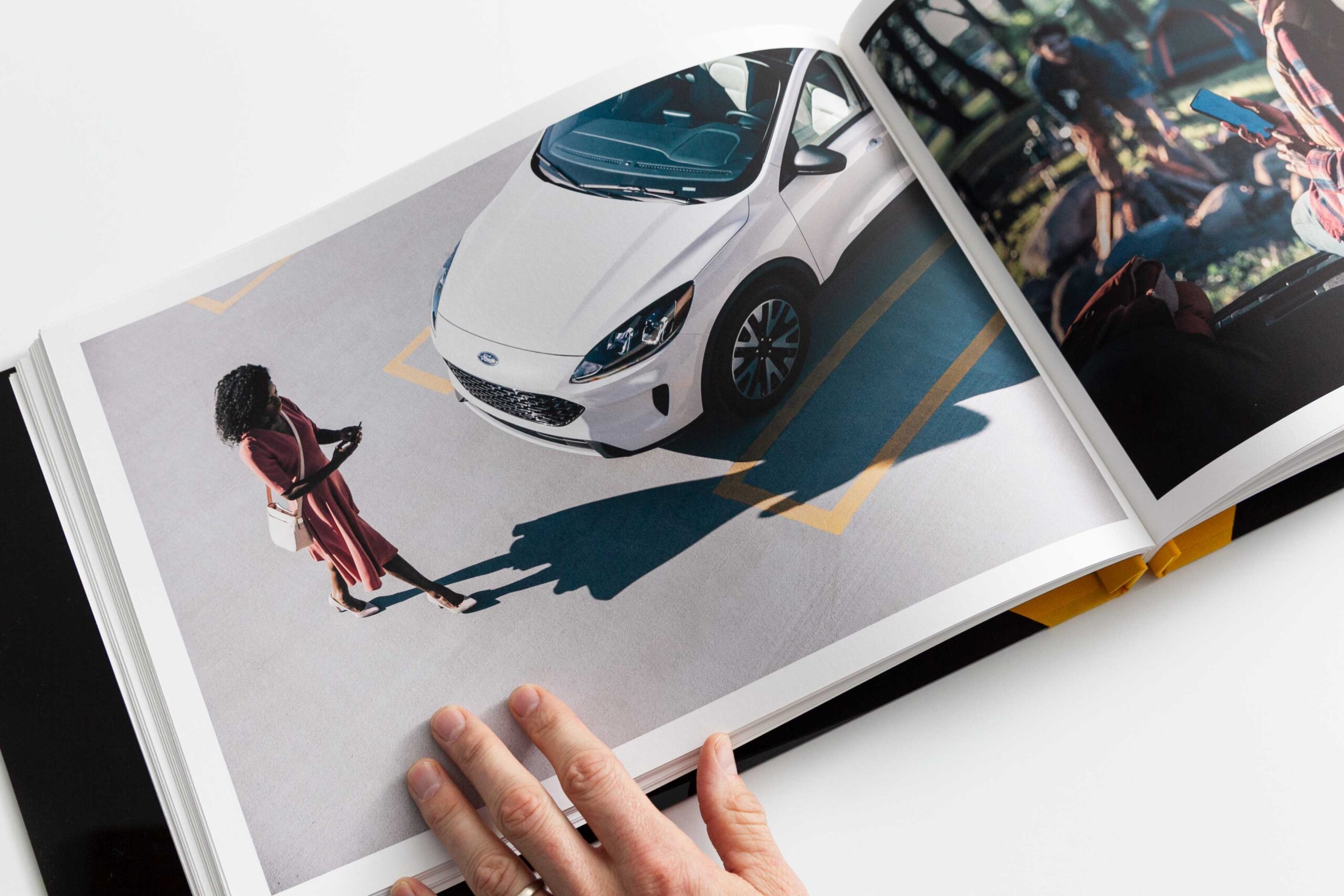
John and I discussed keeping the emphasis on the gritty and organic side of the work, and we talked about how to focus in-depth on a few projects John shot with clients such as Craftsman, Stihl, and Rigid. We talked about playing with some multi-image layouts as a way to represent John’s ongoing relationships with some of these brands and to showcase the range of images he has produced for these clients over the years. After a few rounds of revisions, John and I settled on three images per page across from a spread with a full-page shot.

Once I had reviewed a broad edit of John’s work, I began to grab the strongest examples of his various specialties. Since John has a very consistent style, I had a lot of flexibility in sequencing and arranging the work. Working with multi-image layouts opened up many possibilities for the design of the Rigid and Stihl pages, and gave me a way to show the strength of John’s brand narrative photography. The challenge, however, would be to show just enough imagery to tell a story while maintaining easily digestible layouts that still gave the images room to breathe.
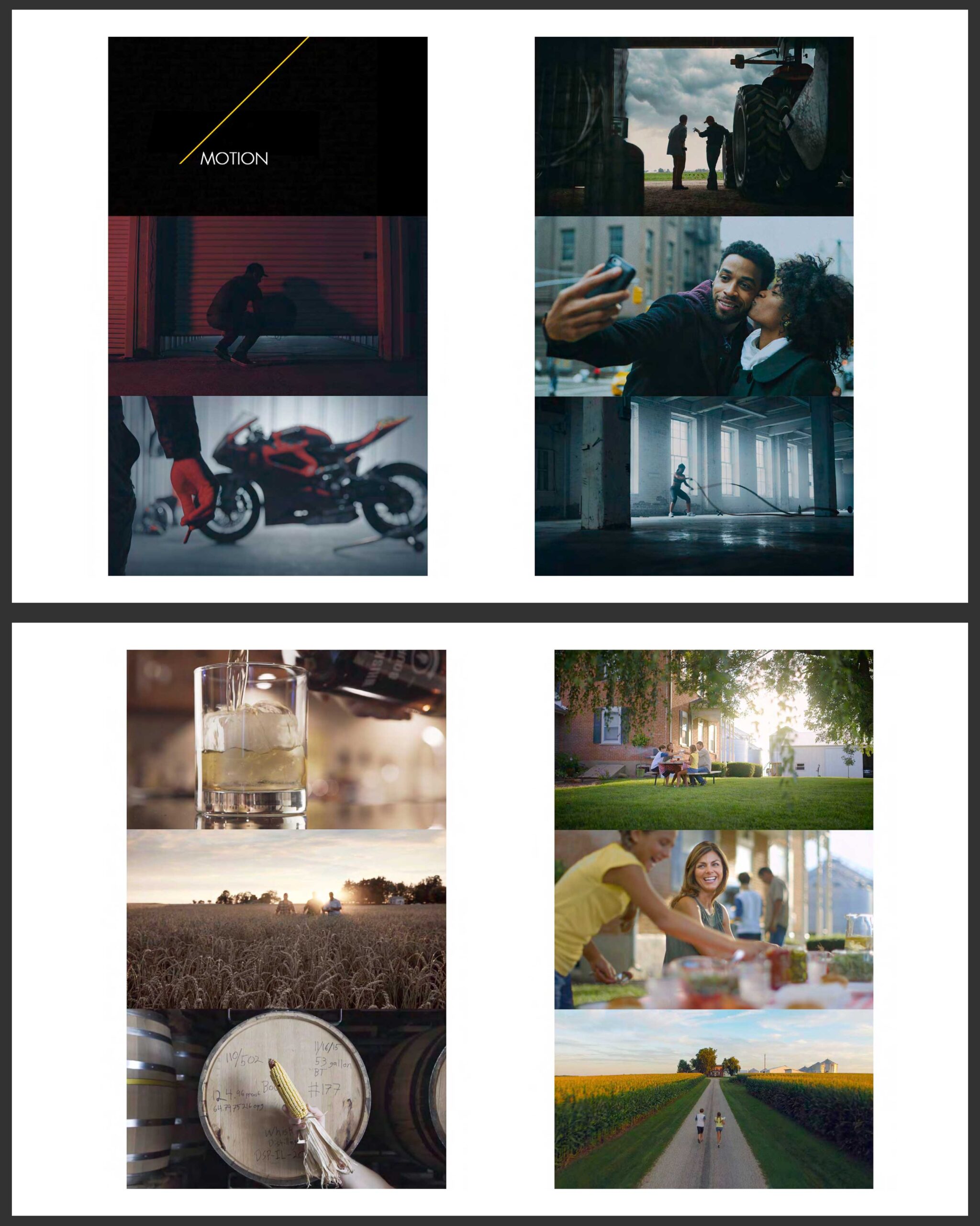
In addition to being an outstanding photographer, John also has a significant body of motion work that needed to be represented in his portfolio. In our ongoing conversations about working with multi-image layouts, John and I discussed creating a spread of motion stills. We wanted to make sure that the motion work had a distinct layout that emphasized the cinematic quality of this work. Again, John had a pretty clear sense of what he wanted here, and the challenge for me was to drop in and sequence the motion stills in a way that felt visually cohesive.
As we were nearing completion of our edit, a giant box arrived at the office with my name on it.
At this point, Mike took over.
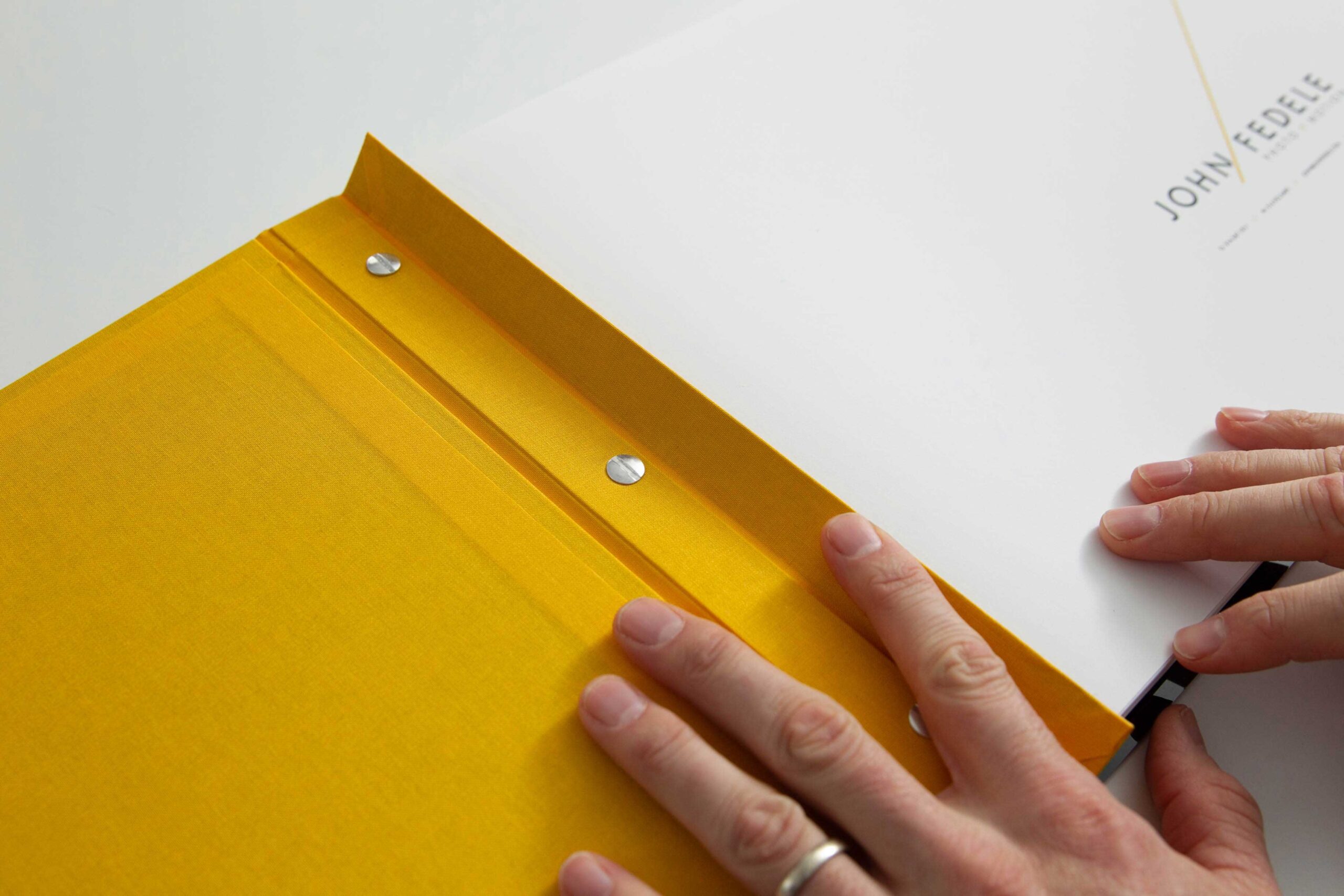
Within that box were two custom-made screwpost binders from Pina Zangaro and a few packs of Pina’s portfolio paper, made in conjunction with Moab. They had laser cut his logo into the front of the binder and even inlaid a line of golden fabric to mimic his logo. As far as modestly priced portfolios go, this company is one of the best options. Screwpost binders are also a great choice when making portfolios. They are designed in a way that makes it easy to swap in new pages, allowing one to remove and replace pages with ease. This makes it much easier to update a portfolio and spend less on a completely new package.
Having done fine art printing for about 8 years, I have completed many print portfolios and print curation projects. John’s was quite different because his work takes on a photo-essay style. As Honore mentioned, multi-image spreads would be the best way to show this work. The challenge was to take Honore’s print edit and make sure that each image had the right amount of living space.
I started by giving each full page a half-inch margin, then I worked from the inside out. I laid out every individual page in Photoshop and inserted some extra space between each image. The photographs are smaller, but the spread is more comprehensive. When a multi-image layout is too condensed, it becomes busy and hard to look at. Just look through your favorite coffee table book and take note of how many blank pages or large margins there are. Imagine if every book’s text went from edge to edge. We might save some trees, but our eyes would be strained and headaches would be more frequent.
After the layouts were complete, I put together a working PDF along with some shots of a few test prints and sent them along to John. He quickly approved the layout, meaning it was time to get printing! Our trusty printer “Bartholomew” (an Epson P800) is a workhorse. Since printing on both sides is a tricky job, I set the printer to a thick paper setting and adjusted the paper thickness controls in Photoshop so that we wouldn’t have too many jams. Printing on both sides also means I’d need to wait a day before printing on the other side. If not, the first print gets scuffed by the printer’s rollers.
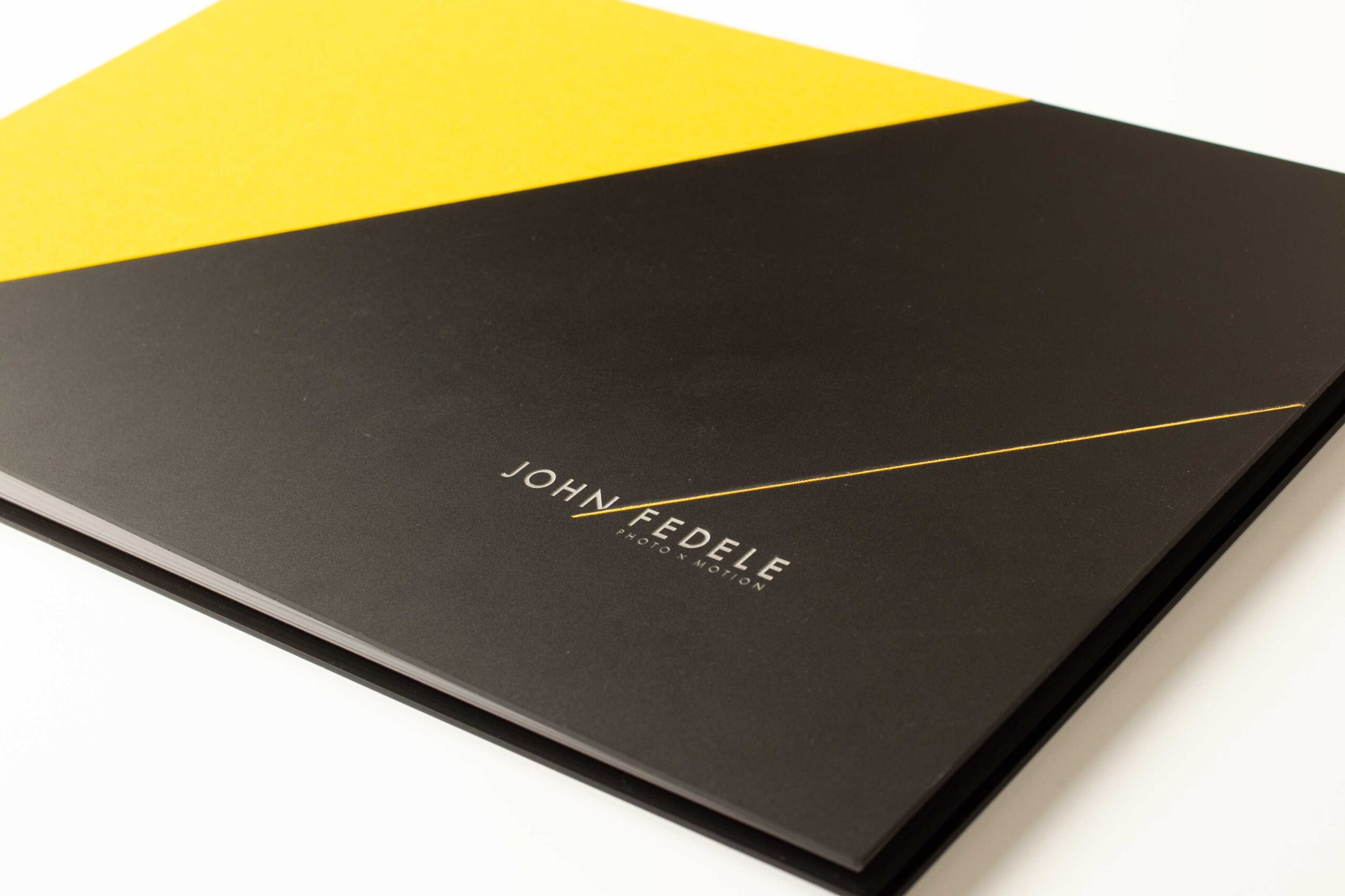
In all, it took about four days to make two portfolios for John. One day for each side of each portfolio. At the end of the last day, I compiled all the prints and screwed them together in the binders from Pina. The results speak for themselves, but John was pleased as well.
Need help with Photo Editing? Reach out!