Please enter your email and website or LinkedIn to receive more information about our free and paid accounts.
Please enter your email address below and we’ll send you instructions on how to change your password.
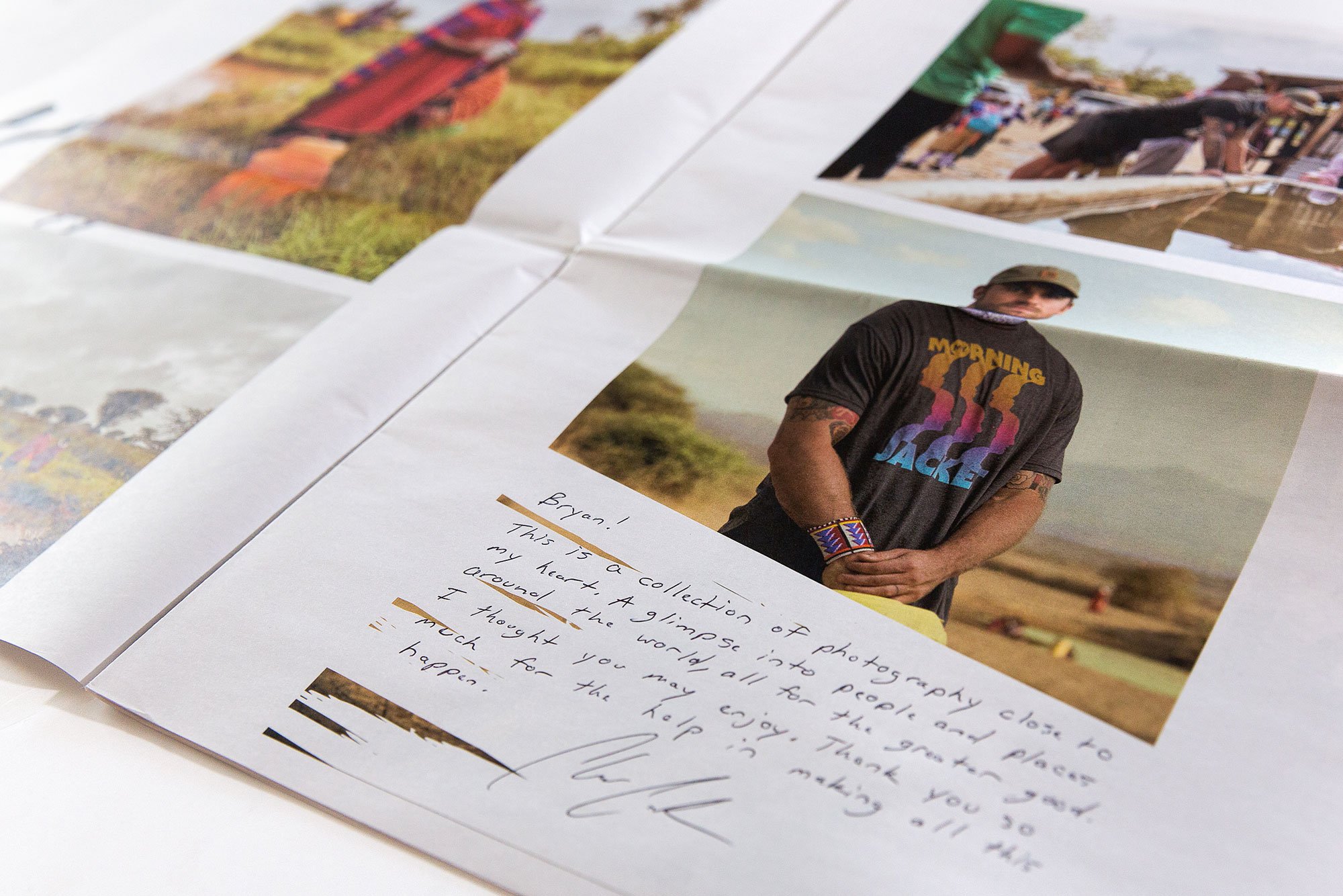
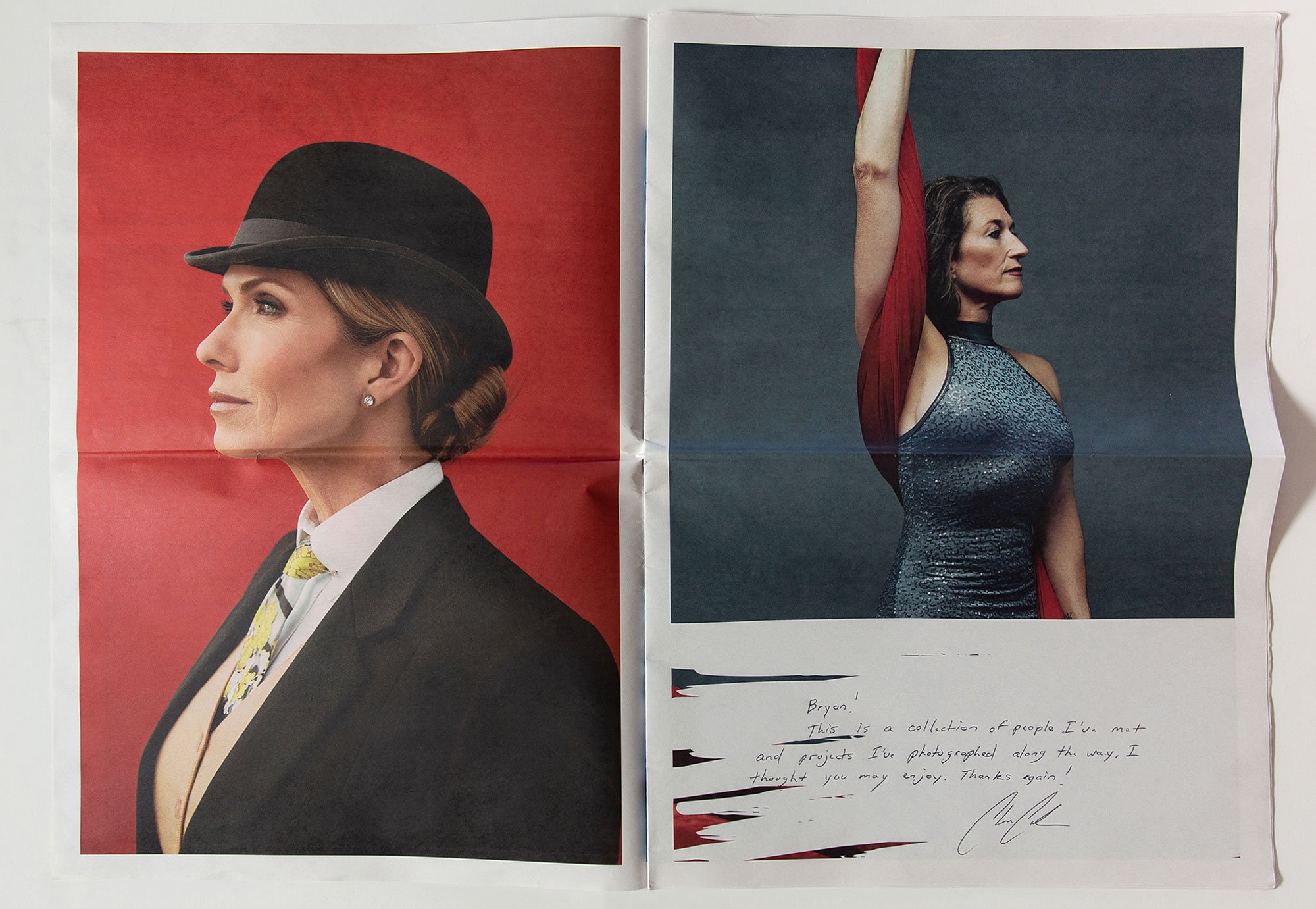
As many folks working in the industry know, print promos can be a great way to share recent projects and connect with clients. For all the ways we interact with photographs these days, there is still something quite special about the tactile and personal experience of a receiving a beautifully branded and thoughtfully edited promo. It was my good fortune in recent months to have the opportunity to work on the edits for two such promos for Louisville-based photographer Clay Cook.
Clay reached out to Wonderful Machine looking for help with the design and editing of two newspaper-style promos. One was to focus on Clay’s humanitarian work, while the other would target commercial clients. As a jumping off point, we organized a call for me, Clay, and our project manager, Bryan Sheffield, to touch base on the scope of the project and to narrow down goals for the look and feel of each promo.
Clay told us whom he intended to contact with each promo, which brought into greater focus the types of images we needed to consider for each edit. Since Clay does many things very well, it was helpful to know that he wanted to lean into environmental portraiture for the commercial-oriented promo. We also discussed the importance of narrative and context for the humanitarian work, and how showing the story within each project would be important.
Project edits typically start with a selection of 300 images or fewer. Since we’d be covering a lot of diverse photographic territory with these two separate promos, it was great to talk through the approach before Clay began uploading his work. After I received all of the files, it was time to download and ingest Clay’s images into Lightroom. There, I grouped the work by type and sketched out an individual sequence for each promo.
Even though the content would be varied, I intentionally kept the palette somewhat muted in all of the selects to keep a visual consistency to the edits. This more muted tone also seemed like a great fit for the newsprint paper that we’d earmarked as the surface on which Clay’s photos would appear.
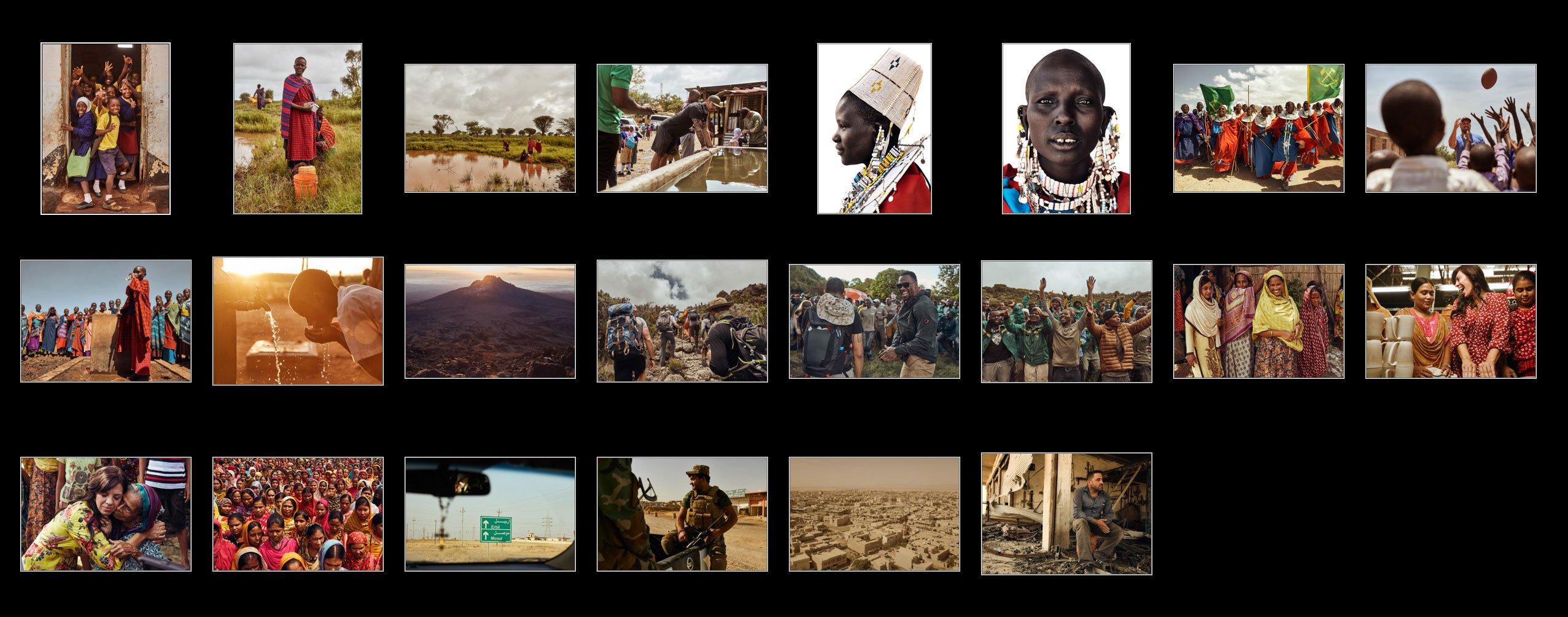
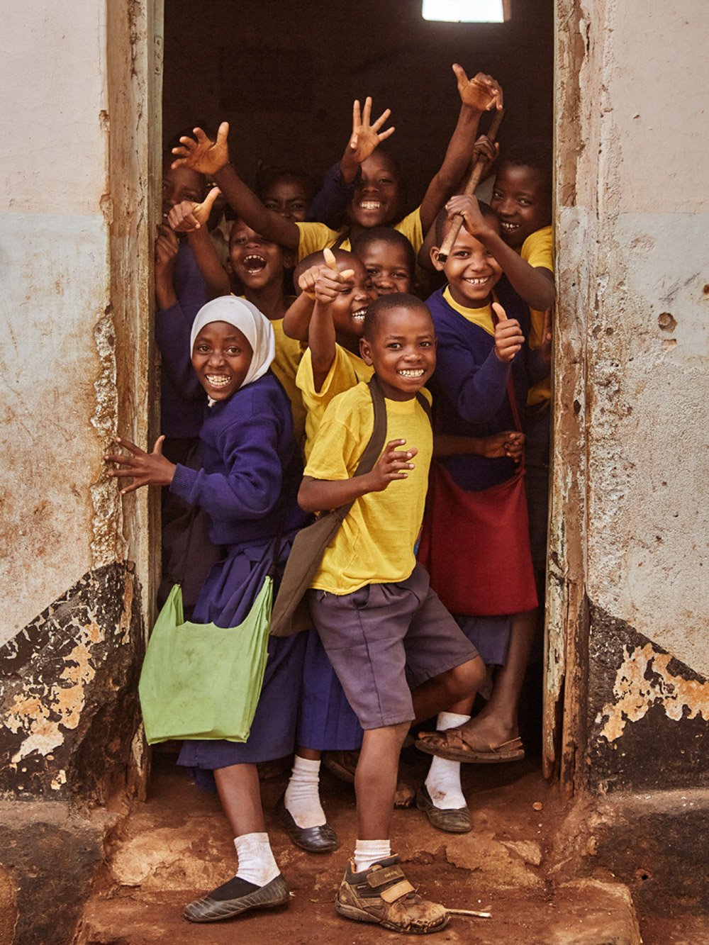
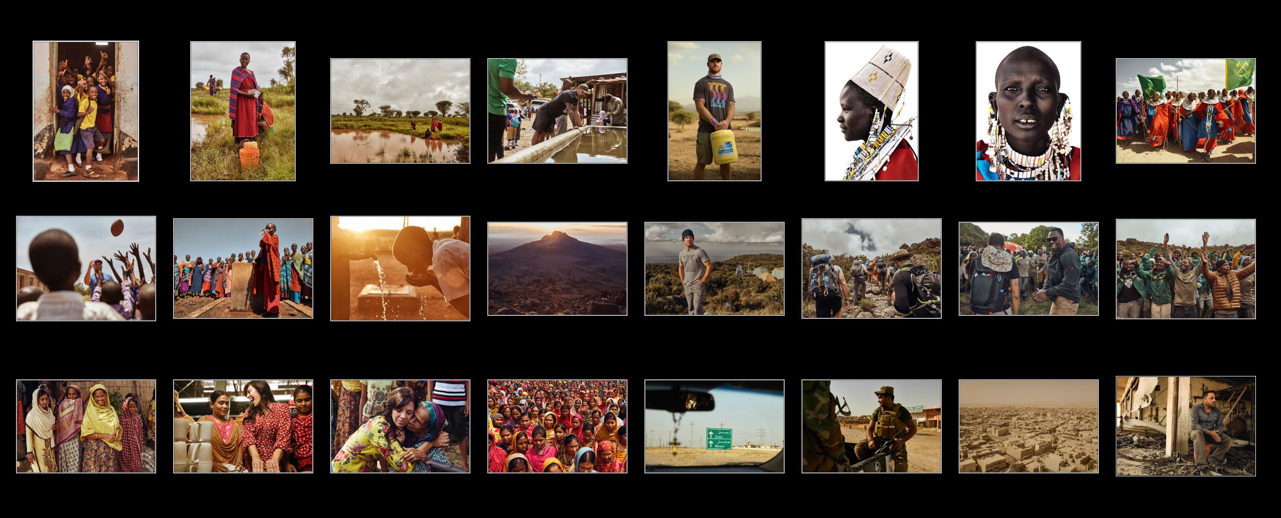
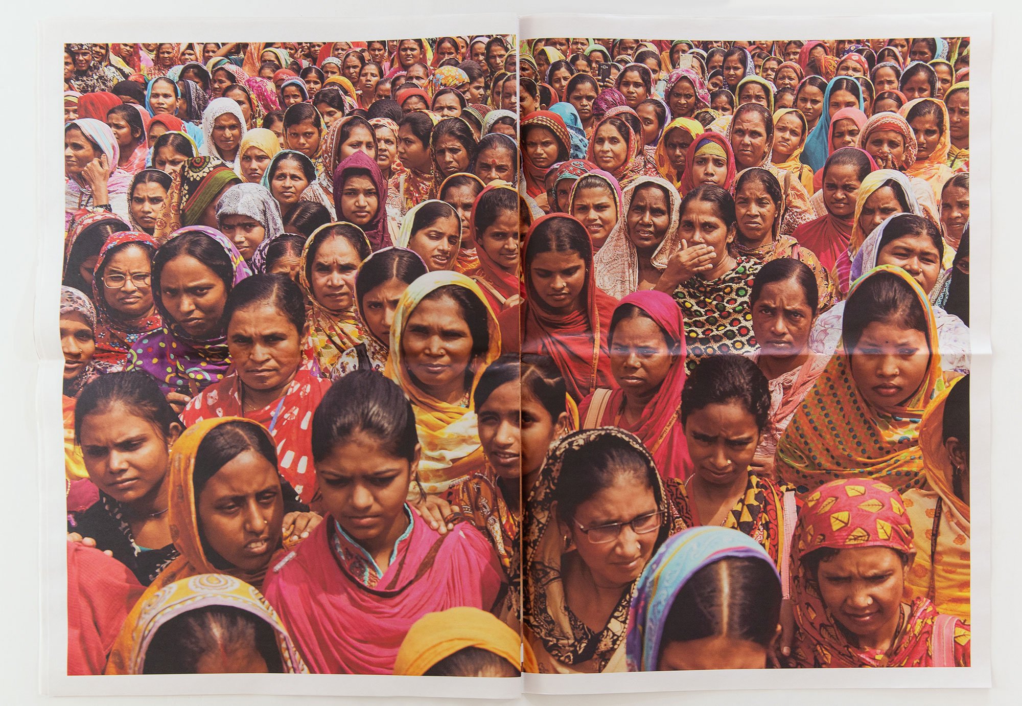
I began with the humanitarian edit. The images under consideration included several different projects, with multiple countries and continents represented. The goal would be to preserve the stories embedded in each body of work, and to find visual transitions that would blend the projects together seamlessly. I knew that I wanted to lead with an image that had emotional impact and eye contact as a way to draw the viewer in. I selected an image of a group of children bursting out of a classroom door.
From there, in addition to keeping the elements of story intact for each project, I understood the importance of balancing the journalistic imagery with the more polished portraiture, showing the range of Clay’s capabilities while shooting in remote locations.
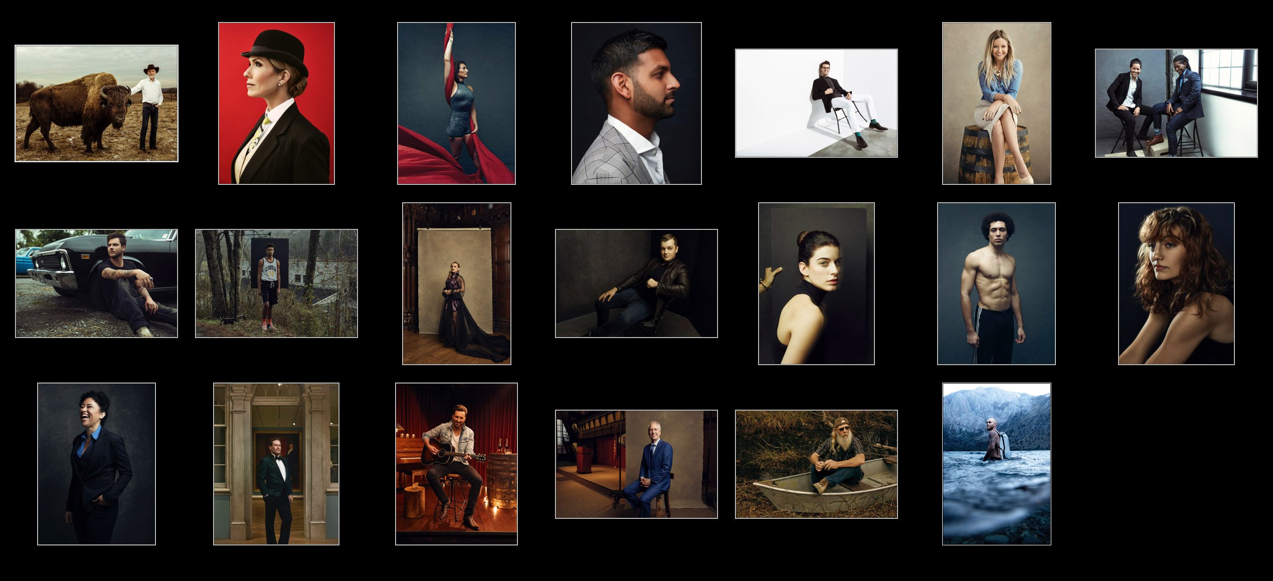
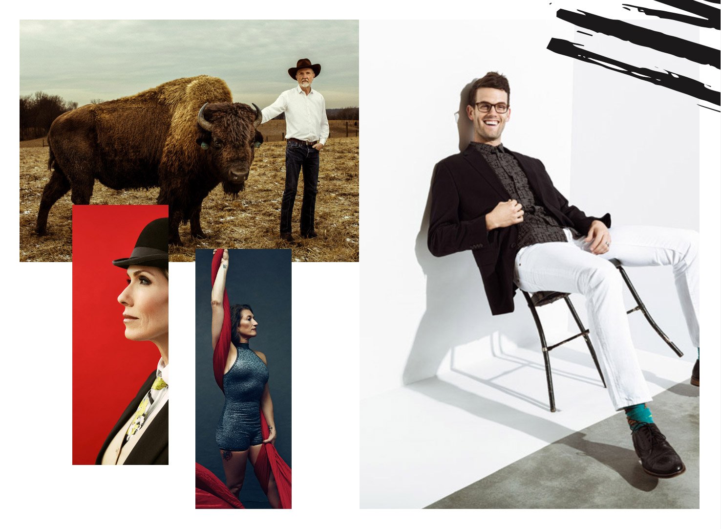
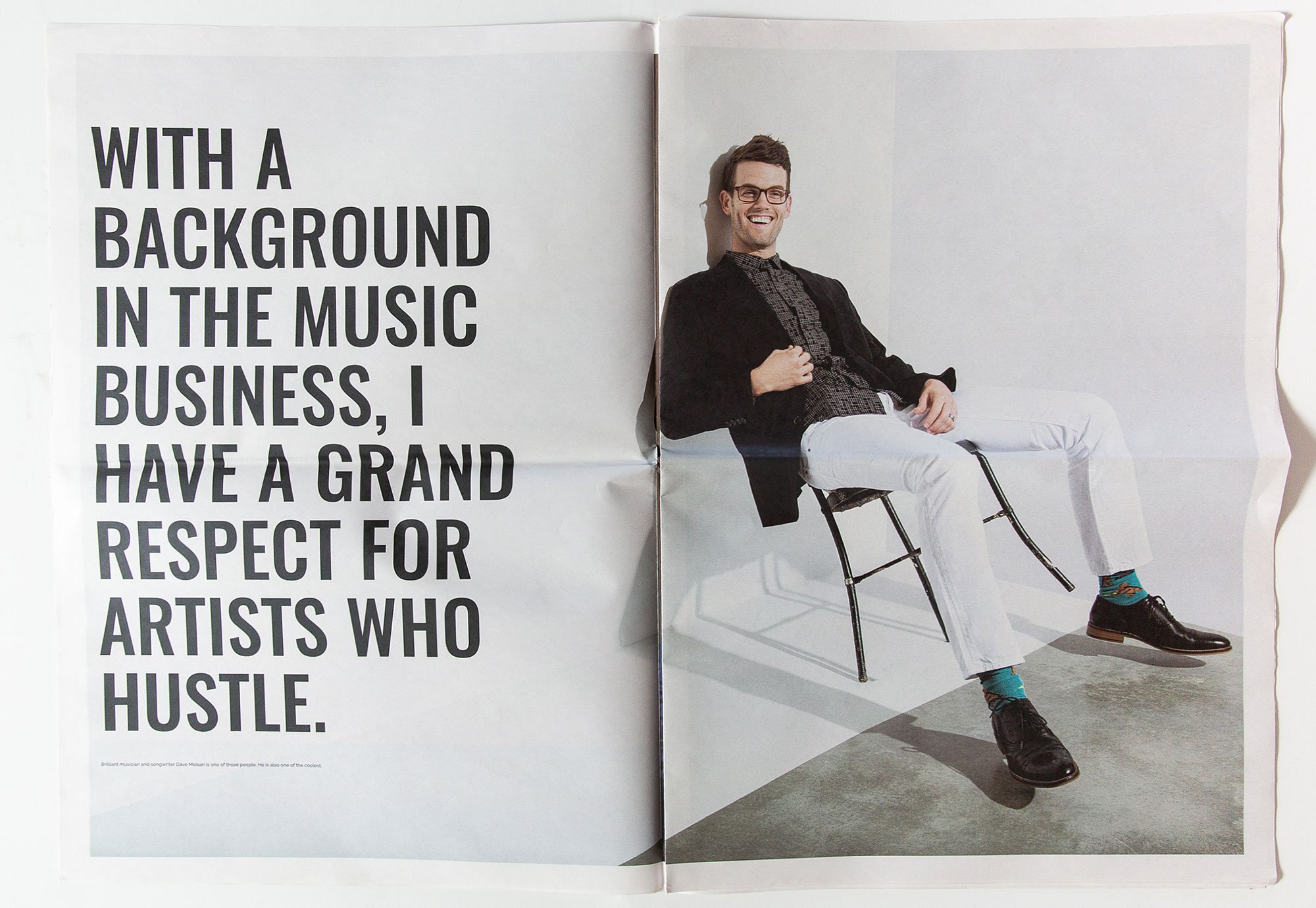
Next I turned to the commercially-oriented promo edit. As Clay and I had discussed, this edit needed to showcase the strength of Clay’s environmental portraiture while also including a tightly curated selection of studio work. Keeping in mind that Clay had mentioned the entertainment industry as being part of our target audience, I shaped the edit with an eye toward incorporating a consistently polished style and moments that felt quiet and intimate.
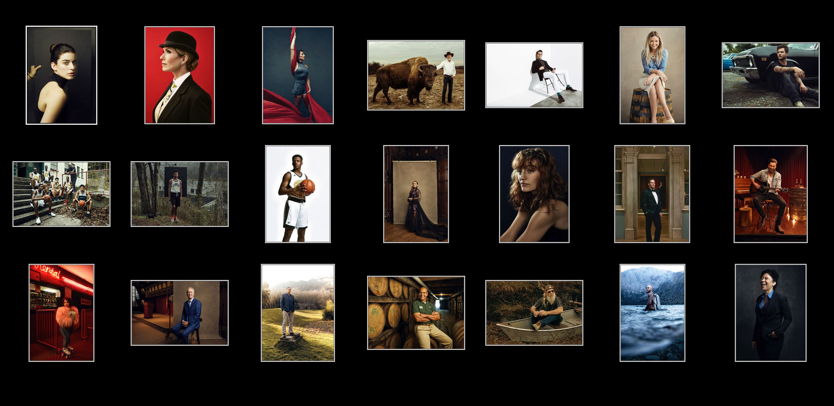
The subjects ranged from athletes to musicians to actors to politicians; I wanted to make sure to highlight the fact that no matter who was in front of the camera, Clay tackled each portrait with a high level of technical skill and creative artistry that expressed his unique style. After a few rounds of revisions to fine-tune the edits, it was then time to hand off the project to Christine Hughes, who would be tackling the design.
As we know, Clay is no stranger to ambitious projects — whether the task is humanitarian or commercial, he’s always up for it. I was thrilled to hear that I would be partnering with Clay again to work on two new print promos for each of his concentrations. We knew from the very beginning that we needed designs which would not overshadow his profound work. But, we also wanted to be sure that said designs were as bold as his photography. This boldness, along with his authencity, is at the very core of Clay’s brand. Knowing this, we decided one something different: newsprint. Typically underrated, the newsprint, merged with Clay’s photography and bold design, would make for a great statement.

This was an in-depth process; while I worked on options for two different sets of photos on three size templates, Clay also worked with Honore to assure that his photos were presented in the perfect order. Once we had narrowed down the layout — a newsprint broadsheet — I dropped in the photos and got to work on the additional flourishes while Clay brainstormed on text. Once the text had been narrowed down, we finally had two beautiful new promos for Clay to send out!
Armed with these promos, Clay is ready to take on the new year with the confidence that his work has been displayed in a way that represents who he is as a photographer: bold, meaningful, and authentic.
Looking for help with Photo Editing or Printing? Send us an email.