Please enter your email and website or LinkedIn to receive more information about our free and paid accounts.
Please enter your email address below and we’ll send you instructions on how to change your password.
Understatement time: there aren’t a lot of things that Democratic and Republican presidential candidates have in common — not on the surface, at least. But if you spend enough time on the campaign trail, cover enough candidates on both sides of the aisle, and start to pull back the curtain while presidential hopefuls stump away, you begin to pick up on eerie similarities that transcend political party.
During the last two major election cycles, M. Scott Brauer has cultivated a series of jarringly unorthodox imagery that puts top Oval Office candidates and their campaigns in a different light. Not an unflattering light, insists the Boston-based photographer. Just a different light.
Campaign events are basically visual press releases, and I’d always been taught that journalists should avoid printing press releases. So, I started interrogating the whole staging of a campaign to look for moments and elements that show both the character and also the person and campaign machine that goes on behind that character.

I really hope that people don’t think I’m trying to get unflattering shots of the candidates. My goal is to treat each candidate as I would any other while pushing against the narrative and image that the candidate is trying to present.
Scott’s quotes are peppered with performance-themed words like “staging,” “character,” and “narrative.” And that’s a big part of what the photojournalist is trying to show: no matter what side you’re on, if you’re running for office, you’re playing a character; a rehearsed, polished persona surrounded by a plethora of moving parts which in conjunction mold the campaign’s talking points. That combination appears to create a sturdy, unique framework when viewed on a candidate’s website or social media page. Through the lens of an observant, objective reporter, however, each campaign starts to resemble a cookie-cutter-esque house of cards.
I want to get the moments off the stage that show real personalities and relationships between candidates, staffers, volunteers, and supporters. Of course, I don’t want to ignore what’s happening on the stage, but I also want to show everything around that stage that goes into making the performance as perfect as can be.

That can be clips holding flags perfectly in place, gaff tape on the floor to show the politician where to stand, or people handing out signs to the crowd beforehand to make sure the supporters look perfect for the cameras.
This is the kind of work that’s at its most powerful when consumed by people from other countries. In 2016, Scott exhibited the series all over Europe and got a chance to mingle with patrons who have only a “passing knowledge” of the American electoral process and can examine the images in a detached, analytical manner, as they don’t have a stake in the game.
It was eye-opening to hear from people who don’t know much about American politics. Like when Americans view the work, Europeans see a confirmation of what they already think about American politics, but it’s very different. Where Americans see all the flags and fervor as signs of patriotism and passion, Europeans tend to see it as a garish circus.

They don’t have political feelings around most of the candidates, so they can view the process as something to look at by itself. If anything, the pictures seem to make them feel even more uncomfortable than they already felt about the American process.
Scott’s sequel for the 2020 election hammers home cynically the cyclical nature of campaigning. You can see the same patterns popping up again and again, no matter how far left or right a candidate stands. Remember the song “Once In A Lifetime” by Talking Heads? David Byrne might as well have been waxing fatigued about our presidential races when he repetitively bemoaned, “same as it ever was.”
The flags, clothing, stages, and signs all basically look the same. The topics they talk about are all basically the same, too — jobs, healthcare, the meaning of America — regardless of who the candidate is or the specifics of what they support. And four years later, it will all happen again in basically the same way, though the faces next to the slogans will be different.

As an example, think about the phrase “Make America Great Again.” You probably only think about Trump when you hear it, and for good reason. It’s been drilled into every American’s head for the last four or five years. But he didn’t come up with the phrase — though he did try to trademark it in 2012. Ronald Reagan used it extensively during the 1980 campaign. That’s interesting, but it gets better. Bill Clinton apparently used the phrase in 1991 when he announced his candidacy and again in 1992, according to Town & Country. Wikipedia also says that the phrase was used in a radio ad for Hillary Clinton’s 2008 campaign.
It makes sense that Scott, a student of history, would bring up the chronology of that poisonously overused phrase. Upon graduating from college, he interned at the Black Star agency in New York. While knee-deep in age-old photos, Scott began to appreciate the style that would eventually influence his ongoing series.
Part of my job was to go through the two floors of slides and negatives and find images with historical relevance to be digitized. It was fascinating to look through that history. I fell in love with the work of photographers that shot on larger format film and used flashes. I felt that approach gave the images a timeless but historic look. Illuminating the entire scene allows the viewer to really look at everything in the frame.

An image that’s been in my mind since the very beginning of working on politics is William M. Gallagher’s picture of Adlai Stevenson that won the 1953 Pulitzer Prize for Photography. It’s one of the all-time great political photographs, and it’s all about getting deeper into examining the candidate beyond what they present at rallies. I’ve wanted to tie my work directly to old press images like this by using a similar lighting style.
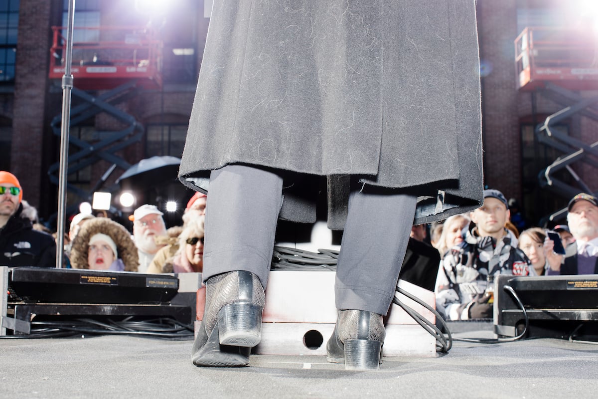
As you might imagine, Scott has received a wide range of feedback from voters, journalists, and campaigners. Some of Scott’s peers have lauded the photographer for “cutting through the BS,” while people who have worked for big-name candidates say these pictures “show what it’s really like” out on the trail. One of those well-known aspirants is Elizabeth Warren, who was the subject of one of Scott’s favorite shots from the series. Scott’s photo makes the Senator more appear relatable than the predictable methods candidates use to personify a “Real American” and appeal the the “Regular American voter.”

This image tells me so much about who she is. There’s the dog hair, the wear and salt damage on her boots, the stance, and the adoration of the supporters. On one hand, she’s standing on a huge stage in front of a giant crowd, with stage lights and decorations making the whole thing look like a television set. This is her big moment to enter the national arena. On the other hand, politicians do a lot to present an air of authenticity — that they’re quote-unquote real Americans. But a lot of the time, that means putting on a pair of jeans and cowboy boots that obviously have never been anywhere near a muddy field.
This shot hints at the profound irony present in all of Scott’s work. Often, the more political candidates try to find common ground with voters, the clumsier they appear. As this is happening, would-be world leaders are overlooking the minute similarities that politicians actually share with the American people.
Here, behind all the flash of a major political moment, you see Warren has a dog that she spends a lot of time with and that sheds a lot. She’s got some pretty normal shoes that look like what a lot of the people in the crowd were wearing and they go through the same wear and tear experienced by anyone who lives in the Northeast.
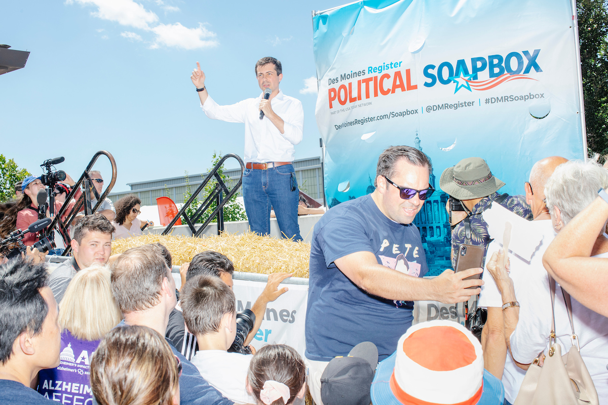
Some of Scott’s other highlights came from when he was on assignment with various publications, like Time Magazine. As with the photo of Warren, an image of fellow Democrat Pete Buttigieg, shown speaking at the Iowa State Fair, stands out for the holistic nature of the approach to getting it. This photo represents one of the main themes in Scott’s work: when you take the time to observe every little detail that goes into crafting a campaign, you notice just how overcooked the whole thing ends up. It might seem like this image is just a run-of-the-mill shot among dozens. Only once you begin to observe context of the photo do you understand why this photo is so effective.

My goal — and where I think this image really succeeds — was to show everything about a politician speaking at the state fair in one frame. You can see Pete is hot. You can see he’s giving a speech he’s given before, almost like he’s reciting from memory. There’s the crowd and media. There’s the guy wearing a “Pete” campaign shirt and taking a selfie with his back turned toward the candidate, which says so much about the current way that supporters interact with the candidates and political process in our current era. And there’s the hay bales, which I suppose are to give a folksy feeling to the proceedings, but you can see how manufactured it is with the branded backdrop.

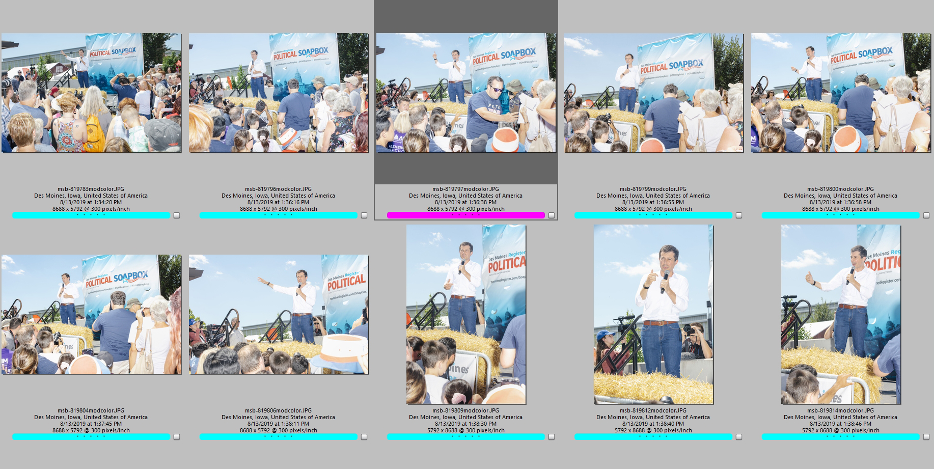
Here, you can see the progression of images around that picture. You can see that I’m a little too far away at first, moving closer. The frame right before is 22 seconds earlier and the guy taking a selfie isn’t doing anything. Then, 17 seconds later is the next shot and he isn’t doing anything again. The moment was gone. But that quick little instant tells so much more of a story than the other pictures.
There’s no video element to this work and for good reason. Scott isn’t focusing on what the candidates are saying. The more you study Scott’s work and delve into the reasoning behind it, the more you realize that this march to a result that half the country is going to be disappointed with anyway isn’t a once-in-a-lifetime event. It’s just the same as it ever was.
One of my goals, and one which I hope comes through the pictures, is to strip away the rhetoric of the campaigns. While there are certainly major policy differences between the candidates, even within the same party the campaigns themselves almost feel interchangeable. That’s very interesting to me, and I think that’s something that people with no knowledge of American politics would pick up on.

Americans tend to have a short memory when it comes to politics, so what I’m trying to do is visually represent that feeling of ‘haven’t I heard that before? Didn’t that other person say that, too?’
See more of Scott’s on his website.
Further Reading:
Read more about Scott Brauer on our Published Blog.
Let us help you Find Photographers, source Stock Photography,