Please enter your email and website or LinkedIn to receive more information about our free and paid accounts.
Please enter your email address below and we’ll send you instructions on how to change your password.
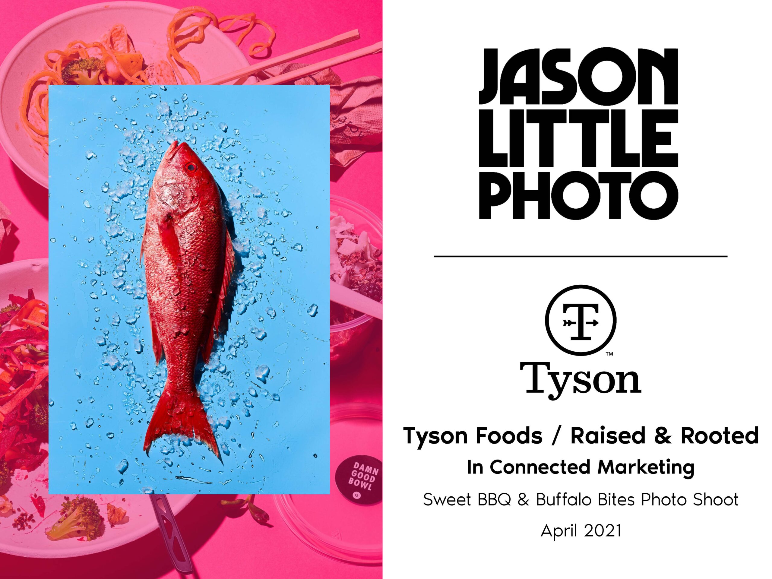
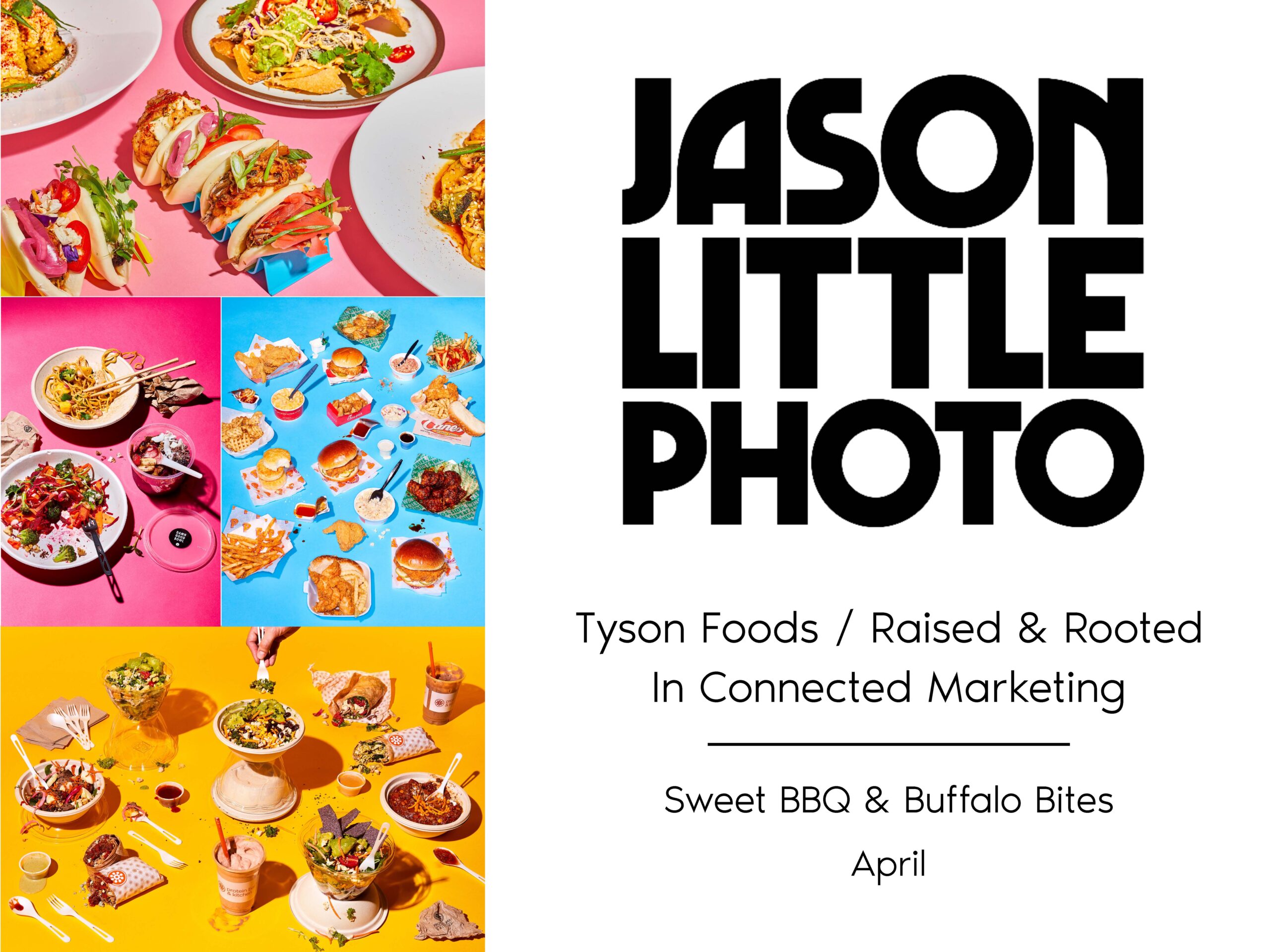
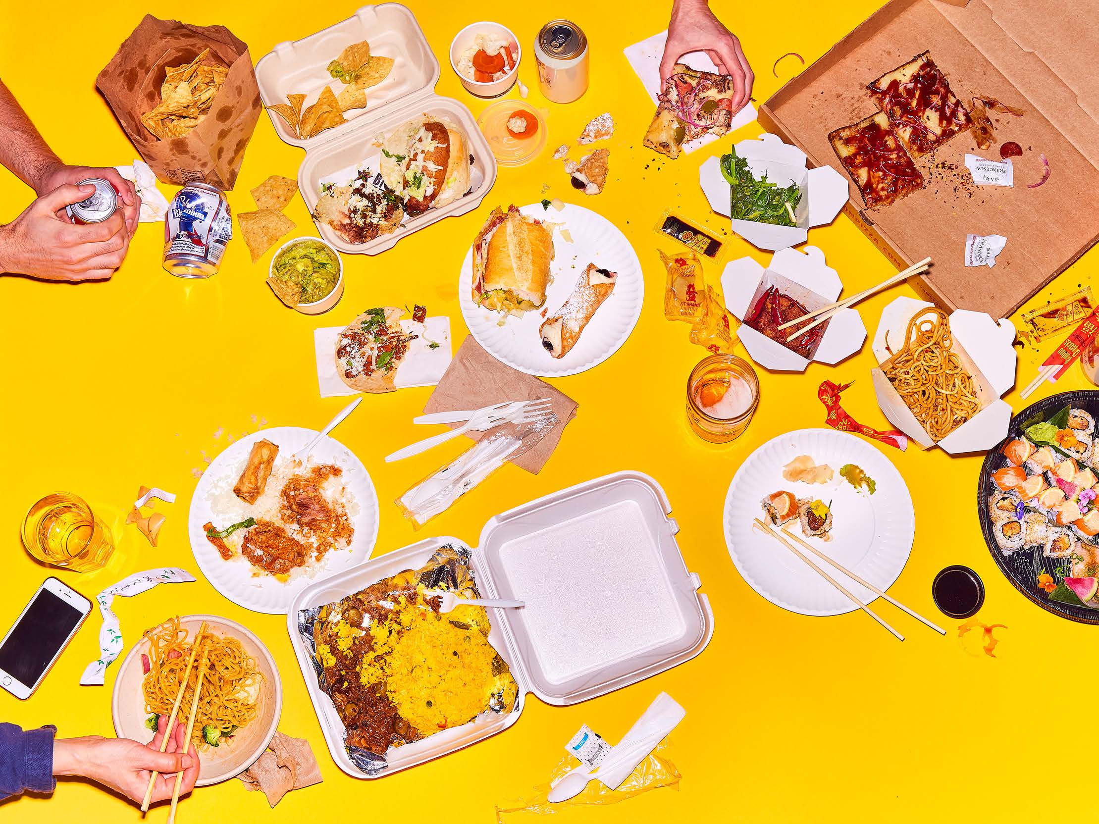
I don’t get to work on a treatment template often, so I’m always stoked to take these on and mix it up from my emailer routine. And I couldn’t have asked for a better project to work on. Chicago-based photographer Jason Little has a bright, vibrant brand — his style is not unheard of for a food photographer, but it’s certainly exciting to see how creative he is with his colorful backdrops and bright lighting.
Jason was familiar with treatments, but he never took the extra step to make one that was specially tailored for his brand. In his own words, here is the list of goals he had for this project:
The first option featured a zoomed-in photo with a color filter that acts as the background/border for the main image on each page. The background photo becomes the main image shown on the next page. An abbreviated submark is used at the top left corner of each page.
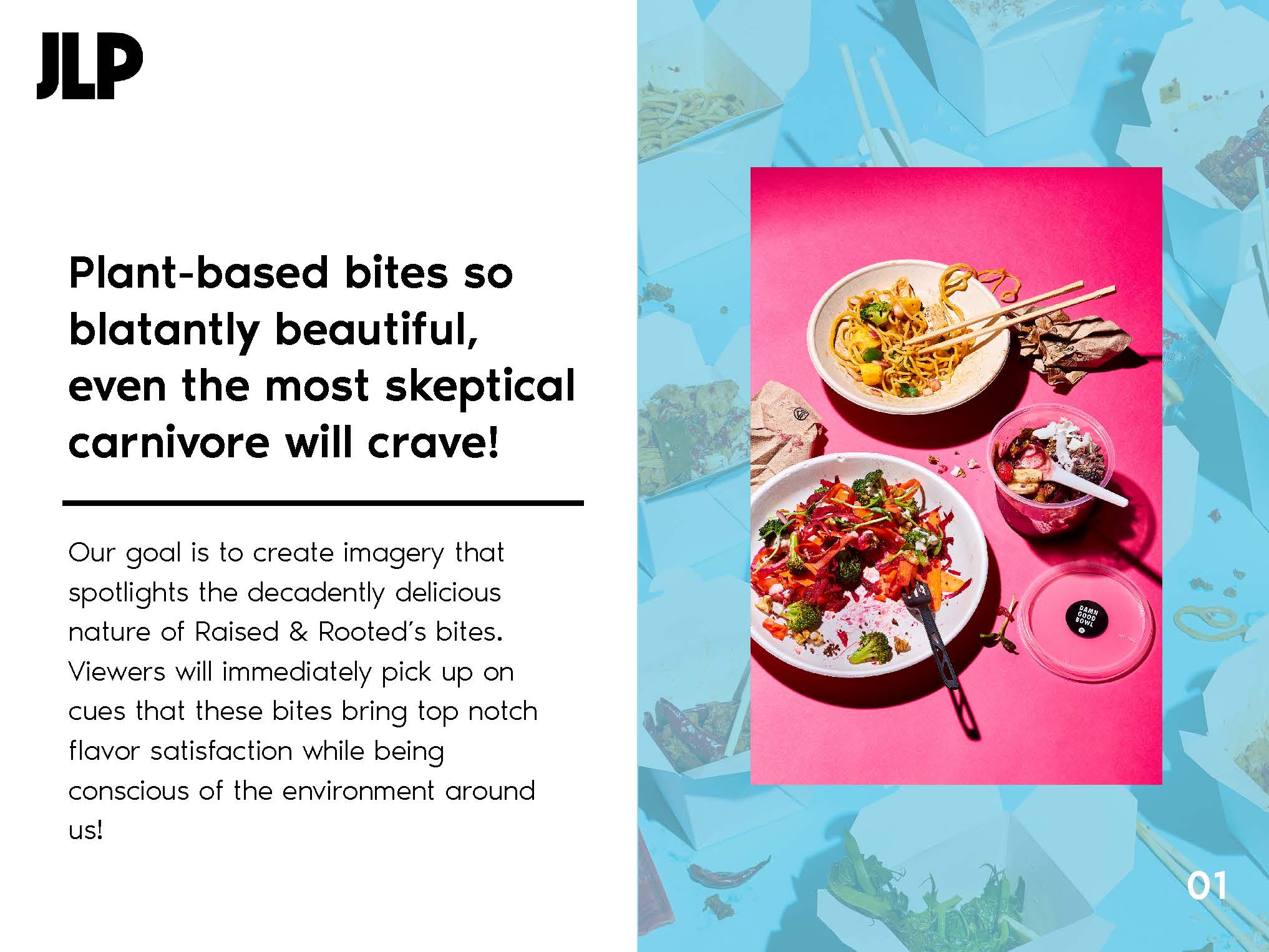
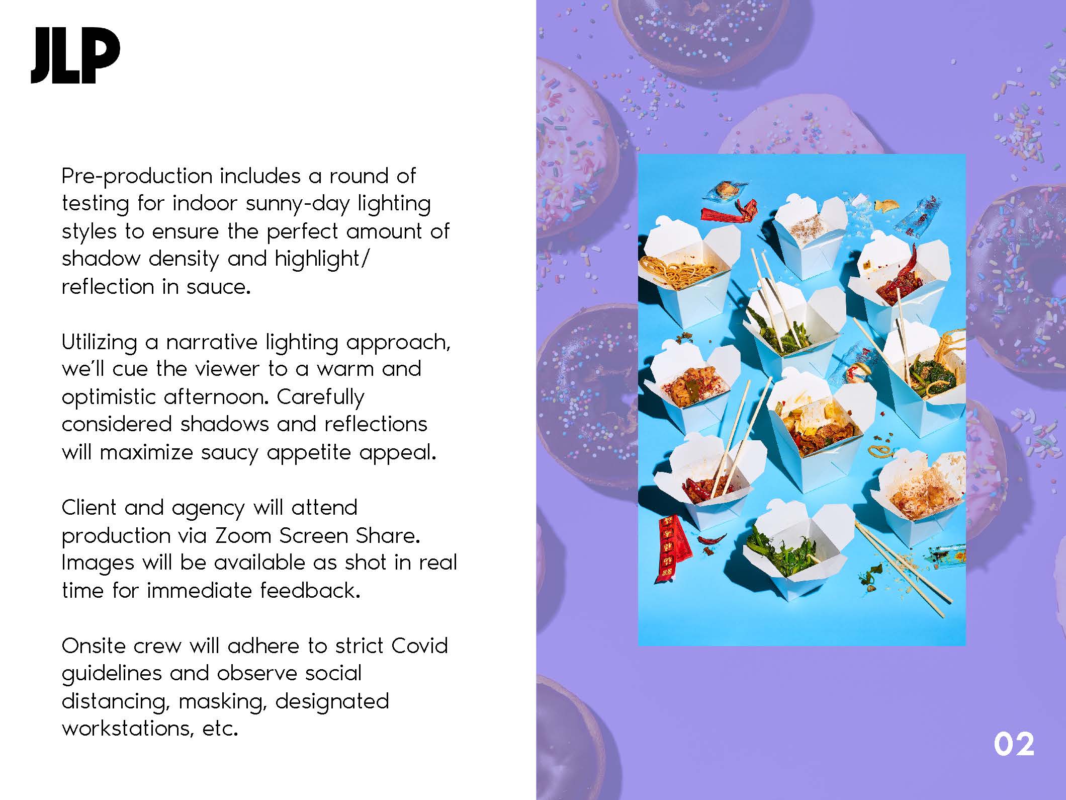
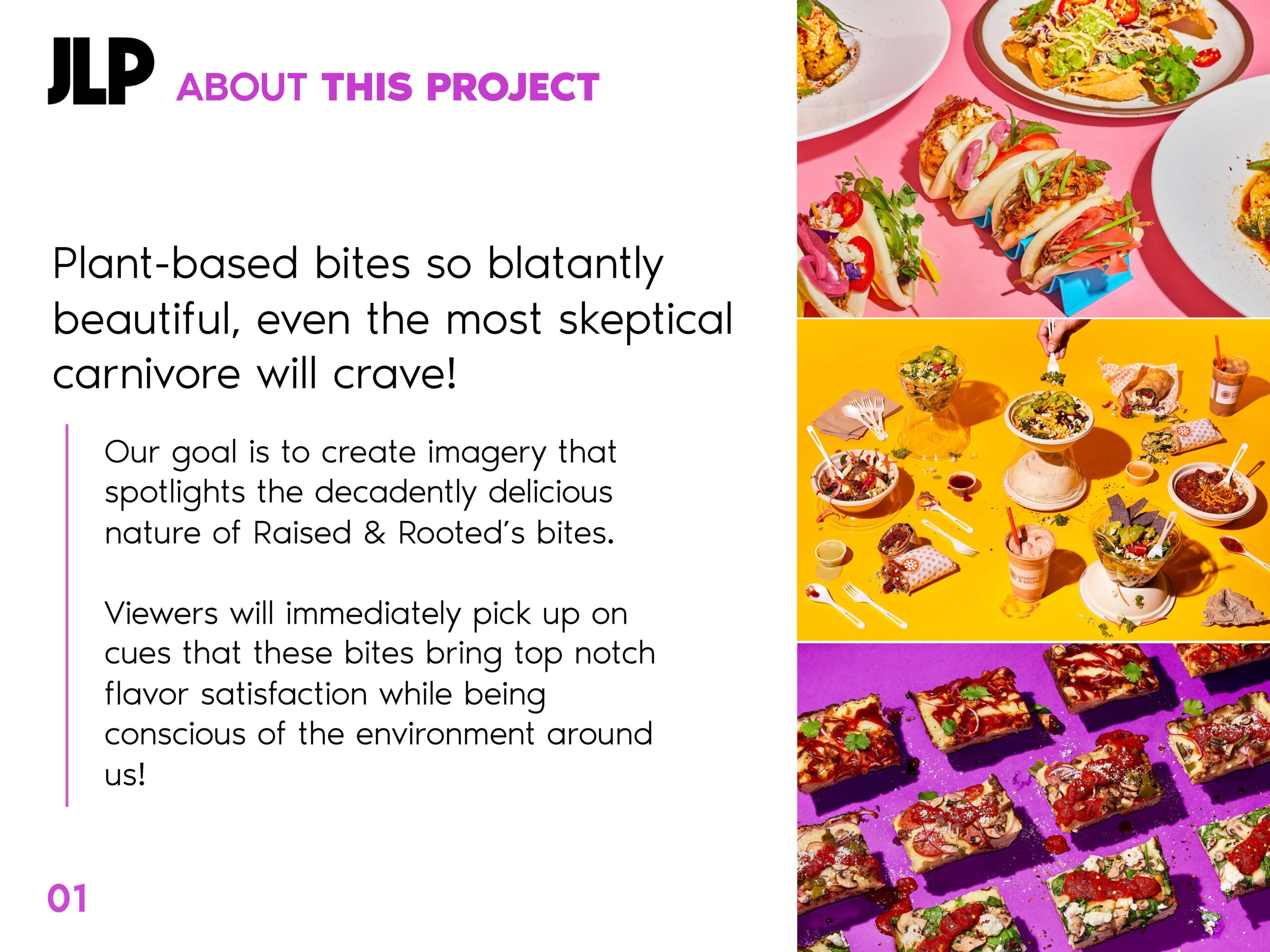
The second option contains photos displayed in a masonry grid that takes up about half of each page. Full bleed pages are also used to separate/bookmark sections of the treatment. Each page is labeled with colorful text (color based on the images displayed). A vertical line to highlight the text and the page number matches the header.
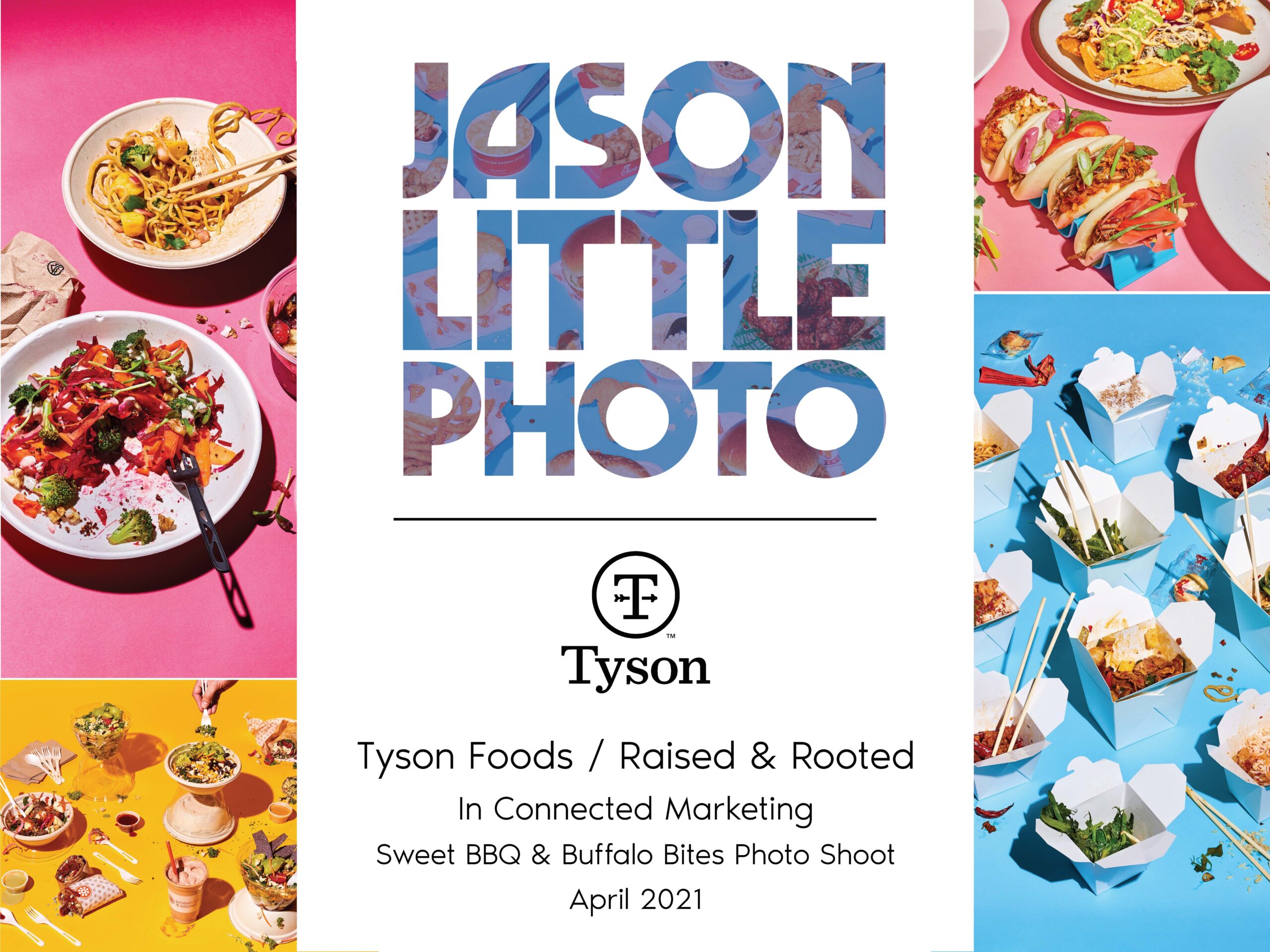
Option three features a large, white strip that lies over a masonry grid of images for the cover. Jason’s logo is cut out of the white block and shows the images in the background. A large, left-justified white block lies over a full bleed image on the interior pages. Jason’s abbreviated submark is cut out of white at the top left corner to show the background image. Each page is labeled with colorful text (color based on the images displayed). A vertical line to highlight the text and the page number matches the header.
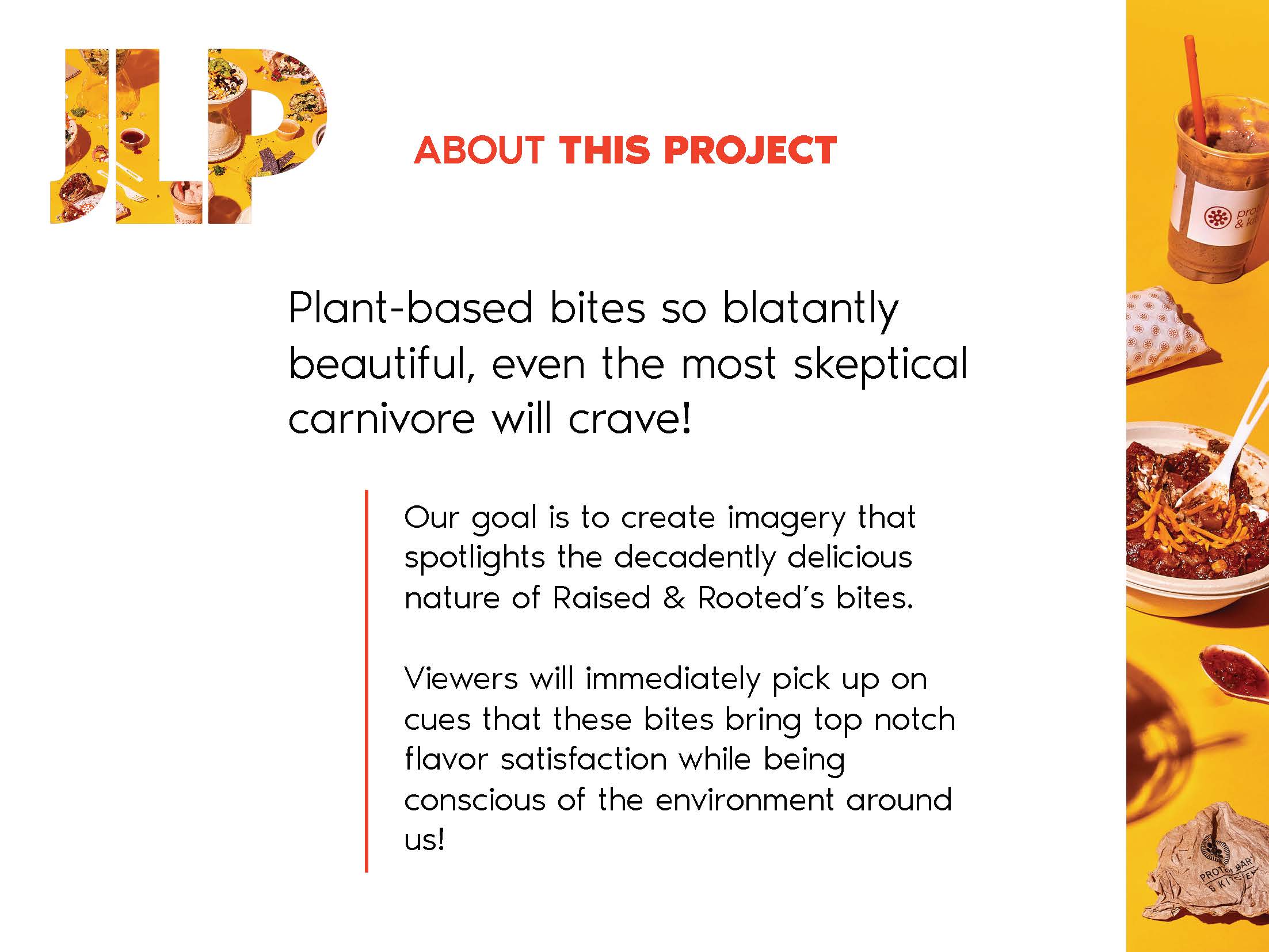
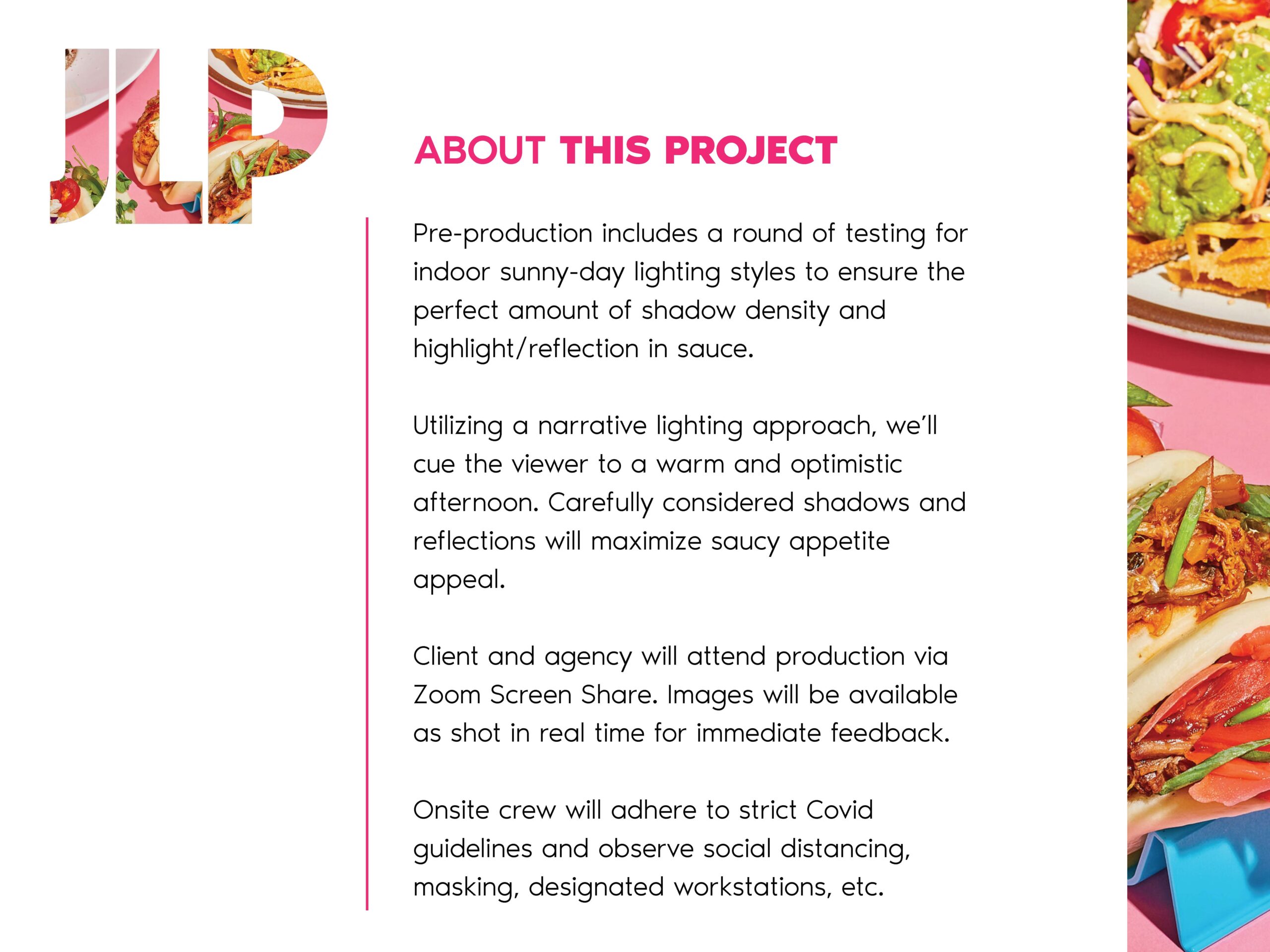
Jason chose a mix of options two and three. The cover of option three was a total winner, as well as the submarks from option three. However, Jason was more intrigued by the masonry grid from option two. By combining these two styles, we created a solid solution for his treatment.
We were on a roll. Jason was happy with the final design so now we just had to figure out what the treatment was going to say. We decided to include pages for the cover, about the project, production details, the team, a flex page, and a farewell page (to which I cleverly added an 80s movie/food-specific pun and really like to point out).
We wrapped up the project within the next day. Jason needed the treatment to pitch to an actual client! With a few tweaks, he filled in all his information and sent it off!