Please enter your email and website or LinkedIn to receive more information about our free and paid accounts.
Please enter your email address below and we’ll send you instructions on how to change your password.
Our Web Assessment service is designed to provide detailed global feedback and suggestions on a photographer’s website and overall presentation. I recently worked with Ft. Worth, Texas-based photographer and director Jason Gilmore. His work features a range of lifestyle and brand campaigns, aerial drone work, architecture, product, and automotive content, as well as corporate events and headshots for small and large clients alike. We met over a video call to discuss his current website, galleries, and presentation while I offered up advice and insights on what was working and where he could improve.
As with any web assessment, my process began with an in-depth review of Jason’s completed consulting questionnaire, his current website, and his social media presence. Prior to any conversation or review with the photographer, I like to make detailed notes on every aspect of their presentation, good or bad. This is so that I can effectively outline all the main topics of discussion and build my feedback and suggestions from this.
As I reviewed his site from front to back, it was obvious that while there were plenty of things that could be improved, there were also quite a few things that worked well. His site had a straightforward and minimalistic design, all of the pages and links worked properly, and, overall, the functionality of the site was great. His work had a consistent visual style that more or less carried through each of the galleries. Also, he had a strong brand identity that carried through to his social media platforms.
While he had up-to-date contact information readily available, I noted that a dedicated “about” page with a bio and headshot would add more personality to his website. Additionally, I compiled a few recommendations for other website templates that could work in his favor by adding larger image sizes and typefaces. Lastly, I suggested some more user-friendly navigation designs, as his current gallery and nav layout felt overly complex.
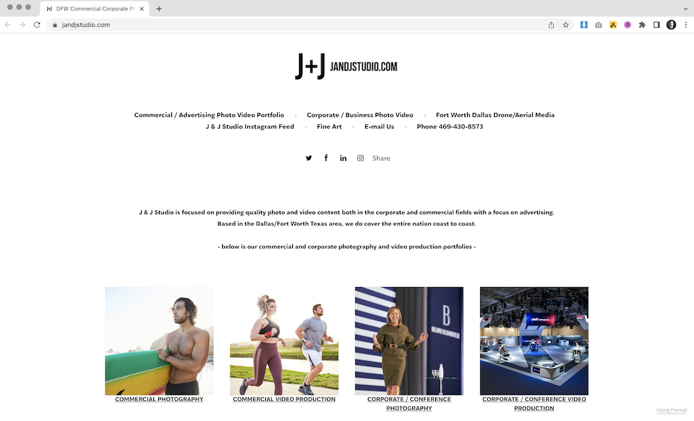
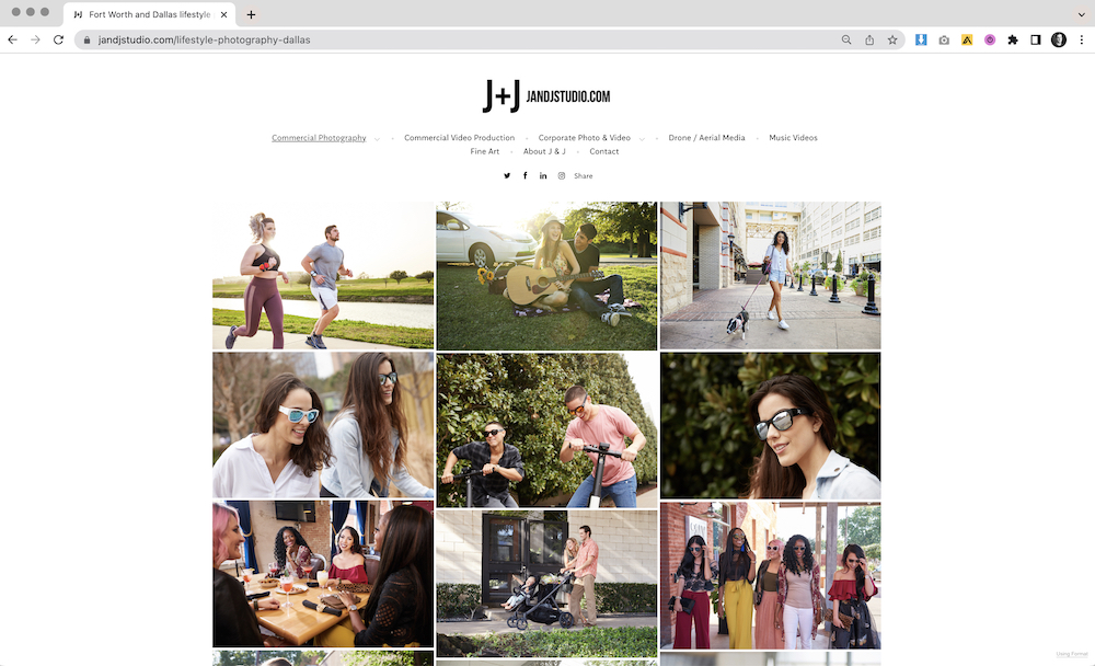
As a producer and photo editor, I spend quite a bit of time looking through photographer websites. Whether for consulting projects or when compiling photographer recommendations for clients and upcoming productions, one of the biggest sticking points is the ease of navigation and organization/flow of a photographer’s web portfolio. This was a primary area of focus that I wanted to touch on with Jason in our assessment. It felt like there were too many ways to reach the same gallery on his site and perhaps too many galleries overall. Also, there was too much complexity in the organization of his galleries and the way in which they were navigated.
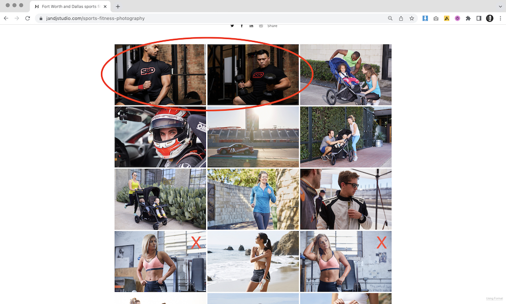
When it comes to organizing a photography website, I like to think of the site as one cohesive edit, broken down into appropriate sections as if they were chapters of a book. It’s also important for photographers to be unbiased when editing. While recent and lucrative work (or any other images that you have a personal attachment to) may be the most tempting to feature, it is not necessarily the most marketable and attractive to your target audience.
I suggested simplifying the flow of his portfolio with more consistent gallery organization. To start, I suggested moving around some work that felt out of place or too repetitive and featuring some of the stronger images more prominently within the galleries. Then we discussed working on a tighter edit that removed weaker work or the same/similar images in multiple galleries, which becomes repetitive, waters down the overall presentation, and makes navigating the portfolio difficult.
After our assessment and discussion over a video call together, Jason promptly made a few key adjustments to his layout, organization, and edits with my suggestions in mind. I felt the update had quickly and easily improved his presentation quite a bit. You can watch the video below for a more in-depth look at the Web Assessment.
Further Reading
Specialty: What is Lifestyle Photography?
Specialty: What is Sports/Fitness Photography?
Need help with your Photo Editing? Reach Out!