Please enter your email and website or LinkedIn to receive more information about our free and paid accounts.
Please enter your email address below and we’ll send you instructions on how to change your password.
Hello, Wonderful Machine readers! After an extended writing hiatus spent focusing on our brand-new look and website, I’m back and excited to share what I’ve been working on with all of you. Way back in September, Sway Chavez and I teamed up to make some Logo magic, and—trust me—the result is worth waiting for. So without further ado, read on!
Sway Chavez is a commercial photographer based in Sandy, Utah. He first reached out to us for some professional advice on his website, and of course we were more than happy to oblige. Sway started off with a Branding & Marketing Plan, evaluating where he wanted to go in his career and how his branding and marketing efforts could help get him there. This is a great first step for a lot of photographers since it’s hard to know what areas of your branding and marketing efforts need some attention until you look at the big picture. Through the BaM! Plan, we identified that one thing Sway needed was a new logo, something distinctive and memorable. With that in mind, he and I joined forces and got to work.
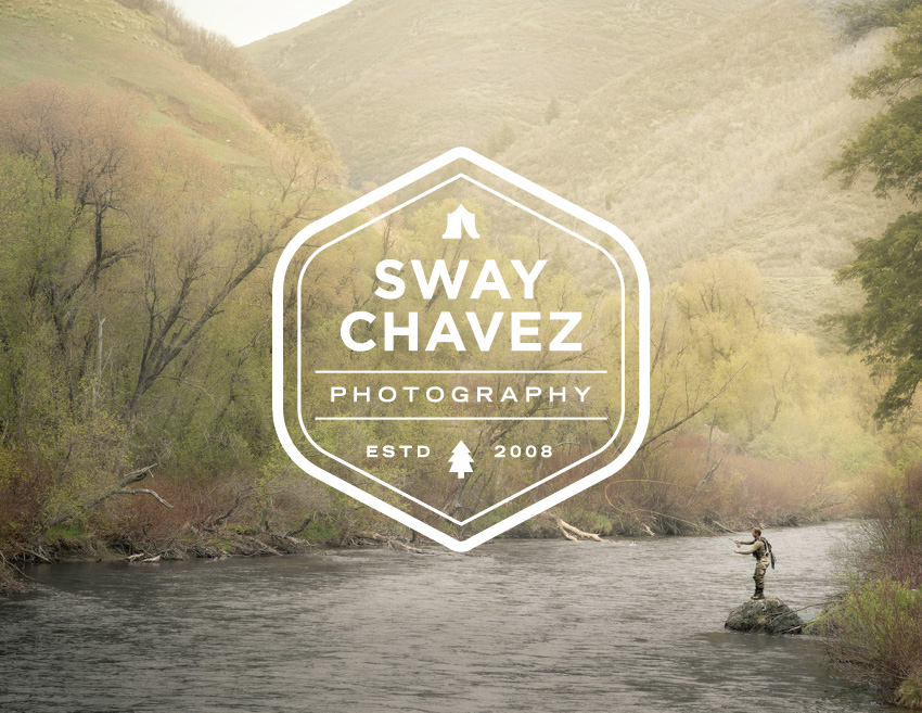
To kick off the project Sway filled out our branding questionnaire, which helped me get to know him as well as his stylistic preferences and vision for his brand. He wanted a logo that was simple and iconic, but also authentic. He told me about his passion for woodworking and the outdoors—especially camping, hiking and fly fishing (which really shows through in his portfolio).
Sway is also a unique case in that he’s a photographer with an amazing eye for design, so when I showed him my Pinterest board of brand inspiration he sent back one of his own right away. The inspiration he shared was on point and we were in complete agreement on the stylistic direction, which helped make the process even more seamless. Sway also mentioned that the logo needed to be versatile because he wanted to print it on leather and wood, which is a sure way straight to any designer’s heart.
Based on this discovery phase and all of the inspiration, I created a mood board to guide my logo exploration and dove into the process.
In the first round, I developed several solutions with a focus on simplicity, alluding to fly fishing and a healthy dose of the outdoors.
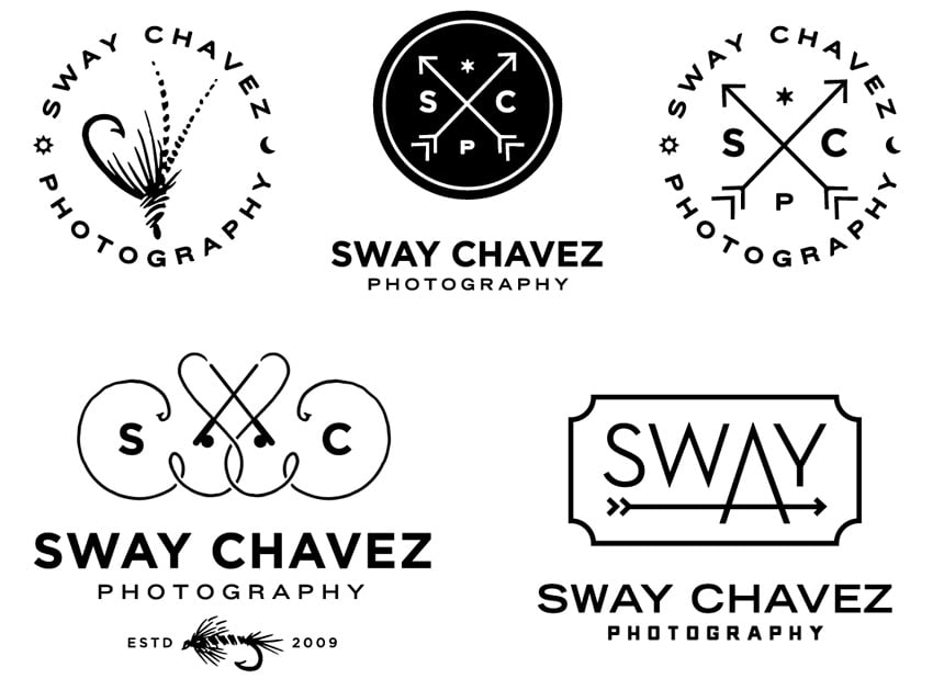
Sway was excited about the solutions and said we were getting close. He shared some more specific thoughts on toning down the fly fishing references and nixing the arrows, along with some feedback on fonts. Based on our discussions, I refined the solutions and developed a second round of options to share. I love when it’s difficult for a client to choose between the solutions I present because they identify with more than one, and two of the options from this next round really had Sway torn.
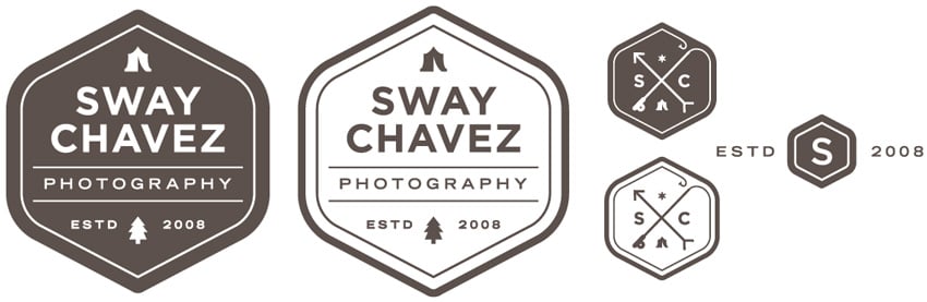
He liked the combination and style of icons in the solutions above, as well as the subtlety of the fishing line completing the mark’s inner border. These two variations also illustrate how the mark could have both a solid and outline version (which would look especially great in white over photos). Logos with initials and icons separated in a circle by an ‘X’ have become pretty popular, so it was fun for me to create a clever variation of that lock-up.
With this solution, it was the icons, badge arrangement and versatility of the containing shape that captivated Sway’s attention. The shape works both as the backdrop for the comprehensive logo, as well as a secondary monogram mark.
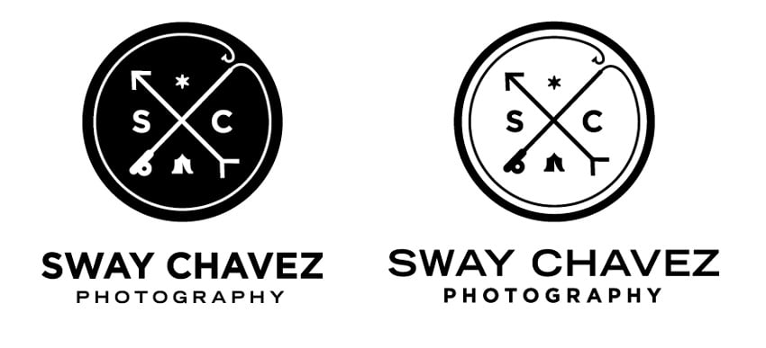
We were both so pleased with these solutions that it became really difficult to choose. We liked the mark and variations so much from the circular options that we asked ourselves, do we really need to choose? With that I created an outline version of the logo and developed one more secondary logo. I fused the fishing line lock-up with the unique shape we’d grown so fond of, and we had our winner.
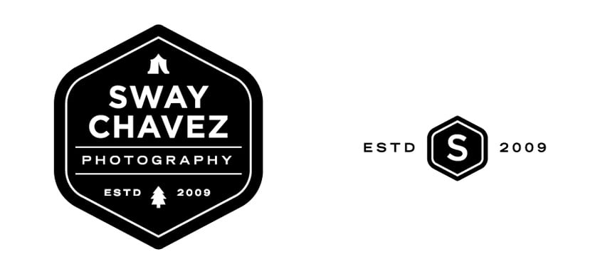
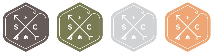
Color exploration was pretty straightforward, since Sway was already using an earthy palette of muted brown and orange that worked really well with his rustic sensibilities and portfolio. We made the addition of a sage green and a light grey for use in various marketing contexts, and I made sure to include the final logo files in white for photo overlay purposes.
Once the project was complete and the final files sent, Sway told me what a great overall impression he had of WM, how pleased he was with his new look and that he couldn’t wait to implement it throughout his brand. He also shared this testimonial,
I am of the firm belief that your brand’s design is much more than a typeface and maybe some cool mark. A brand is your identity, it’s who you are, it’s the feeling people have around you, particularly in the case of creatives. I am a Peace Train humming, Bon Iver retouching, America (the group) road-tripper, Danny’s Song singing to my kid kinda guy. Melissa helped me convey that!
Working with Sway was an absolute pleasure, and I’m hoping we’ll have the chance to collaborate again soon on some killer business cards! That’s all for now, folks, so be sure to take care and stay tuned!
Further Reading
Wonderful Machine: Marketing Mentor & Client Introductions: Brett Deering
Wonderful Machine: Brand Identity: Mulling over Stephanie Mullins
Wonderful Machine: Logo Design: Heather Perry
Need help with your Design? Reach out!