Please enter your email and website or LinkedIn to receive more information about our free and paid accounts.
Please enter your email address below and we’ll send you instructions on how to change your password.
Jess Williams is a portrait and lifestyle photographer based in Nashville, Tennessee. While in the process of creating a new portfolio book, Jess realized he wanted a fresh, bold wordmark to help encapsulate his brand.
For those who are unfamiliar with the concept of a Wordmark, rather than being a symbol or styled abbreviation, it’s a type of logo that spells out the name of the company or business. Perhaps the most famous Wordmark in history is Google. We’ve all used it — hell, it may very well have brought you to this article. And we all instantly recognize the sans-serif font with alternating primary colors (extra points if you know the color of each letter without peeking).
Wordmarks can be as simple or detailed as you’d like but, often enough, the best examples employ a clean, unique font. Jess wanted this simplicity but was also in search of something bold to grab his audience’s attention. After a quick call to get a sense of his brand identity and career goals, I began my first round of designs.
Unlike with other logo designs, this project was more about finding the right font than creating any imagery to go with the text, which meant I had to do some research. After diving into a few online font tools — Google-font, Adobe-fonts, and Myfont — I found a few clean sans-serifs and put together a chart for Jess to look through.
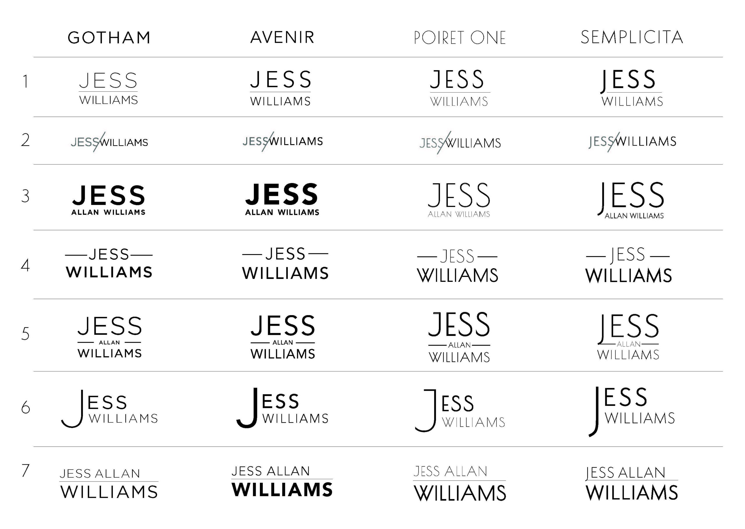
I may have overdone it with the variations, yes, but this was the first Wordmark I had done in some time — I was determined to impress. Anyway, Jess was pleased with the first round and selected a few layouts he liked, with a clear trend emerging: he wanted the next batch to include more bolded options. So, I took his preferred logos and applied a few bolder types; from there, Jess got back to me by circling his favorite options.

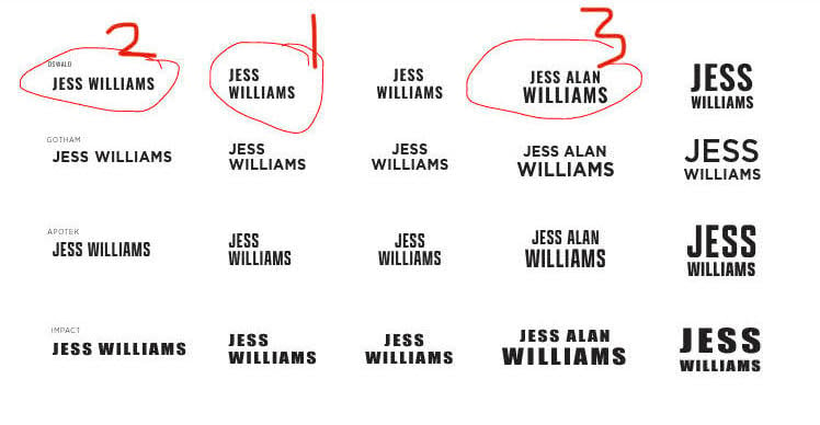
As you can see based on Jess’ picks, Oswald — the first row displayed above — was the favorite font of the bunch, so we moved on to finalizing the layout of the words. During this time, Jess was also deciding if he wanted to add his middle name “Alan” to the mix (he eventually concluded that he did want “Alan” in the Wordmark). Together, we narrowed down the best layout for his first, middle, and last name. To help with this process, I overlaid the Wordmark on an image of the book, which he’d sent over at the start of the project.

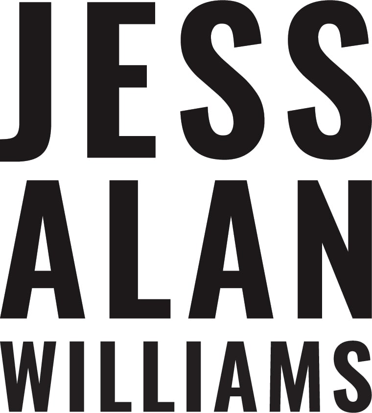
Each name stacked on top of each other in Oswald font was the ultimate winner. All that was left was to get him the files he needed to incorporate the logo for his promo book, and that was that! Here’s a closer look at that final logo:
One last thing…
If you find yourself slowly becoming more obsessed with fonts and the difference between serif and sans, Simon Garfield’s Just My Type is a fun read. The book makes you look at and think about how you interact with fonts on a daily basis. Who knows, maybe it’ll inspire you to take a closer look at Wordmarks!
Looking to design or refresh your logo and establish a brand identity? Reach out!