Please enter your email and website or LinkedIn to receive more information about our free and paid accounts.
Please enter your email address below and we’ll send you instructions on how to change your password.
Last year, Devon Stephens needed help with his Brand Identity. His website and branding were in place, but it just wasn’t him—literally. His name wasn’t on his logo, portfolio, or even on his website URL. So what’s a photographer to do? Devon knew he needed a fresh start, and came to us for a brand overhaul.
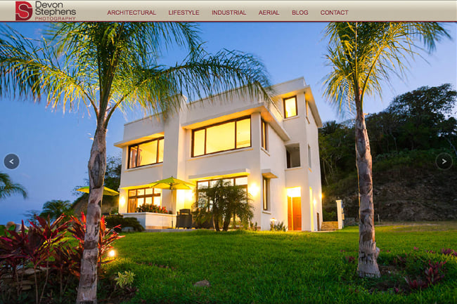
I started off by asking Devon the usual branding questions, seeing what stood out. Living in Honduras, Devon shoots mostly hospitality and travel work, but was interested in attracting more industrial clients. He also specifically asked for some type of mark he could use on social media sites, stamps, and potentially hats and t-shirts. Sure, his full name would be in the logo, but he wanted something simple that could pair with it. Both an easy and smart request, so I set to work.
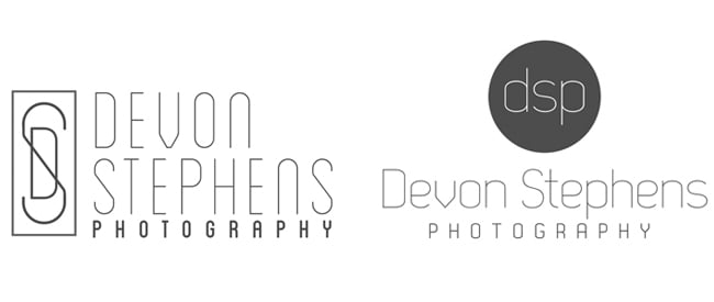
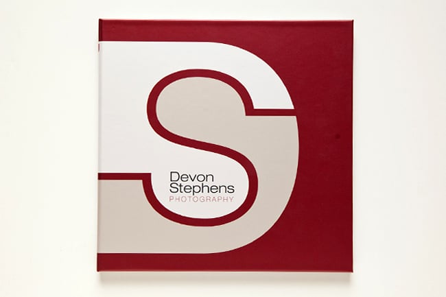
I delivered Devon a few different concepts for a logo. After some back and forth, he decided on the following mark: a combination of the D and the S.

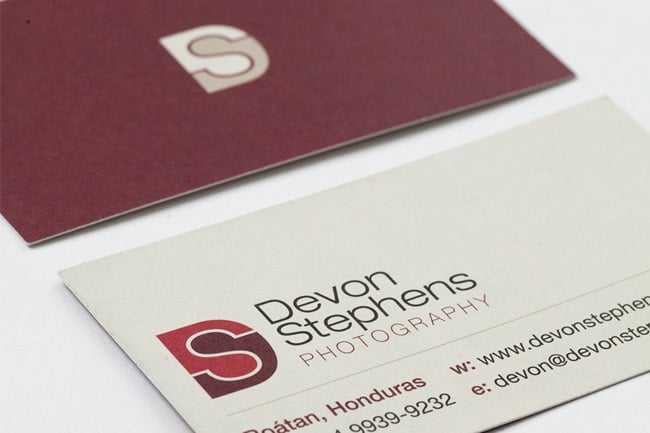
Color was extremely important, and we spent a lot of time exploring options. Keeping in mind, Devon’s desire to work with industrial clients, I presented some color palettes that were a little more earthy. These colors were then implemented across all of his brand collateral.
Once everything was completed, I gave Devon a small branding document so that he would be able to implement any future design changes on his own if he wanted. With it, Devon took his logo and created a new cover for his portfolio.
Devon was kind enough to give us some feedback on the work:
I wanted to create a new brand identity that featured my name and focused on more specific areas of photography than my previous branding. I also wanted to make sure that all of my materials were consistent rather than a mismatch of designs cobbled together over time.
I knew I wanted a word mark as well as a design, but really didn’t have any specific design in mind. I had not been though anything similar, so I wasn’t sure what to expect. “Starting out, Amanda asked me a number of questions to clarify the direction I wanted to go in, as well as other designs that appealed to me. After a few days, I got a number of “rough” black and white concepts to review. I was surprised at how clean and polished each concept was, I expected them to be more rough. I reviewed these, then discussed the aspects I liked and didn’t like with each design. Any one of these would have been a good design, but it was nice to have so many solid choices to choose from.
I was really happy with a few of the designs. We continued to refine two or three designs further, modifying fonts, and arrangement until I liked the way it looked. The color palette was next, and I was presented with a number of options and narrowed the choices down again through a couple revisions. Once the final branding and wordmark were settled on, I was presented with all of my designs, business cards, letterhead, web logos, etc.
I’m very happy with my new branding as well as the process to reach the final design.
Further Reading
Wonderful Machine: Expert Advice: Visual Identity for Photographers
Wonderful Machine: Expert Advice: Web Design Basics For Photographers
Wonderful Machine: Logo Design: Heather Perry
Need help with your Design? Reach out!