Please enter your email and website or LinkedIn to receive more information about our free and paid accounts.
Please enter your email address below and we’ll send you instructions on how to change your password.
Grammar and credit unions are subjects that usually neither incite the artistic imagination nor call for a similar aesthetic. Fortunately for Grammarly and Sound Credit Union, Seattle-based visual artists Boone Sommerfeld and Stanton J. Stephens “solved” their “problems” with a single creative vision.
As Boone explains it…
Between the two of us, we wear a lot of hats: Stanton as photographer/director and me as art director/cinematographer. This allows us to cover a broad range within the production and keep the crew lean, and it makes us economical.
The Grammarly shoot, a pet project of Boone’s that he’s hoping the online platform picks up, took less than a day to film. At the heart of the project is a poem heard in the video’s voiceover, a clever ditty penned by Boone himself, which was the result of some free time he had earlier this year.
I wrote the poem in an afternoon. It was January and freelance work dropped off, so I had some free time to concept some personal work to update the portfolio. I wanted to have some work in my portfolio that was art-heavy, stylized, and colorful.

I have a hard time writing without a brief, so I decided it would be easiest to concept for a specific client. I had seen Grammarly was making more ads to promote their product and the colors and typewriter seemed to match their aesthetic, so I wrote to that.

I started out writing the poem. All I knew is that I wanted to have it end with ‘Teh End’ because it’s such a common typo and I just worked backward from there.
Boone didn’t embrace this project because he’s a grammarian. Quite the opposite, in fact:
I have terrible grammar. I use Grammarly for almost everything I write. As I sit and write this, Grammarly has caught a mess of mistakes I wouldn’t have caught on my own.
One benefit of collaborating with other talented individuals is being able to conjure up new ideas in the midst of a shoot. While the typewriter was always going to be at the center of the video, it didn’t dawn on Boone and Stanton to film the carriage sliding back to its starting point until the day of the shoot, inserting a unique, quick motion in a more slowly-paced narrative.

Boone had his slider and we were getting it set up for another shot when we realized we could tie in the slide with the movement of the typewriter. It’s just a simple little thing but cool. And it’s a good reminder that no matter how good your script or story board is, don’t stop looking for inspiration in the moment.
That shot that Stanton is describing comes at the 37-second mark of the video. While it may not immediately register with viewers, the image of the subject being surrounded by giant wads of crumpled paper certainly will.

The idea of the paper came from writers just throwing out all of their rough drafts. I really wanted a shot of the room filled up with the paper balls and all you could see was the model’s face, as if she were inundated in a paper ball pit.
While Boone’s initial idea didn’t come to fruition and he nearly scrapped the shot entirely, Stanton talked him out of it and helped flesh out a new look for the concept.
It was a really fun moment. We were of course up against the clock and it was basically like ’stop everything and wad up some paper!’. The concept was so cool, I’m glad we found a way to execute it well.
Both Boone and Stanton have worked diligently to expand their skill sets and become more appealing to potential clients. Boone’s educational background is in illustration and after working as an art director in advertising for years, he felt comfortable making the jump to cinematography and video production.
I didn’t just up and decide one day to switch. It’s been a goal for about five years. I got my ad agency to invest in an internal content studio and start shooting more and more for them until I was basically 50/50 art director and videographer. At that point I decided all I really wanted to do was shoot, so I took the plunge into freelance life and began pursuing video production as my main thing.
Stanton, a photographer by trade, found his way into the director’s chair after spending years focusing on stills.
The desire to direct came from wanting to find the next step in visual story telling for where I was in my creative development. The biggest challenge for me getting into directing was learning to pace myself and find peace with not having a new fun project to put on my Instagram one week after I envision it. Executing a great motion project usually takes a lot more time, a lot more people, and a lot more money than a stills project.
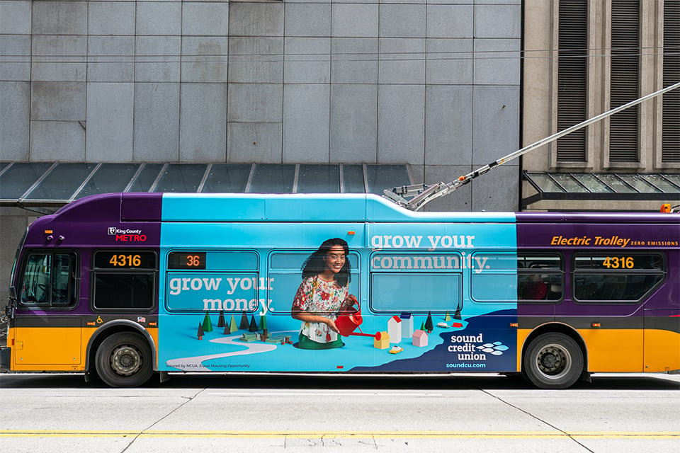
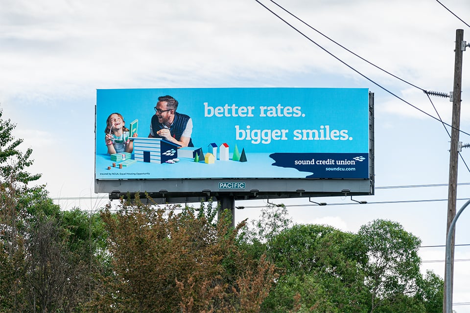
The duo recently brought their ever-evolving artistic prowess to Sound Credit Union in the Pacific Northwest. WONGDOODY, an institution within the Seattle advertising community, asked Boone to helm the credit union’s multimedia campaign.

Interestingly, Boone was inspired to get into video production in part because of a piece of WONGDOODY’s he saw at a Seattle International Film Festival. Soon after, he began working with the ad agency and brought Stanton on board to help him with this project.
This is sort of an uncommon scenario since I was the freelance Art Director who was working for WONGDOODY to design the campaign for the client. That gave me the ‘in’ to offer my services as a DP on the project and then bring on Stanton, who had a large portfolio of shooting this kind of colorful style.

This aesthetic, described as a “monochromatic in-real-life paper diorama” by Boone, permeates each video and still. One of the main spots from the project revolves around a woman on her way to Sound Credit Union.
Once again, Boone and Stanton worked together to take an initial idea and produce a collaborative outcome.
Originally, I planned on doing the whole downtown scene in one long tracking dolly shot, but when Stanton started storyboarding it, he wanted some close-up cutaways which really saved us in the end.


That way, we were able to make it feel like it was one long diorama without needing to make the set very big by cutting into the protagonist’s reactions and cutting back to the wide of her walking into a new section.
Unlike the Grammarly piece, which featured a skeleton crew, this project employed other creative individuals. Kaleo Quenzer and John Lavin designed the adorable props that helped give the project its character. Boone was surprised to learn about the simplicity of the prop-making process.

I assumed it was going to be a bigger to-do involving plywood and jigsaws, etc., but it was all gatorboard, which is a super lightweight and inexpensive material that can be cut with a box cutter and doesn’t warp when painted. It was great having Kaleo and John on set. They really delivered everything we wanted.
After three days of shooting stills and video and some post-production, Boone and Stanton’s work was complete. From there, Sound Credit Union started plastering the campaign all over Seattle.
While Boone and Stanton await more work from big-name clients who will allow them to flex their creative muscles, they can take solace in the fact that their diversified skills and portfolios have led to unique and successful collaborations. As Stanton puts it…
I know for other photographers getting into directing, the switch from “doer” to the “communicator” has been hard. For me, it felt very comfortable and easy. I deeply love the collaborative process and when you have the privilege to be creative with talented people, like Boone, the project ends up being greater than the sum of its parts.
Grammarly Credits:
Talent: Sophie Gao
Hair & Makeup: Samantha Tokita
Sound Credit Union Credits:
Art Department: Kaleo Quenzer, John Lavin
Copywriter: Kate Benton
Agency: WONGDOODY
Production: IMI Productions
Let us help you Find Photographers, source Stock Photography,
and Produce Your Shoot — or just reach out to hear more!