Please enter your email and website or LinkedIn to receive more information about our free and paid accounts.
Please enter your email address below and we’ll send you instructions on how to change your password.
Jimmy John’s, the popular sandwich brand, recently debuted a new menu and a new look. The new bold and expressive visual approach is the work of Cincinnati-based food photographer Teri Campbell of Teri Studios.

With over 30 years of experience in the food world, working with established brands like Burger King, Kellogg’s, and Hershey’s, Teri and his team specialize in making people hungry. For this project, Teri was hired by Change Up, a retail brand experience agency. Teri worked with them on a similar project for Sonic Drive-In Restaurants.
Our previous experience working with this agency was certainly important — but so was our more than three decades of experience helping to craft the visual identity for some of the most iconic Quick Service Restaurant brands in the world. The agency knew we could bring to life the fresh look they had envisioned.
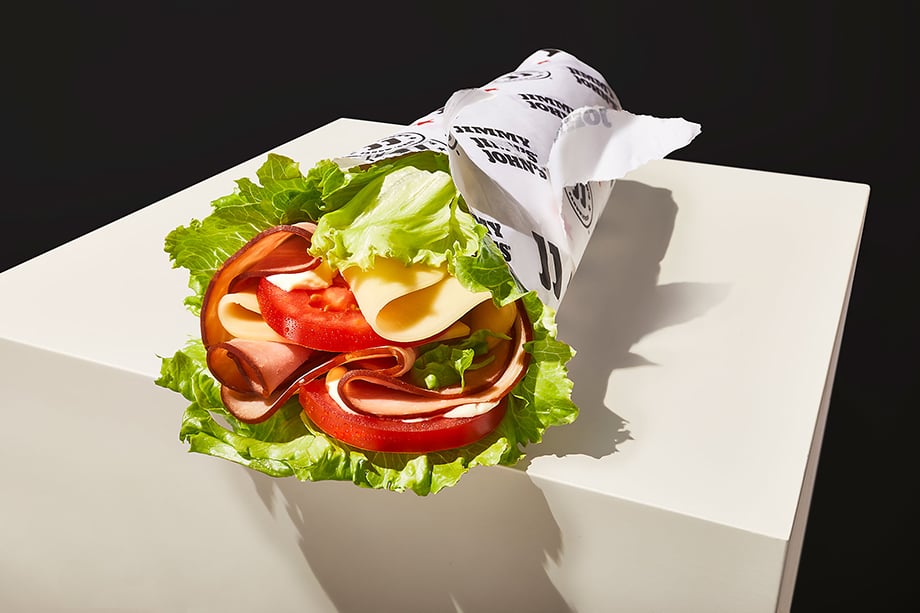
The shoot took place at Teri’s photography studio in Cincinnati. Since Teri Studios specializes in food photography, the location was well-equipped. It included a comfortable prep space and a modern kitchen stocked with plenty of cooking appliances. Jimmy John’s is a sandwich company well known for its bread, so it was crucial that they accurately represented the product. This led them to bring in the big guns — the brand’s own ovens — for consistency.
Even though we have a large kitchen with nearly every appliance known to man, we brought in Jimmy John’s proprietary ovens to make sure the bread was authentic.
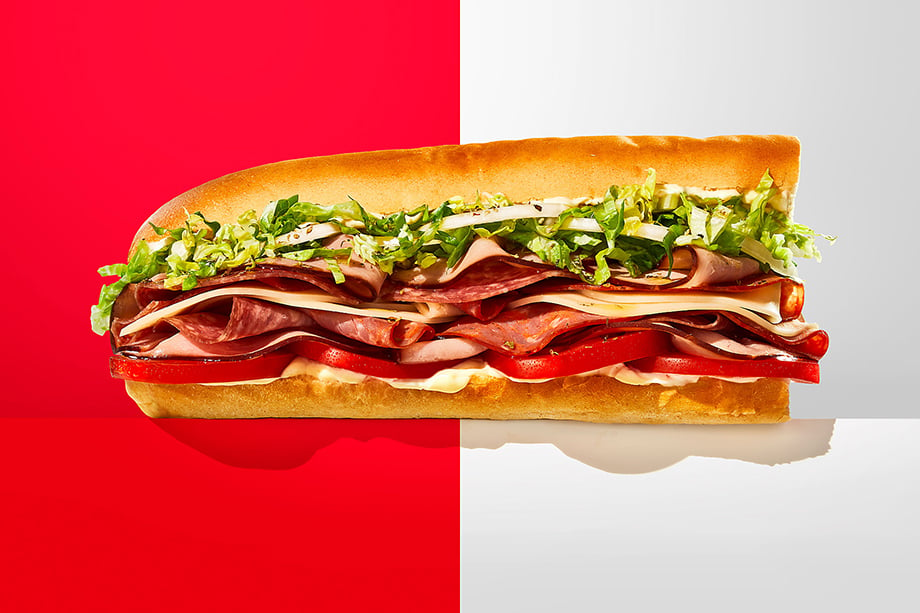
While the brand and creative director had a visual direction in mind for the shoot, they still gave Teri some flexibility to execute the project based on his expertise. Teri’s images would serve to establish a new look and feel for Jimmy Johns, so they needed to communicate the brand proposition in a fresh new way.
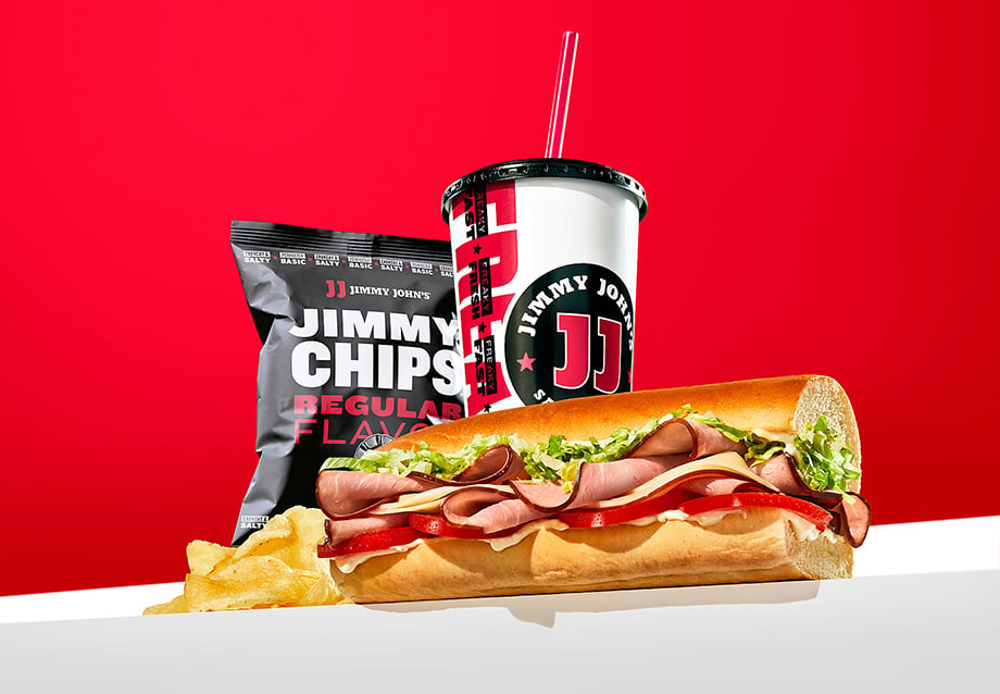
We did lots of experimentation — with lighting, composition and styling. It was great to be able to explore the possibilities and not just execute a layout.
The images are vivid and utilize the brand colors (red, white, and black) to reinforce Jimmy John’s branding further. Using simple backdrops, heavy contrasts, and bright light, Teri’s photos evoke a bold, adventurous brand personality while maintaining a good balance between a highly stylized photographic approach and making sure the food looks appetizing.
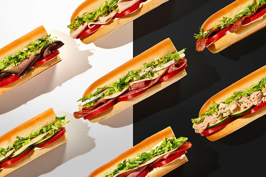
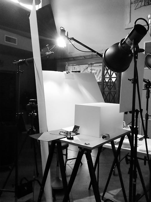
The creative director wanted the sandwiches to look as if they were race cars. The lighting and low angles helped to create that vibe, but made the food styling particularly challenging. We utilized a prep day to finesse the lighting and create a look that delivered on the creative brief but also made the food look delicious.
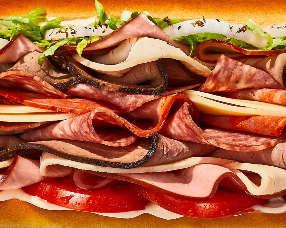
Teri’s team executed the lighting and styling flawlessly, creating bright geometric compositions that make the sandwiches look equal parts intriguing and delicious. The bread and fully stuffed sandwich ingredients were meticulously laid out in a way that accentuates each ingredient, so they’re easily recognizable. The crisp close-ups also do a great job of highlighting the freshness of the ingredients and the bread by showcasing its texture and showcasing the air bubbles you typically only see on gourmet slices.
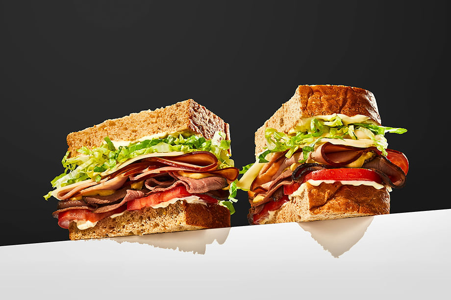
Even though this “hard light” look is very popular right now, it is difficult to execute in a way that doesn’t look too artsy. I enjoyed the creative freedom we were given, and the trust placed in us by the agency & client. And the super fresh bread!
See more of Teri’s work on his website.
Credits
Photography: Teri Studios
Client: Inspire Brands
Brand Lead: Chris Phillips
Agency: Change Up
Creative Director: Ryan Brazelton
Art Director: Haley Kunka
Director, Client Services: Susan Rogers
Producer, Teri Studios: Sherry McKown
Post-Production: Scott Martin, Haley Kunka
Further Reading:
Read more articles about Teri Campbell.
Read more articles about Brand Narrative photography.
Let us help you Find Photographers, source Stock Photography,
Produce Your Shoot — or just reach out to hear more!