Please enter your email and website or LinkedIn to receive more information about our free and paid accounts.
Please enter your email address below and we’ll send you instructions on how to change your password.
San Francisco-based artist Matthew Carden is widely known as a pioneer in miniature and toy photography. He approached Wonderful Machine because he wanted a Branding Overhaul, hoping to reposition himself as a fine art photographer. First, he needed an update of his existing, outdated logo and an upgrade of his graphic identity.
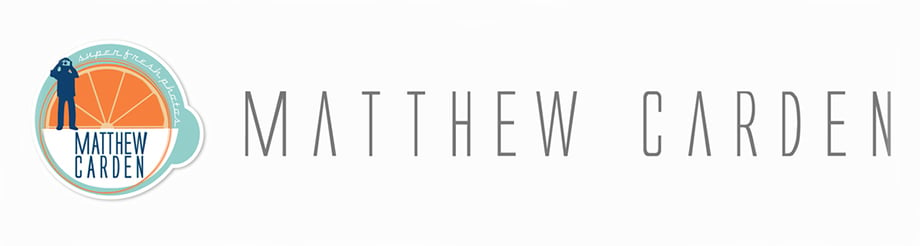
Matthew combines his expertise in photographing miniatures with his background in commercial food photography. Moving away from the latter, he needed a logo that represented who he was as an artist while conforming to the more refined fine-art world.
After our initial conversation, we agreed on a new approach to his existing concept, experimenting with angles and fonts. I drew from one of his own images for my illustrations.

Along with the miniature photographer, we wanted to incorporate the orange from his original logo to relate to his many food projects. For the first round of logo refinement, I developed three black-and-white concepts. Illustrative yet simple, these designs walked the line between a fine artist and Matthew’s fun personality brought to life in his photography.

Matthew liked the first concept best and asked if I could make the lines of the orange more organic, without making it too busy. Also, out of the different character versions, he had chosen the slightly more detailed one. Based on his feedback, we approached the second round of refinement.

Matthew was drawn to this design instantly, so we moved on to the next phase, adding color. Since he already mentioned that he’d like it to evoke some retro feel, my idea was to go with washed-up shades of orange and blue. We also agreed on the fonts Bebas Neue Bold for his name and Canter for the tagline, since these are both clean and sharp, but with a slight retro feel.

Matthew was absolutely thrilled with the result. Stemming from the original concept of the fruit and the photographer, I was able to redesign his logo just the way he wanted, giving it a new, fresh, up-to-date look. Working with Matthew was a great experience. He knew what he wanted from the start and provided direct, valuable feedback at each stage of the review.
Upon receipt of the final files and style guide, Matthew had this to say:
This is all great!!! I love it and can’t wait to implement it all!!!
Need help with your Brand Identity? Reach Out!