Please enter your email and website or LinkedIn to receive more information about our free and paid accounts.
Please enter your email address below and we’ll send you instructions on how to change your password.
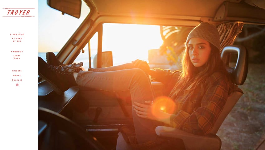
A few months ago, I started working with San Diego-based photographer David Troyer and really enjoyed the opportunity to take an in-depth look at his work. With a background in surf photography, he gradually made the transition into lifestyle and product-based work, while still maintaining his signature coastal style.
Although David had initially signed on for our Marketing Partner program, he soon realized that his brand was in need of some updates in order to be more client-friendly. He knew he needed to tighten up his edit in order to be more competitive in the marketplace, and he wanted someone else’s expertise to help him do that. The previous edit on his site hadn’t been refreshed in some time, nor was it showing any focus or direction, simply acting as an archive of his favorite commercial images for clients to peruse.
We had a productive conversation over the phone, during which David explained his current situation and clarified his goals. In the past, he had done significant work for fashion lifestyle brands like Reef and Eagle Creek. Moving forward, our plan was to expand his reach to agencies and brands, with the intent of landing him clients like Vans, Levi’s, Converse, and Oakley. Soon after our call, I began working on both a web and print edit for him.
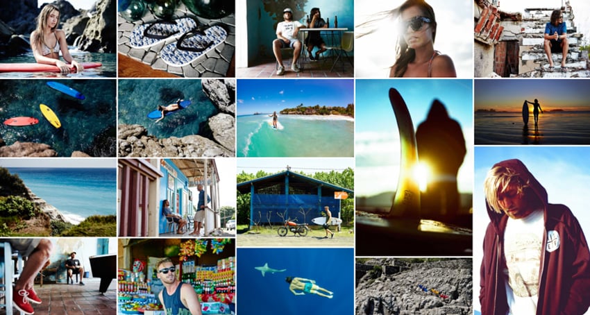
For the web edit, David sent over a batch of around 800 images for me to consider. After doing an initial run through and flagging his most commercially viable work, I divided the photos up into 2 primary specialties: fashion-based lifestyle and product. From there, I rated the images in Lightroom based on their strength and put them into thematic sub categories that would make sense for web viewing.
With oceanic work being ever so prevalent in David’s lifestyle work, not to mention an important and unique component of his brand, I used that as a foundation for the subcategories and opted for two major themes: By Land and By Sea. After that, I fine-tuned and sequenced the edit into concise, tightly curated galleries that showed off a range of his skills and expertise. With his product photography, it was important to continue the organizational rhythm of the lifestyle edit, and so I settled on subcategories of Light and Dark.
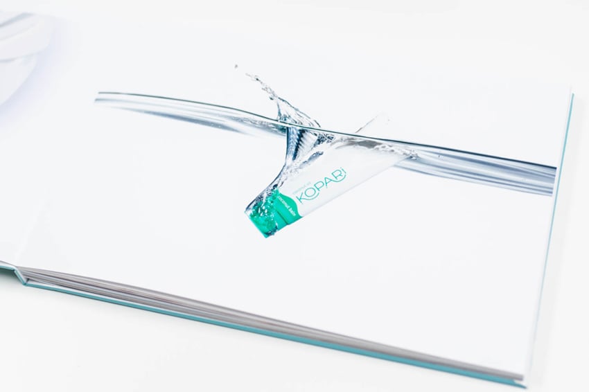
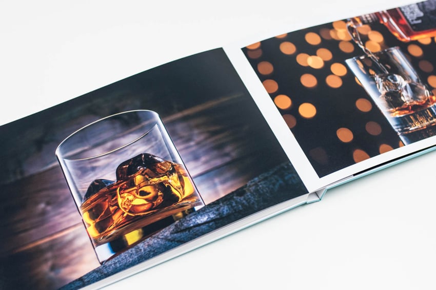
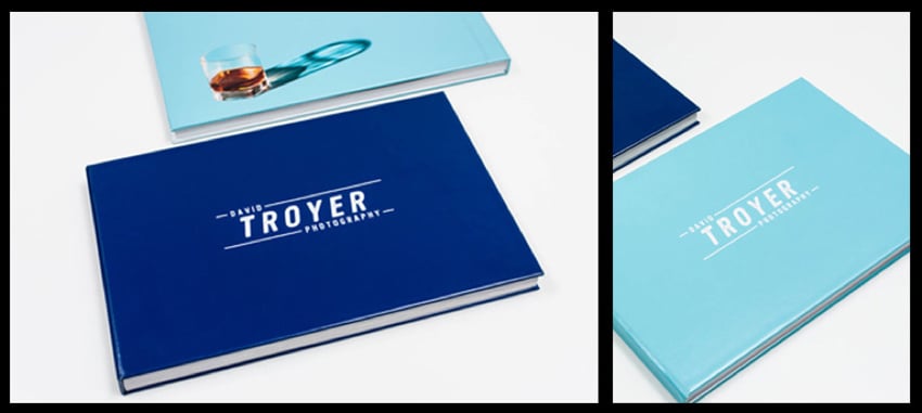
With David’s print portfolio, I wanted to showcase both of his primary specialties in a manner that would feel cohesive and make sense to clients. As a result, I decided that it would be best to create two separate books, one for his product photography and one for lifestyle, in order to show a comprehensive enough collection of each. Knowing that I would be doing both a web and print edit for David allowed me the flexibility to avoid unnecessary image repetition between the two media, and I constructed the books to highlight new content not shown in the web edit.
The cover concept and edit for each book were inspired by key characteristics of David’s brand. The blue tones were used to create an association with water, and images that incorporated those hues were placed on the back covers. Keeping in mind the new organizational structure of his online edit, I sequenced the images from light to dark in his product book to coincide with the theme on his site.
Aware that his product work was not as extensive as his lifestyle work, yet realizing the importance of having two unique books with solid edits, David created additional in-studio content during our collaboration. Having a series of new images to integrate into his print portfolio and website edit really helped push his brand forward.
For printing, we decided to go with AdoramaPix’s on-demand service and ordered multiple copies of each book, one for David’s studio and one to be kept in-house at Wonderful Machine. The books were shipped out from the vendor within a week of uploading the designs, and we were 100% satisfied with the results. They lived on our portfolio shelves for just a few short days before I took them out on meetings with Ann Taylor and Vox Media, both in New York City. I was thrilled to see how well the images, edits, and designs were received by clients. Even the print quality received applause.
After our work was done, David was very pleased with the way everything came together and had this to say:
Stacy got to work on both my web and print portfolio edits. I was simply blown away to see my work through Stacy’s eyes! It seems so fresh and new and flows so well together! When Stacy sent me the edit and cover art for my printed portfolios I couldn’t do anything but SMILE! Thanks to Stacy’s focused and thoughtful edits, getting my brand back on course was a breeze. I feel so much more confident in both myself and my work. I can’t wait to get my imagery back out and in front of new eyes!”
Below are David’s new lifestyle and product portfolios:
If you’d like to get to work on revamping your own brand, feel free to reach out! We are always happy to help.