Please enter your email and website or LinkedIn to receive more information about our free and paid accounts.
Please enter your email address below and we’ll send you instructions on how to change your password.
By Peter Clark
Last fall, then Denver-based photographer Steve Temple came to me looking for feedback on his website and promotional materials. Steve was about to move out west—to Portland, Oregon—and wanted a solid new look for his business. After reviewing his work, I recommended he join Wonderful Machine to start (which he did). Steve then expressed interest in having a new website and identity designed. I was happy to oblige.
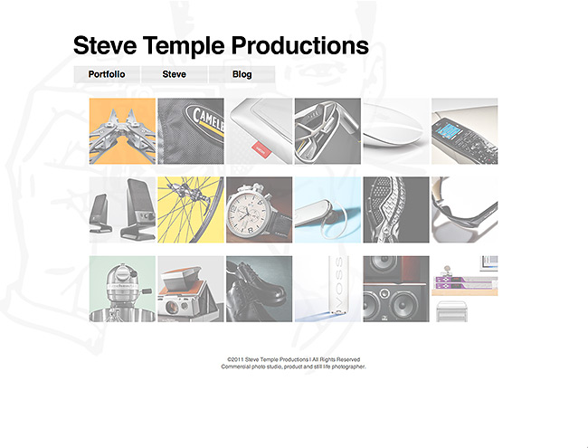
Steve’s original online portfolio design felt bland and uninspired, to say the least. He desperately needed a website and identity to complement his bold still life photography. When it comes to choosing a portfolio template, it’s best to find one that offers at least some form of customization in terms of colors, typefaces, image size, and editing layout options. You don’t want a template that only lets you upload a logo and change a few minor details. After recommending a few new templates to Steve, he decided on Virb.com, which offers customizable, html based templates that are scalable and come with a their own blogging feature.
After the template service was settled, I suggested to Steve that he get rid of the word “productions” from his name. To me, it sounded like a multimedia company that offered photo and video production services. This meant changing everything from his URL to his email addresses. However, he was more than happy to go along with my recommendations.
Steve Temple’s old website design:
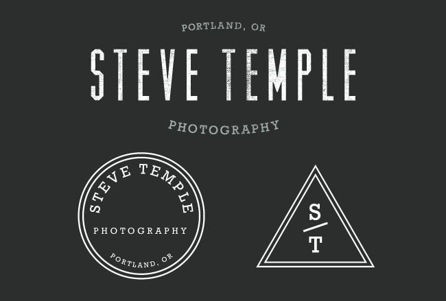
While we were hashing out the new website, we also started on Steve’s new graphic identity. He was actually working on a “visual marketing statement” for himself at the time, so that helped me get a sense of what “Steve Temple Photography” is all about. Soon after that, he graciously sent over a few logo examples he liked with comments attached to each one. I took all this into account as I began my design process. I believe that it’s important to start off any project like this in black and white. Delving too deep into color too soon can sometimes breed so many ideas and concepts that you’re sure to waste time. After obtaining all the information I need from a photographer, I first explore my personal database for inspiration—currently over 6,000 images. They range from anything like a type treatment to a favorite color palette. If needed, I do a bit more research online or find materials in our office. Most of my consulting projects have an inspiration folder that I reference throughout the process.
After a week, I presented Steve with three black and white word mark/logo concepts so that I could get a better sense of where he wanted to take the project. A few days later, he sent back my comp with red squares and notes around all the ideas he liked. I agreed with his choices and started brainstorming in my head on how to get them to work together as a single identity. I spent another week refining the design before sending him back another b/w version. This time, I had also started to explore distressed/grunge effects since Steve had expressed interest in that look. Again, Steve offered some valuable feedback which I took into account.
The next step in the process was to introduce color. After presenting a few different concepts, we agreed on a final execution for the palette. From there, the design progressed further, adding minor tweaks here and there, until the final result (below).
Part of Steve’s new identity:
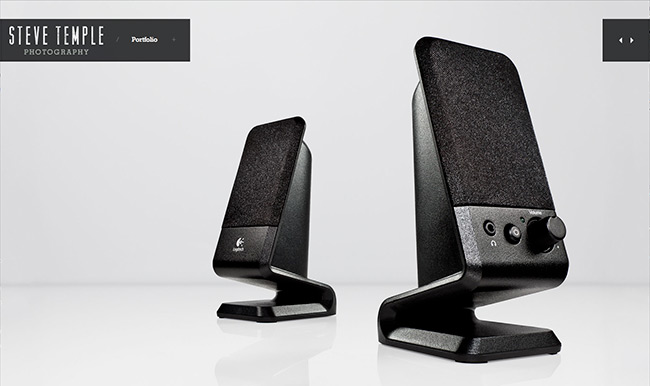
Steve’s new website (stevetemplephotography.com):
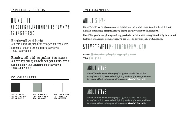
When working with a designer on an identity, it’s always good to make sure they supply you with an identity guide at the end of the project. What is an identity guide? It’s basically a document that you can reference that explains your identity. So say two years down the line, another designer has to help you out with a promo design, they can reference your guideline and easily follow the standards set within it. You want your identity to be as consistent as possible. An identity guideline can come in several forms such as a simple visual overview to a super descriptive document that spells out everything from logo sizing to image placement. Your identity will always evolve through time, but it’s good to have this base to work from. At the very least, it’s good to make sure your designer includes a description of any typefaces and color palettes used.
Part of Steve’s identity guide:
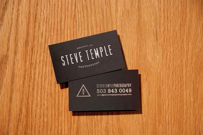
In addition to working on Steve’s identity, I had the chance to create some business cards for him. Steve can now take his brand new identity and run with it. He’ll be using the identity package to create some great material to promote his photography business. Steve’s next steps are to get his Portland studio space in order and begin to foster relationships with creatives in the local scene. He’s been to a couple social events this year and the talk of projects has already come up.
Steve’s new business cards:
A well-designed website is the cornerstone of every photographer’s brand.
If you need help designing a website, reach out!