Please enter your email and website or LinkedIn to receive more information about our free and paid accounts.
Please enter your email address below and we’ll send you instructions on how to change your password.
by Peter Clark
Roberto Westbrook came to me recently looking for some creative feedback on some print promo concepts he had. I mocked up a few things based on what he sent over. He must have been happy with my ideas because a few days later he asked me to design the whole thing.
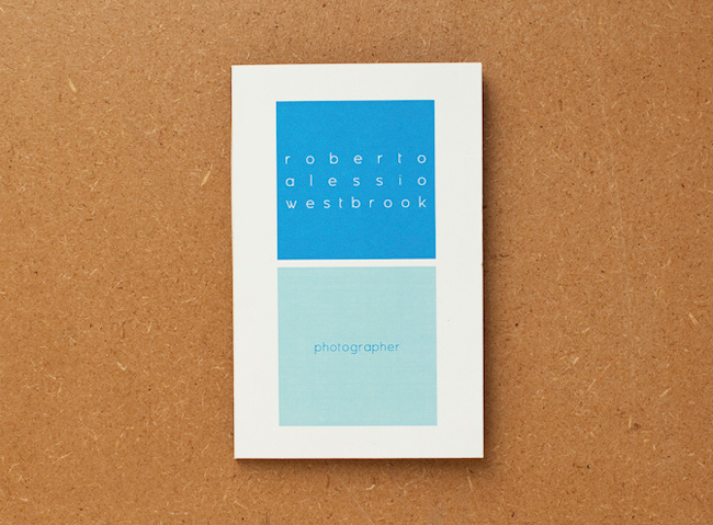
Roberto, a Richmond/Norfolk-based photographer, is gradually becoming aware of what one must do to be successful at marketing and self-promotion. He had worked with Suzanne Sease, a photographer consultant, in early 2010, to develop a new book, web portfolio, and email campaign for the year. He kept the branding he already had in place. Before all this, he admits, he didn’t really have a plan of communication to reach potential clients successfully and on a regular basis. His comments:
Marketing is this multi-faceted process that requires research, promotion and selling. It’s necessary for developing relationships with new clients and maintaining ties with old ones. Styles change but personal connections are always important. I think a personal meeting is the best way to be remembered. The question is how do you get that meeting? I’m still figuring that out, but I think one of the keys is targeted research. For example, Google Analytics indicates that someone from an agency spent ten minutes on my site last week. From now on, that agency’s art buyers will be on all my future promos and maybe some personal project updates.
The design for his printed promo would revolve around an accordion layout. I suggested he try and get his printer to print the promo double-sided to get the most out of the layout. One-sided promos, especially those designed to be seen from both sides, always leave something to be desired. I always think a photographer should take advantage of the extra space in whatever way possible.
Using that space, we were able to include four decent sized images and his existing branding elements on both sides. When the promo is folded up, his identity appears at the front and his contact info directly behind that. I had Sean, our director of photography, give me some suggestions for photo combinations for each side of the promo. We figured a quirky image paired with a more commercial image would work well since Roberto’s work has a great sense of subtle humor that should appeal to art buyers.
Deadline Digital, a local printer in Norfolk, printed the promo (he said they were close enough for him to ride his scooter to check the first proof). Roberto recently sent us a bunch of the final folded and enveloped incarnations, and I think they came out great. He says his promo is intended as a leave-behind for portfolio meetings and as a targeted mail piece for people he’d like to work with in the future.
If you’re ready to take your marketing to the next level with print or email promos, reach out!