Please enter your email and website or LinkedIn to receive more information about our free and paid accounts.
Please enter your email address below and we’ll send you instructions on how to change your password.
I recently partnered with Jesse Justice, a Salt Lake City-based photographer specializing in Music/Performing Arts photography. We collaborated on a Digital Promo that he planned to use as an attachment to his promotional emails (Jesse had just started working with our marketing consultant Eloísa García on Client Introductions).
Jesse needed something versatile that he could use to promote his corporate photography and portraiture as well. The main objective for any email attachment is to communicate quickly and effectively, so my design approach emphasizes a clean and minimalist style. The project kicked off in October. After Jesse sent me his brand assets, I turned around the initial designs a day later. I also got his feedback about the layout. After that, Jesse sent over the final images and I adjusted their size.
During the initial sketch phase, I focused on the organization of the different visual elements. The three main elements (logo, image set, and contact info) of a digital promo should look integrated and cohesively placed together before including any additional design elements. Finally, I presented Jesse with four options to consider. Jesse’s website influenced the design, ensuring the development of a brand-aligned product.
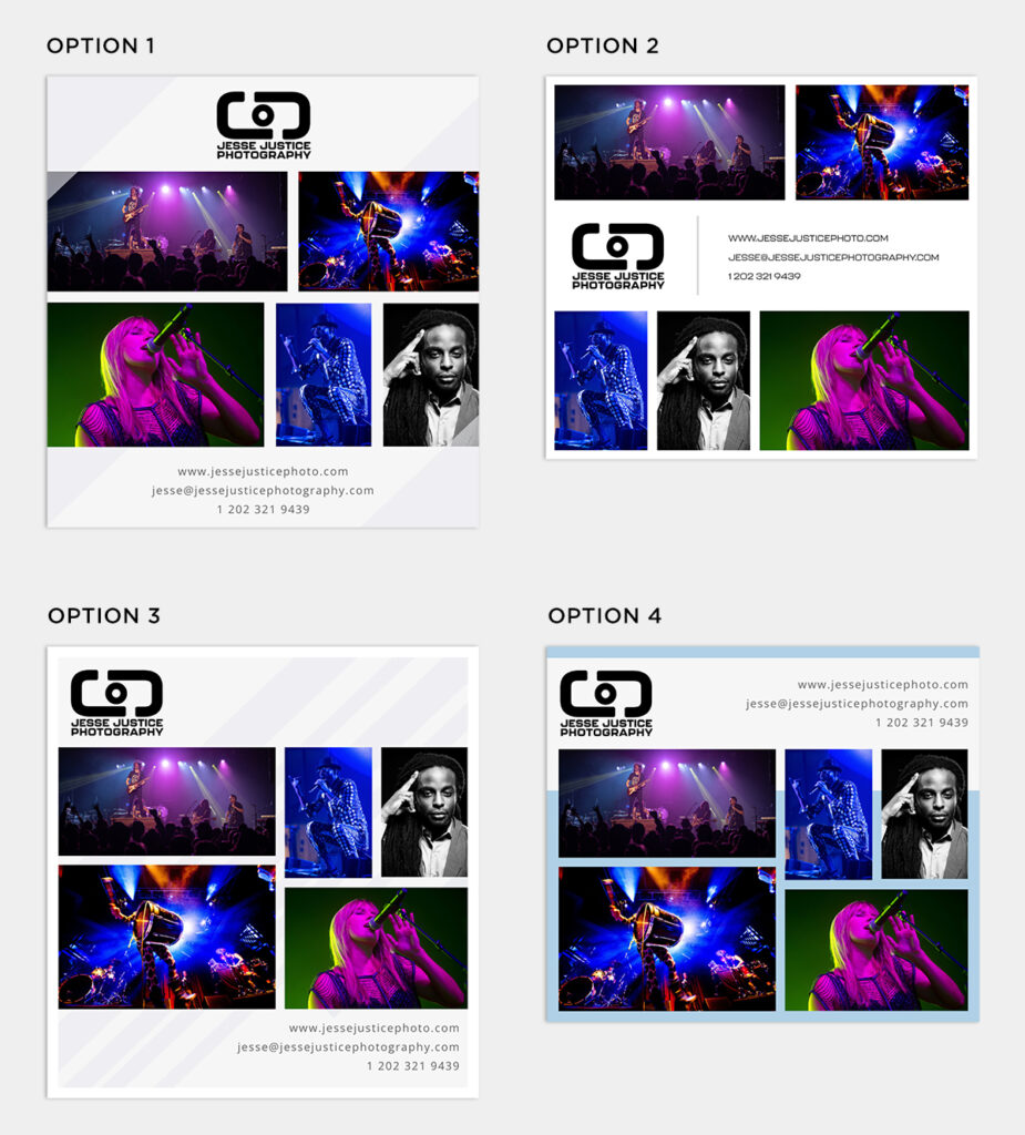
For this option, the imagery was grouped in a grid. The logo was centered on the top and the contact info at the bottom. As a design element, diagonal rectangles were added overlaying and behind the pictures on a white background.
This was a simple and minimalist version, where the images were split at the top and the bottom of the page. The logo and contact info were placed in the middle of the page and divided by a thin line. For this option, I also wanted to show Jesse what the contact info would look like in his secondary font (Kallisto).
This option starts with the logo left aligned and the images grouped in a grid, followed by the contact info right aligned, to keep the design balanced. The background color was light gray, with skinny diagonal rectangle shapes in a slightly darker gray color. Everything is inside a white border.
The logo and contact info were placed at the top (left and right aligned), followed by the grid of photos. I also used light blue as a contrasting color in the background, except for the logo and contact info part, which shows a white background.
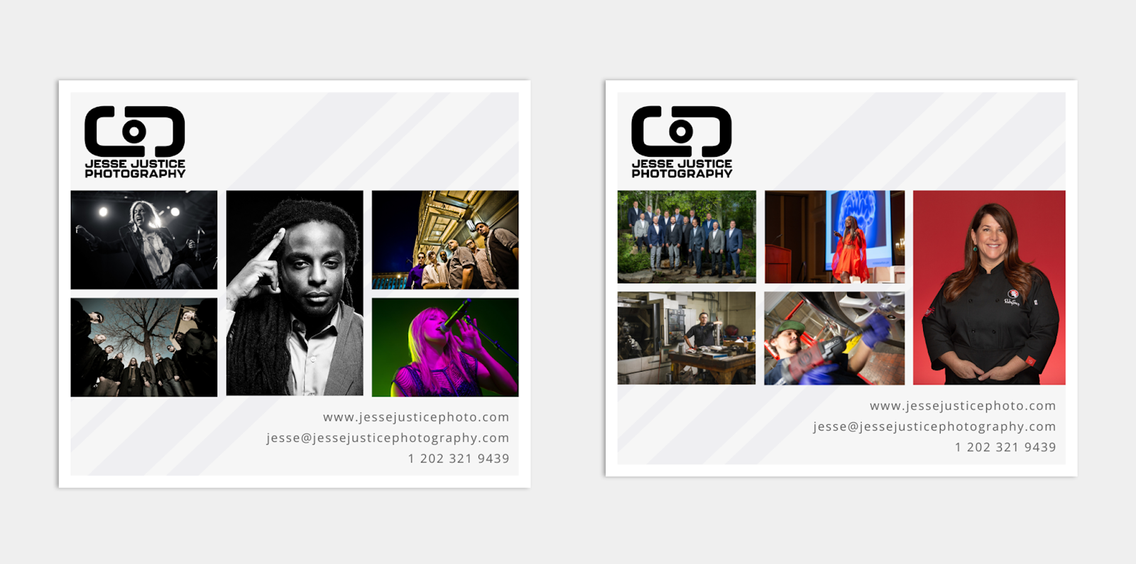
Jesse expressed his initial satisfaction with Option 3 and opted to proceed without any changes. He quickly sent the required image sets:
Spent the weekend going back and forth, but the first option I liked is still the best in the end. Option 3 is the one — it fits perfectly! Let me get the right two sets of images to you ASAP.
Finally, I also implemented minor tweaks in the aspect ratio of the layout to accommodate Jesse’s photos.
Eloísa was pleased that we were able to turn the project around quickly so that she could include it in Client Introductions. She loved how it seamlessly complemented Jesse’s brand and website design.
In the end, Jesse loved the results. Our collaboration was a smooth and straightforward process. I liked the final design and how it relates to his website, keeping everything on-brand. The digital promo successfully achieved its intended purpose as an effective and visually appealing tool.
Further Reading
Specialty: Music/Performing Arts Photography
Expert Advice: Email Campaign Analytics
Expert Advice: Going Viral on Social Media