Please enter your email and website or LinkedIn to receive more information about our free and paid accounts.
Please enter your email address below and we’ll send you instructions on how to change your password.
San Francisco-based photographer Diana Mulvihill shoots the bright and intimate moments of everyday life. On her website, a decent amount of white space surrounds each photo. This layout focuses on a single image, highlights the photo’s strengths, and mimics the brightness found within her work. She recently contacted Wonderful Machine, hoping to incorporate this light and optimistic style into her emailer design.

This first variation displays a lead photograph, a mix of supporting images, and plenty of space in-between. Diana wanted to push the white space further to be more consistent with her website. She also wanted to experiment with off-centered images. With this in mind, I got started on the second round of emailers.

I added even more white space between Diana’s photos, capturing the light and airy look of her brand. Diana loved the pink bar at the top of the emailer but was curious about changing its color to align with the content. With that, I was ready to refine the emailer into the final design.
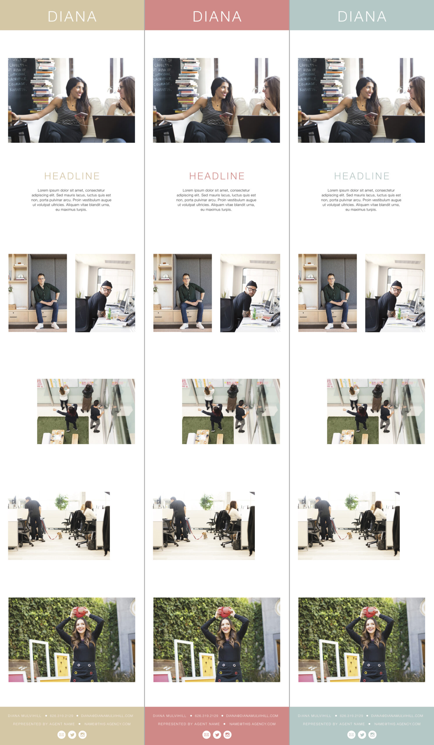
The final design has a spacious image placement and makes a strong statement about Diana’s brand. Her emailer is as dynamic as her website and works seamlessly with MailChimp’s template. Diana will have no problems utilizing this marketing tool to attract all kinds of new clients!
Need help with your emailer design? Reach out!