Please enter your email and website or LinkedIn to receive more information about our free and paid accounts.
Please enter your email address below and we’ll send you instructions on how to change your password.
Nashville-based food photographer Stephanie Mullins had been shooting quite a bit of new work and came to us looking for help with her second web edit this past summer. She’d been busy working on some larger commercial jobs for regional clients like Christie Cookies and Hunt Brothers Pizza, enjoying a nice change from her usual editorial work. With the new edit, she’s hoping to show off the awesome new work she’s made, expand outside her regional market and attract more commercial clients like Auntie Anne’s, Cinnabon, and restaurant chains such as Ruby Tuesdays.
We started her editing process with a quick phone call to get caught up on the exact type of work Stephanie’s been doing and the clients she’s been working with, along with her goals for the upcoming year. We were both happy to see her style solidifying, as well as her confidence and aptitude for shooting naturally-lit images of real food. These are the aspects that come together to forge a solid brand.
Luckily, Stephanie’s site was in excellent shape prior to the edit. She was using a responsive template from Squarespace that had clear and easy-to-navigate galleries for her work: one for food and drink, and one just for desserts. The fact that she was only showing two galleries for all her work made sense during her last edit. Moving forward, it was important to fill out her site a bit more and ensure that all the work she’d been doing would have a proper place in her portfolio. Prior to getting started, she mentioned that she’d like to have a gallery specifically for drinks in the new edit. As we went through all the images she sent over, we also factored in some images taken on a last-minute shoot and found we’d be able to pull together this additional gallery for her site. While doing so, it made sense to reconsider her current gallery names and come up with something more apropos and fun. We settled on “Have a Bite”, “Take a Sip”, and “Indulge a Bit”.
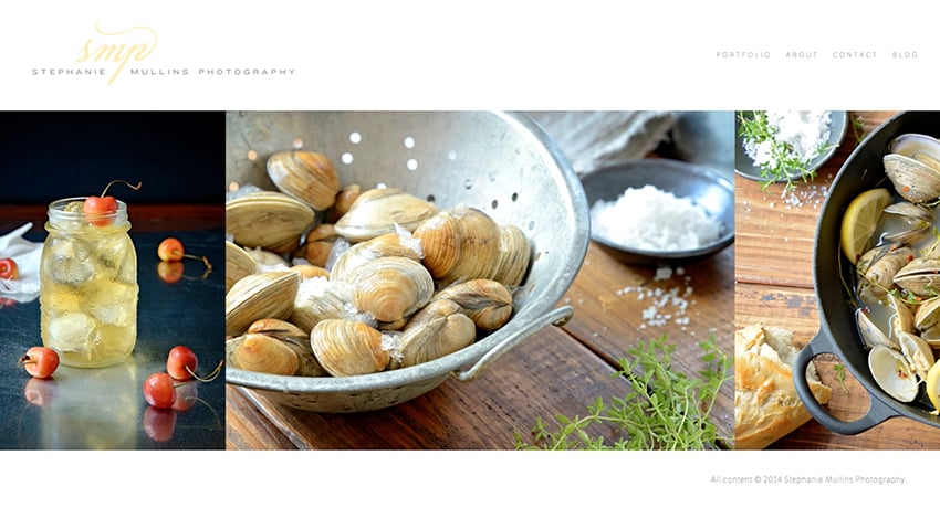
Stephanie’s homepage before the edit:

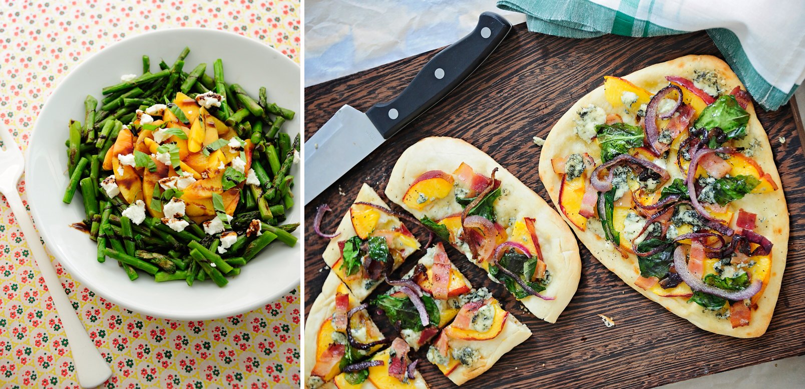
With the new edit, we focused on showing off Stephanie’s style and skills within the variety of work she’s been shooting, making it look both fresh and logical. “Have a Bite” starts off with light, summery platings of fruit, then progresses towards sandwiches, pasta, fish, and then heavier dishes of poultry and meat. We made notes for a few images to be reprocessed here and there so that varying color temperatures could be balanced out specifically for the edit.
Stephanie’s new homepage, which launches to her “Have a Bite” gallery:

An additional pairing from Have a Bite:

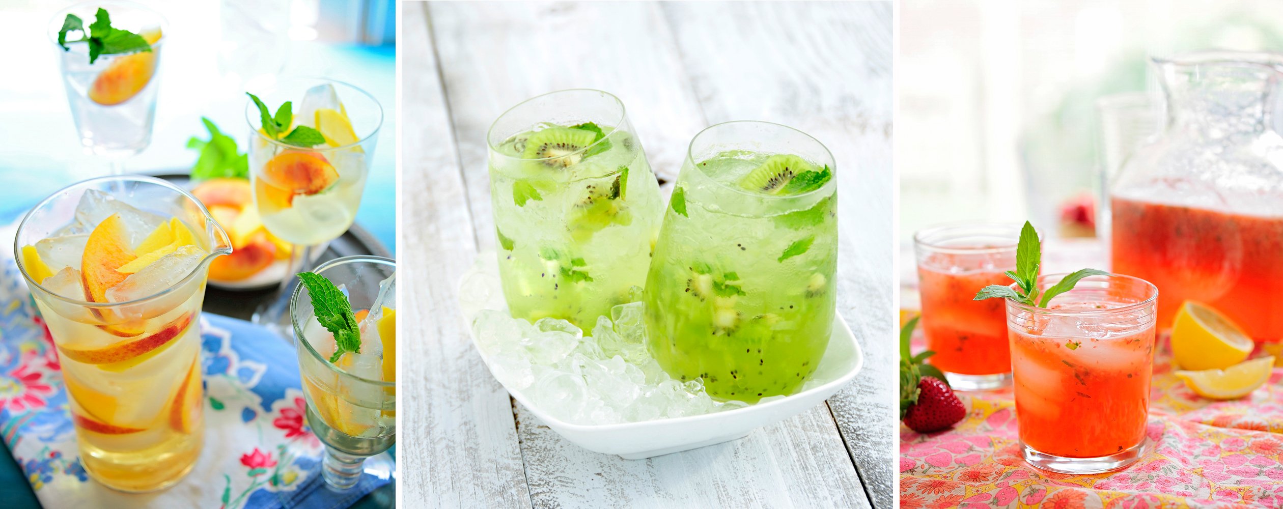
“Take a Sip”, Stephanie’s smaller drink gallery, was organized so that each image would flow from one to the next. While most of this was based on color, composition, and the actual type of drink, varying the angle of view was just as important.

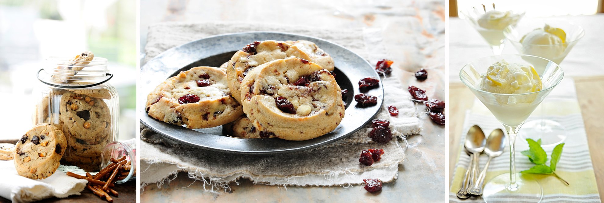
“Indulge a Bit”, our favorite gallery for obvious reasons, was composed with a similar approach. Since Stephanie had an abundance of cookie-related shots in her portfolio, we needed to be selective about exactly which ones were used. The first image was chosen quite literally to “take the lid off the jar” and get the dessert party started. You’ll notice the play on color and detail observation from one dessert to the next, with the emphasis on cookies sprinkled throughout.

Stephanie was really happy with the way her edit turned out, and was thrilled with the new drink gallery:
I loved having my new edit done. Sometimes it just takes an outside person to look through your images and create a beautiful story that is a portfolio. I find myself getting caught up in something that happened with a shot and not liking it for a while, but when I sit back and look at my work as a whole, sequenced and selected by Stacy and the Wonderful Machine team, I feel quite proud of what I have accomplished lately!
Check out the video below to see a before and after screencast.
Need help with an effective online portfolio? Reach out!