Please enter your email and website or LinkedIn to receive more information about our free and paid accounts.
Please enter your email address below and we’ll send you instructions on how to change your password.
A well-known peer-reviewed study showed that it only took 50 milliseconds to form an impression of a website. So it stands to reason that viewers will judge the design of your email promotions just as quickly. Good design does more than make the photos pop and your branding memorable. Picking the right fonts, sizes, and colors can communicate professionalism, a safe pair of hands, and sophistication. It can also indicate a photographer with a finger on the pulse of contemporary visual culture. Emailer design must also work hard to grab the viewer’s attention and leave them with a sense of what the photographer is all about.
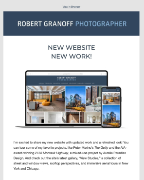
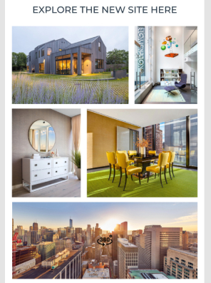
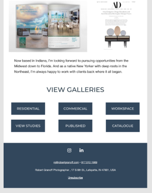
Robert Granoff, an Indiana-based architecture photographer, finds that design is crucial to his email promotions.
We all spend so much time looking at email and social posts these days, and image fatigue is a real issue. Yes, the function is marketing, but I like to think that I’m offering something nice to look at, a place for people to rest their eyes before the next doom scroll. We’ve had an amazing response to both the newsletter and the website. “Clean” and “wow” are two responses we’ve seen a lot of. Our open rates on emails are very high, which suggests my audience doesn’t mind looking.
Table of Contents
The design of your emailers should align with your overall branding. Their look and feel must be consistent with your website and other promotional materials, but it’s also important to think about what you’re trying to communicate. Do you want to capitalize on your creativity, your clever ideas, and quirky style? Or are you a dependable collaborator who delivers consistently high quality? Do you only work for top-tier clients, or can you do an excellent shoot even on a tight budget? What’s it like to work with you? The design and words you choose can subtly communicate these messages.
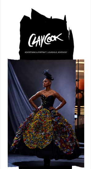
Louisville-based corporate and lifestyle photographer Clay Cook also finds that his email newsletter cultivates new conversations.
Throughout the years of my outreach, I’ve received a lot of positive responses. Of course, it does require upkeep, and you can’t take it personally when someone unsubscribes. But I’ve directly cultivated new conversations because of the newsletter.
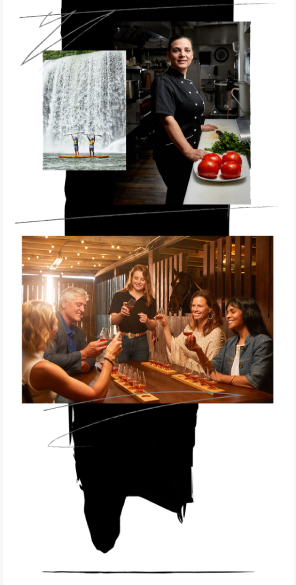
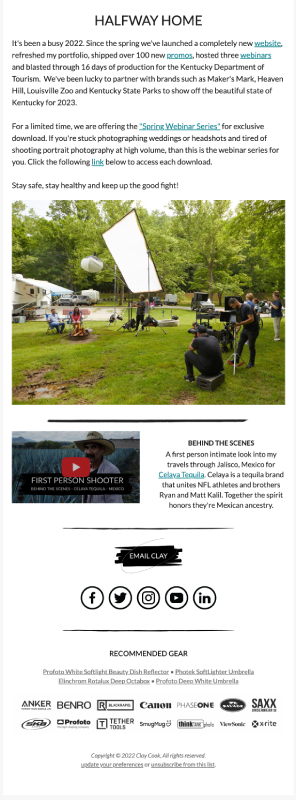
It’s worth keeping the goals of your email marketing campaign in mind as you consider the design. To drive traffic to your website, you may choose an impactful design and images that spark the viewer’s curiosity. If you want to persuade potential clients to pick up the phone, you can choose an approach focused on the kinds of images they are likely to shoot.
Buffalo-based corporate photographer Luke Copping reminded us that goals vary and analytics are not always the best measure.
Many people will go right into analytics to judge the effectiveness of an email campaign, but end goals are also important. My first campaign generated an open rate of 44% and a click-through rate of 2%. — but more importantly, it generated several direct email replies, two assignment inquiries, and one assignment that can be directly attributed to this campaign. As this campaign is part of a long-term email strategy, it may also contribute towards building trust and brand recognition with recipients, which could contribute to winning more assignments in the future.
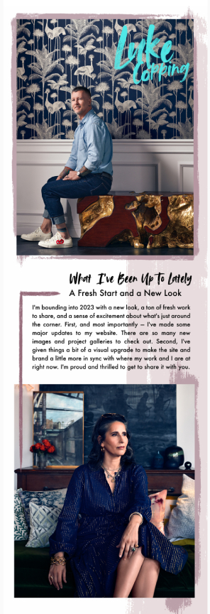
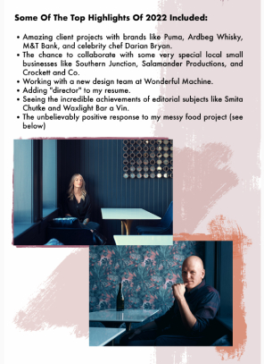
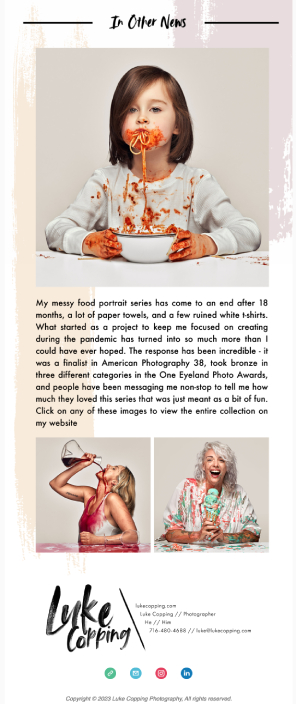
These are designed to make an immediate impression, featuring compelling visuals and concise messaging. As a general rule, less text is usually better to get your message across. The design must make your point easy to understand, usually with a single image or two doing most of the talking.

These feature ongoing communication with subscribers, showcasing a variety of content and updates, such as recent projects, behind-the-scenes stories, and upcoming events.
A good template for an email newsletter can include all of the above and show existing and potential clients that you are a busy, happening photographer. A well-designed newsletter template can be versatile – easily and quickly adapted by a photographer to communicate different messages.
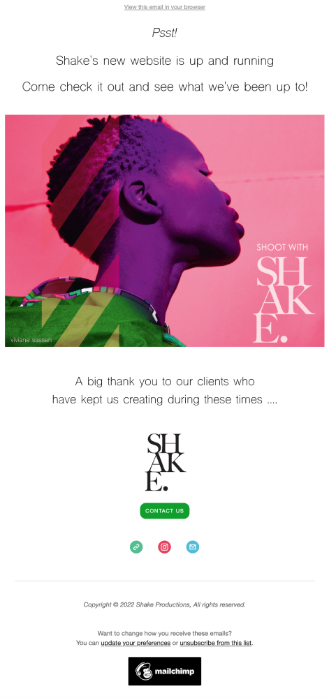
This third kind will be used mostly for special notices and events, whether a photographer’s exhibition or a partnership with a brand.
The table below will help you understand the main differences between the three types.
| Digital Postcard | Photography Newsletter | Announcement Emails | |
| Purpose | Building and maintaining relationships, generating intrigue | Building and maintaining relationships | Specific promotions or announcements |
| Content | Image-focused with minimal text | Broad range of content and updates | Single-focused message or offering |
| Call to Action | Engage and nurture subscribers | Engage and nurture subscribers | Drive recipients to take a specific action |
| Frequency | Regular communications (e.g., monthly, quarterly) or standalone campaigns | Regular communications (e.g., monthly, quarterly) | Standalone campaigns targeting a specific audience |
Whatever type of emailer you decide to go with, your audience will influence the majority of design choices. Suppose you’re a photographer with both advertising and editorial clients. It would make sense to have two separate emailers that present a different selection of text and images. Your advertising clients could get a sneak peek of your recent commercial campaigns, while your editorial clients could see a few tear sheets from publications. By doing so, you’re curating content that is more relevant to each group.
The strategy is to divide and conquer, knowing that a one-size-fits-all approach is unlikely to satisfy your various email lists. When you know your audience, honing in on the right visual style, content, and call to action in your emails becomes simpler.
Before any design comes into play, your email needs to pass the most crucial test: whether its envelope display can entice the recipient to click on it. The average open rate for email campaigns hovers around 21%.
According to recent research by SuperOffice, 45% of people said they opened an email because of who it’s from. Names of individuals fare much better than companies, so send the email from an account with your first and second name (for example, Ben Jones), then your company name (e.g., BJ Photography).
From the same survey, 33% of respondents said they would open the email depending on the subject line. If you can make it intriguing, great. But quite often, “simple” works just fine, such as “Look what I have been photographing” or “My latest work, including XXX.” Finally, 7% open an email based on the intro paragraph, which is usually displayed in the email list, so make it count.
The average time people look at emails is only 10 seconds, so an email’s design must get its message across quickly. In addition, many people scan a designed email in a Z shape. So make sure the email design directs the viewer’s gaze effortlessly past the most important elements, using different fonts, sizes, contrast, colors, and white space.
The design should also lead the viewer to a clear call to action, depending on the goals of your campaign. Often, this is a button positioned at the bottom center of the page.
As always, good curation is crucial. The chosen photos need to be eye-catching and intriguing – in particular, the first image people will see. The general consensus is that less is often more: the images should present your work and make viewers curious, hopefully leading them to your website.
When preparing an emailer showcasing your photography, start by assembling a set of visually appealing images with standalone value that complement each other when presented sequentially. Then, when it’s time to send out the email, choose recent work that aligns with the selected style. Ideally, your recipients should not have seen these images before, aiming to generate intrigue and encouraging them to explore further.
It can be helpful to seek assistance from someone else during the image selection process, as photographers may be too close to their work to make objective decisions. Your chosen images should represent your finest work and cater to the recipient’s specific needs, without necessarily creating individualized emailers for each client.
Instead, you can create a few targeted lists with slightly adjusted content based on your audience’s demographics, ensuring that each email remains relevant to the specific group you are targeting.
Email campaigns are also great opportunities to show off a photographer’s video work. These can be embedded so that they have a ‘play’ button or programmed so that they start automatically. There are also GIFs, which are moving images that can effectively draw people’s attention.
However, there is a risk of irritating readers. A study by the Nielsen Norman Group has shown that still images in emails garnered better responses than those with GIFs. Emails with moving images can be perceived as irritating and distracting, even being deemed untrustworthy in some cases. It’s best to use animation sparingly in emails to draw attention to one particular point.

This is a section of text and graphics at the very end of an email providing basic information about a photographer with elements of personal branding. It typically includes contact details, a logo, social media handles, and legal disclaimers. A well-designed signature that reflects your brand leaves a professional impression and acts as a digital business card of sorts.
Every emailer must have an ecosystem of hyperlinks that guide the viewer to other relevant websites and web pages. These link choices must be logical and intuitive. For example, the social media icons need to direct people to the right social media platforms. Your brand logo should be linked to your website. And any photos of specific campaigns could link to dedicated pages on your website or the client’s website, where additional project images may be featured.
In many countries, it’s a legal requirement to give recipients the chance to opt out of receiving your emails. This option is largely found at the very bottom of an email, and most email service providers like Mailchimp generate this option automatically across all templates.
Most email designs will have a “View Email in Browser” option at the very top. This allows recipients to view the emailer outside the clutter of their inbox on an isolated browser tab or window, facilitating a cleaner viewing experience. They may also bookmark the emailer for later reference.
Being a professional photographer doesn’t make you a good designer, by extension. Designing an email yourself requires skill, experience, and a feel for how to get your message across. You could easily fail to recognize technical considerations such as padding and creative considerations connected to fonts and colors.
To spare you the trouble, email marketing services (EMS) usually come with templates that often have strong designs that are also mobile-responsive. But even if these designs look good, you’ll risk having your emailer look similar to the ones sent by other photographers. Hiring a professional designer to provide a custom design will help you stand out from the crowd.
A professional designer will go one step further. They’ll find out your goals, study your branding, and use their expertise to craft a template you can adapt. While using a designer is usually more expensive, getting a professional look and feel (never mind the time savings) can be a worthwhile investment that gives clients confidence in your professionalism. Clay agreed.
Since day one, I have taken the route of trusting a professional to design my newsletter. While I could tinker around and create a design myself, I knew that a professional who knew the MailChimp platform would create something far beyond my skill set.
Luke was of the same opinion.
I have long believed that pros should work with pros. I focus primarily on photography and designing a stellar client experience, but I still need assistance from experts in other fields like marketing, legal, accounting, and more. Design is one of those areas where my lack of expertise means it is far more efficient to outsource my design needs. This yields better results faster.
In addition, a professional designer is better equipped to make your email templates mobile-responsive. Today, 81% of all emails are opened and read on mobile devices, so responsive design is mandatory. In addition, most EMS provide data about email subscribers’ device usage, so it’s worth checking and optimizing the newsletter for the most-used devices.
Despite mobile devices being the public’s preferred medium for reading emails, the reality for photographers and their clients could be much different. This is something that Robert discovered while checking his campaign analytics.
I like email newsletters because analytics show that my audience is mostly viewing email on a desktop, which, in my opinion, is the best way to view my photography. The screen is larger than mobile and has more impact. I feel that it might also be a more intimate and focused viewing experience with fewer distractions, like sitting down to read email rather than catching up on the way to a meeting.
While most EMS templates are mobile-responsive and feature preview buttons, there is little room for optimization, with the risk of some padding and space proportions not being as good as they could be.
So while some EMS templates may look very slick in the preview, they don’t always work as well across all devices, which can cost photographers credibility. Employing a designer will help optimize a photographer’s presence across different platforms.
The great thing about digital technology is that you don’t have to rely on gut feeling but can use hard data to refine your newsletter, from interrogating the data to AB testing. The analytics section of most EMS software gives insights that can unearth design tweaks for better results.
Here’s the definitive list directly from Wonderful Machine’s branding and design specialists:
The best emailer design is hardly noticed, as it puts the photography center stage to let it shine. As Robert highlighted, it’s an area where creatives working together can produce brilliant results.
Since my work is all about interpreting and conveying interior design and architecture, design is something I’m always aware of, whether it’s printed matter, product, or the layout of a city. It’s always on my mind. So at first, I thought I would do it myself, but José (WM’s design consultant) had done such a great job designing the new site that I wanted that aesthetic to carry through to all of my marketing assets, including my emailer. I think it’s good to collaborate with other design professionals rather than produce everything in a vacuum.
Further Reading
99designs: The 7 Principles of Design
HubSpot: The Ultimate Guide to Email Design and 13 Best Practices
Wonderful Machine: Email Marketing Services
Wonderful Machine: Email Marketing Strategy for Photographers
Need help growing your photography business?
Learn more about our services on our Consult page or just give us a shout!