Please enter your email and website or LinkedIn to receive more information about our free and paid accounts.
Please enter your email address below and we’ll send you instructions on how to change your password.
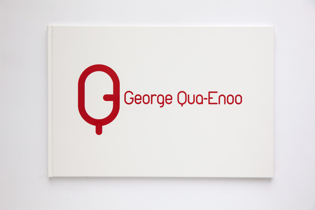
Meet George Qua-Enoo: Whether he’s shooting gorgeous models in Toronto or documenting daily life in his homeland of Ghana, he brings out a richness that stylishly unifies his imagery. Already having a cohesive brand identity, George came to me looking for a way to strengthen the unification of his presentation, and I happily jumped on board to help.
To start, I looked at George’s branding. His logo was already in great shape, literally, as a G and Q in one form. I always think of it as something between a gender symbol and a minimal cartoon character—so improving his presentation was going to mean focusing on a Web Edit. While we were at it, we decided to carry out a Print Portfolio Production.
When first deconstructing George’s website, I found poetic threads of imagery here and there, but overall, the phrasing was a bit blocky. The gallery organization scattered his thoughts, instead of communicating them through coherent prose. Originally split up into 13 categories, I aimed to consolidate George’s work division down to 4 galleries: “Portraits,” “Lifestyle,” “Fashion” and “Ghana.”

In previous editing project discussions, I’ve talked about creating narrative arcs, some of which come full circle. So it was refreshing to hear of a real-life narrative coming full circle for George. He shared with me his memories of watching William Shatner host “Rescue 911” as he grew up in Ghana and his excitement at sharing lunch with Mr. Shatner himself after shooting several fantastic portraits of him. As a nod to this nostalgic anecdote of George’s, I felt one such portrait was a clear way to start off both his Portraits gallery and print portfolio:

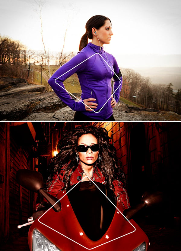
In order to bring together his diverse subject matters throughout the Portraits, Lifestyle and Fashion gallery, I incorporated sequencing approaches where bridges were built between images based on similarities in shape and hue. This helped to smooth out sudden leaps in subject matter:
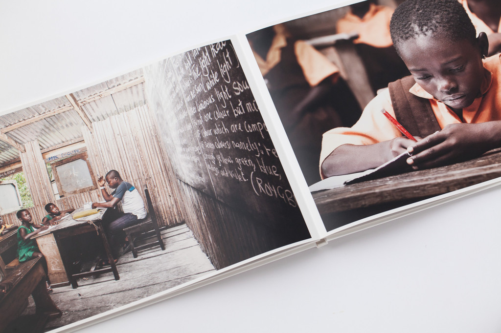
In his 4th gallery, “Ghana,” George had a body of work that stood apart from his more commercially-based endeavors, while still radiating enough passion to augment his web portfolio in a beneficial manner. This is an ongoing project for George, who regularly visits Ghana. Each time he returns with beautiful images that illustrate his intimate connection with his surroundings. In fact, he embarked on one such trip during the course of our consulting, and a few of the resulting images provided the perfect spritz of fresh-squeezed material to flesh out the gallery.
For his print book, I envisioned his images coming together in double-sided 11×17 landscape spreads, which allowed for 4 portrait images in one spread. Creating pairings for diptychs is fun; triptychs are an even greater blast. But tetraptychs? Well, let’s just say I break out the top shelf Asti whenever I get to jump into that playground. In George’s case, I found a nice rhythm developing of spreads containing a vertical pairing on one side and a lone landscape format image. Being one to abide like The Dude, I fell in step with that rhythm and let it roll.
After I had finessed the arc to flow like a Zen Fountain, George implemented my edit in an AsukaBook Zen Layflat book. Upon our copy’s arrival here at the studio, the experience of flipping through the final product was as pleasing as George’s unfailingly charming demeanor throughout our correspondence. He was an absolute joy to work with, now it’s your turn!
Further Reading
Wonderful Machine: Specialty: What is Portraiture Photography?
Wonderful Machine: Expert Advice: Visual Identity For Photographers
Wonderful Machine: Expert Advice: Print Portfolios
Interested in our Photo Editing service? Reach out!