Please enter your email and website or LinkedIn to receive more information about our free and paid accounts.
Please enter your email address below and we’ll send you instructions on how to change your password.
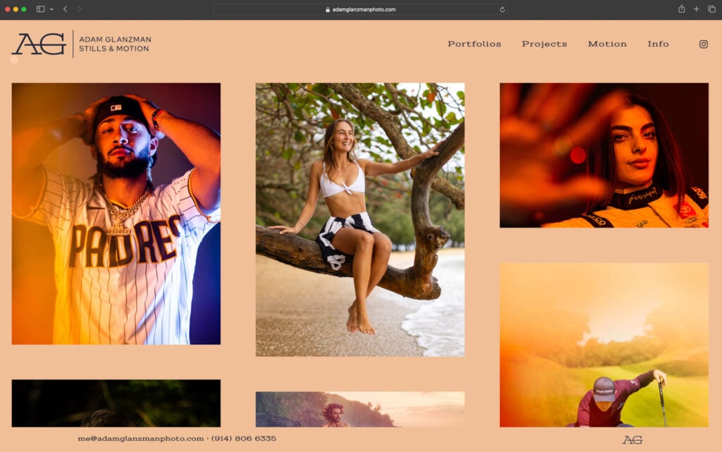
Over the years, I have had the pleasure of helping numerous photographers improve the flow and design of their website. I recently had the opportunity to work with Adam Glanzman on a Web Template Customization for his website. Adam is a Medford, Massachusetts-based photographer who creates Corporate, Sports, Lifestyle, Healthcare and Portraiture imagery for a variety of commercial clients. Adam has been rebranding his photography business and wanted a vibrant and modern template that matched his new style.
Although Adam regularly works with well-known brands and publications, he felt that his website wasn’t making him stand out as much as it should, and he needed to improve the way he was presenting his work. As a designer, my goal is to create a user-friendly website that’s simple and elegant, with intuitive navigation, and a contemporary flare. As we started the design process, Adam and I shared websites we liked, designs that impressed us, collected sources of inspiration, and developed a collaborative working relationship along the way.
Adam’s old website relied on sidebar navigation to organize sections of his work. When it is used correctly, this organizational format can be functional and appealing. As it was implemented on Adam’s website, however, each menu item covered another when opened. This made navigating through different sections of the website slow and disjointed.

I wanted to create a seamless and intuitive browsing experience. My solution was a “sticky” horizontal navigation bar. This type of navigation bar doesn’t change location when scrolling through the page. It remains at the top of the page and provides an easily accessible way for users to find what they’re looking for.
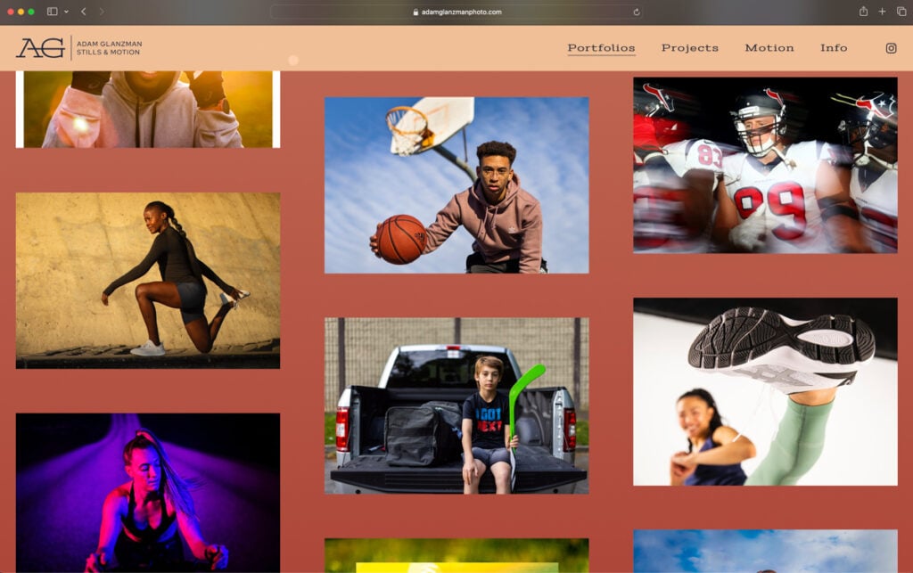
As I dove deeper into the organization of Adam’s website, I noticed some inconsistency in the way images were displayed on the old site. There were seemingly random spaces between each image which created a distracting viewing experience. To resolve this, we decided to create a uniform format using a masonry grid with generous spacing between the images. This would make each image stand out on its own while creating a cohesive and complimentary flow between the images. We can also give kudos to Honore Brown for her excellent web edit!
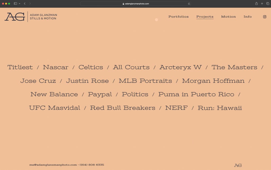
Furthermore, in order to create a more organized display of sections across the site, we created a separate page that contains all of Adam’s commercial projects as well as a page for each individual project. Previously, Adam had a dropdown menu that showed overviews in each specialty — portraits, lifestyle, corporate, education, healthcare and athletes. Now, the “Project” displays each project title. It also features photos appears when the cursor passes over the title. This feature streamlines the browsing experience, making it easy for viewers to know who Adam has worked with, the specialty he shot, and see a preview of the work with the option to open a gallery.

In the previous version of Adam’s website, video imagery was mixed in with still imagery. We wanted to separate these mediums so viewers could immediately see that Adam specialized in both. My solution was to create a dropdown menu for motion files, separating videos and GIFs, to easily navigate through all varieties of moving imagery. Within these pages, videos were placed alternating left and right, while GIFs followed the same style of the stills galleries.
In addition to the overall organization, we also decided to create a colorful background for a more dynamic viewing experience. Previously, Adam utilized a neutral white background that didn’t enhance his work in any way. With a recently refreshed brand identity, this was an ideal moment for Adam to add new colors and fonts into the design of his site. We were especially focused on the background of the website, for which we created a dynamic color transition that smoothly changes from peach to deep red.

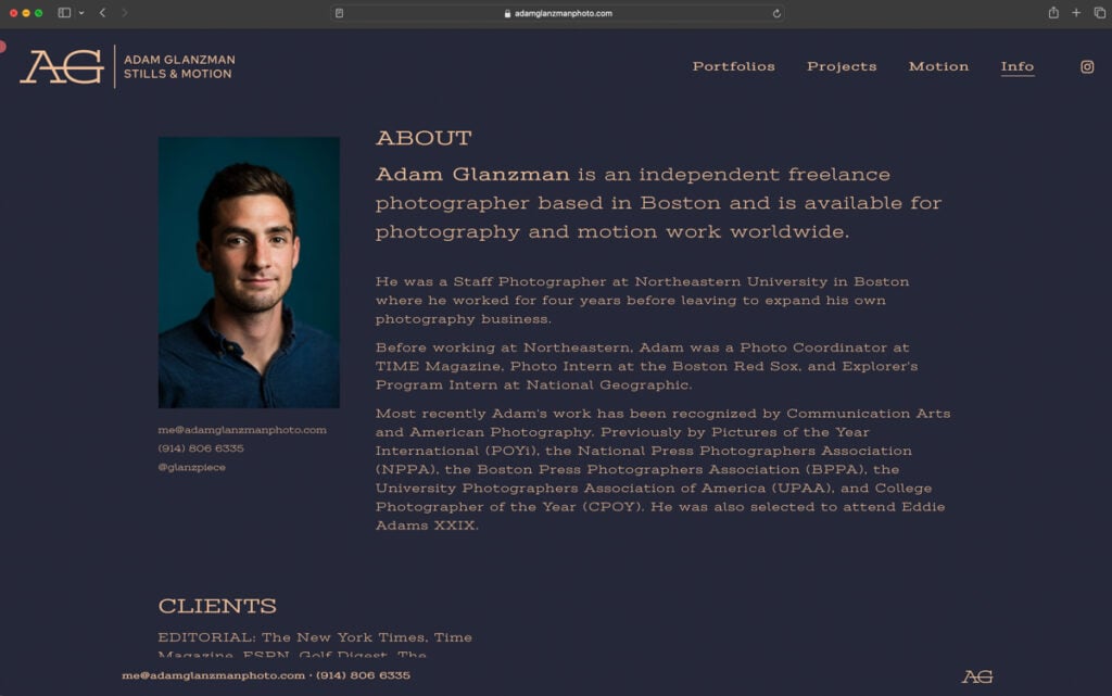
As an extension of Adam’s new brand identity, I created an information page that had a distinct appearance from the rest of the site. We wanted to maintain the feeling of a bold rebranding, so, for the background of this page, we decided to use a deep navy with light peach for the logo and text. This color scheme would create a striking and eye-catching contrast that is at once visually appealing and professional. Lastly, to help guide visitors to the most important elements on the page, I made further changes to font sizes in order to create a visual hierarchy that directs the user’s attention.

I provided Adam with three design options. Each of them had a different header, footer, image lay-out, color scheme so he had some options to choose from. This was his answer:
Thank you so much for these options, they look amazing! I am very excited.
When the designs were complete and the new custom web template was implemented, Adam reached out again to express his satisfaction:
The site looks fantastic, thank you so much for all of the work on it. I love it!
Further Reading
Read more articles featuring Adam Glanzman.
Case Studies: Web Template Customization
Expert Advice: Google Analytics Setup