Please enter your email and website or LinkedIn to receive more information about our free and paid accounts.
Please enter your email address below and we’ll send you instructions on how to change your password.
I recently had the pleasure of working with Washington, DC-based photographer Jonathan Timmes. Jonathan came to us in the midst of a rebrand and a new website. He was looking to utilize our Design Consulting Services to help him finish up the process and finalize his logo.
After talking with Jonathan, we decided to move forward with a logo refinement. He had provided us with a strong circular mark that, with the right tweaks, had potential to be a great logo. Circular marks are classic and clean, and they tend to do well over time. Jonathan has also already chosen a great color palette that we decided to keep.

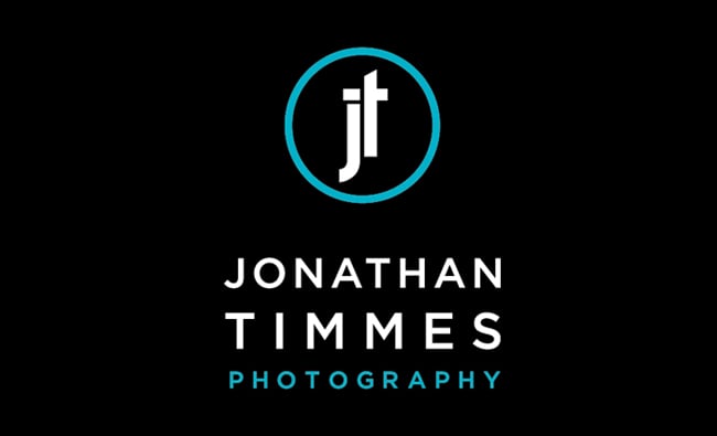
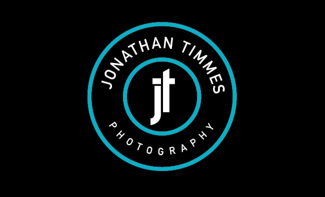
While talking with Jonathan, he mentioned that he was interested in a more vertical mark. For the first round, I came up with some typography that was more vertically oriented, and also included a few options where the type was stacked under the mark. Here are a few of his favorites from the first round:
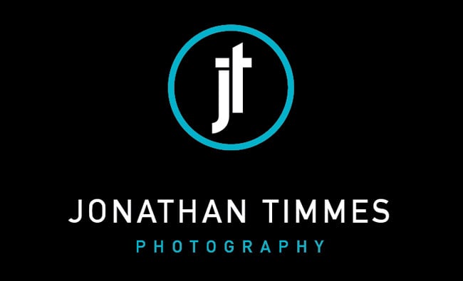
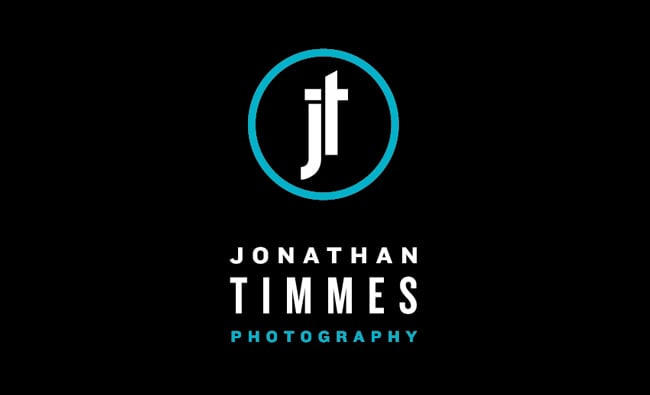
After a few font changes and adjustments we came up with this final mark:
After all was said and done, Jonathan and I were both so thrilled with the results that we also decided to collaborate on some business cards.
Further Reading
Expert Advice: Photographer Logos
Expert Advice: Visual Identity For Photographers