Please enter your email and website or LinkedIn to receive more information about our free and paid accounts.
Please enter your email address below and we’ll send you instructions on how to change your password.
Stephanie Trattner is a Belleville, Canada-based photographer who specializes in Beauty/Cosmetics, Fashion, and Portraiture photography. She came to Wonderful Machine to work with Honore Brown on Creative Coaching. During their process, Honore suggested that Stephanie collaborate with me to develop her brand identity and logo.
The first thing we did was schedule a meeting to discuss her business goals, design ideas, and where she wanted to go with her brand. Before the meeting, Stephanie sent me a document with samples of logos she liked and ones she didn’t like. We also discussed all the aspects of her brand identity (typography, color palette, and style). The logo she previously had, represented the business name she was working under. We decided that she use her name as her brand identity and grow her business around that. After the meeting, she sent a mood board. It included images she was drawn to and that she wanted to incorporate into the design in some way or another.
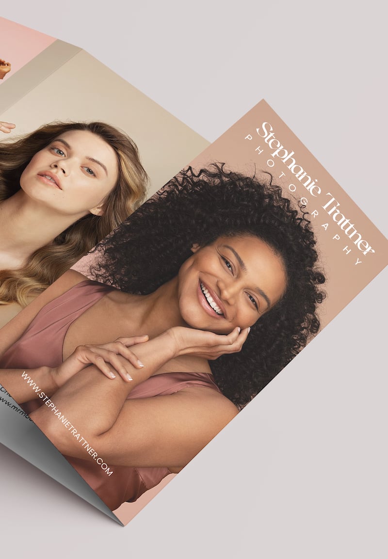
In terms of developing her brand identity around her name, we needed to pin down what made Stephanie unique. She is energetic, self-confident, and has a great sense of style – all this is reflected in her work. She also wanted to build her brand identity so that it appealed to high-end brands and magazines. Stephanie wanted to use her new logo and brand identity on her website, emailer, print mailer, business cards, and stationery.
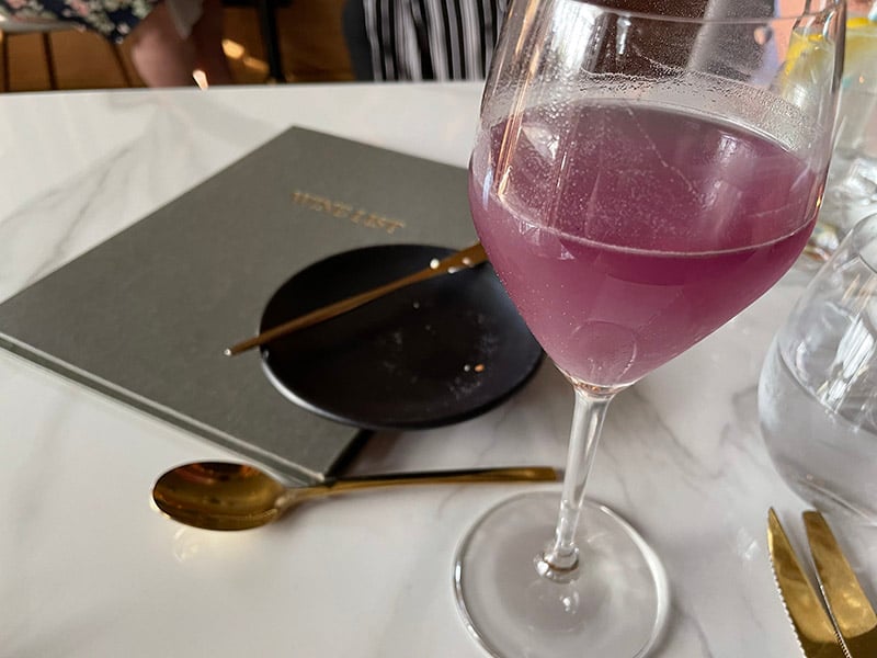
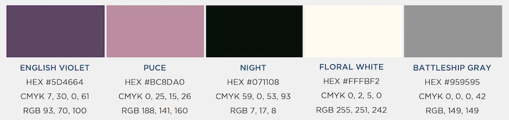
Along with the logo and its variations, we also selected a color palette as part of Stephanie’s brand identity. We spent some time discussing colors and tones that were aesthetically pleasing and reflected her personality and her work. A fun fact: Stephanie sent me a picture of a table setting one day as she was eating out. She really liked the colors and so did I! Then after some adjustments, we reached the final color palette using that image as the starting point.
For the first round, I sent Stephanie a number of options to look at. I also included some additional sketches that didn’t end up being fully fleshed concepts but were part of the creative process.
The first option, 1a, had its submark composed of separated shapes showing the “S” overlaying the “T.” And, a slight variation for option 1b had a circle at the bottom of the “S,” while 1a had a diamond instead. The letter “T” was also positioned differently in option 1a. For both options, the typography for her business name was written in all caps and aligned on both sides.
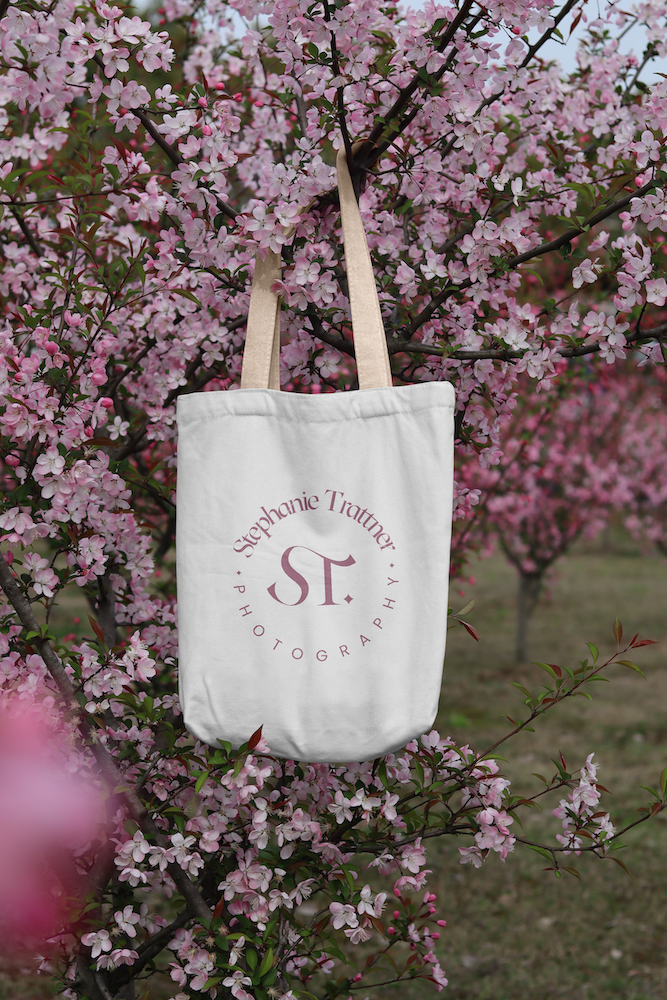
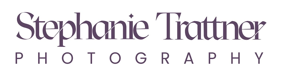
For options 2a and 2b, I created a custom serif font that was the starting point for “Stephanie Trattner.” Specifically, I designed it so that the “h” in her first name and the second “t” in her last name were connected by a ligature. The word “photography” was shown in a complimentary font, providing contrast. Also, the “i” in Stephanie had a diamond instead of a circle. The submark showed the “S” and “T” connected within some decorative lines. However, in option 2b, there was no line linking them.
For option 3, the submark consisted of an emboldened “S” with the “T” integrated into its curves. The paired font was a sans serif aligned on the left, where the word photography appeared in the same size but in a less bold font.
For option 4, I designed a clean and minimalist logo. The typeface was narrow and tall, and the letters were written in all caps. The submark showed the “S” and the “T” connected within a circle.

Stephanie chose option 2 for us to develop into her final logo.
Thank you for passing those along – 2b is a great starting point. I LOVE the diamond design on the “i” and how you carried it through into the initials.

After a few refinements, we had a design that she loved. Stephanie’s feedback was always very directed and specific, which made it easy to understand what she wanted for her final logo. For the final design I presented, I added some examples of how her new logo could be used in different ways to market her business. Stephanie loved the final option I presented to her and required no other revisions.
In the end, we achieved exactly what Stephanie wanted. She was happy with the final product and immediately started implementing it across her marketing materials.

It was a breeze working with her and I am delighted with the final results of this project. Stephanie agreed, saying,
Thank you again! I am very happy with the way things progressed and the final design – I love it.
Further Reading
Expert Advice: Emailer Design for Photographers
Expert Advice: Visual Identity for Photographers