Please enter your email and website or LinkedIn to receive more information about our free and paid accounts.
Please enter your email address below and we’ll send you instructions on how to change your password.
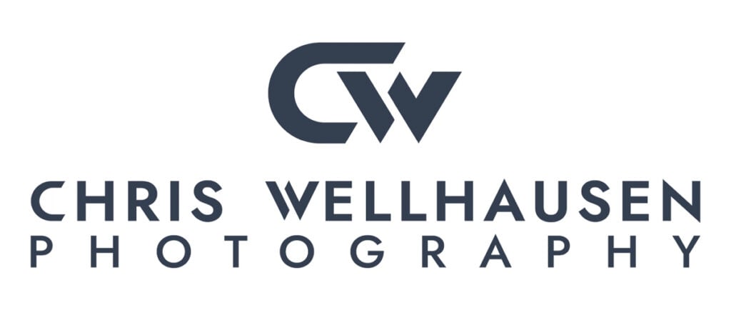
A strong logo design can be the anchor of a successful photography business. Encinitas, California based photographer Chris Wellhausen recently came to me in need of an update to the logo he made many years ago. Chris shoots Brand Narrative, Landscape, Outdoor/Adventure Photography, and he wanted to create a logo that represented both the subjects and aesthetics of his work.
Every Logo Design consult begins with a questionnaire that allows me to understand the photographer’s needs, ideas, and objectives going into the design process. Chris’s answers to our questionnaire helped me better understand the scope, style, and focus of his photography business. This is valuable information that allowed me to craft a personalized logo in a short amount of time.
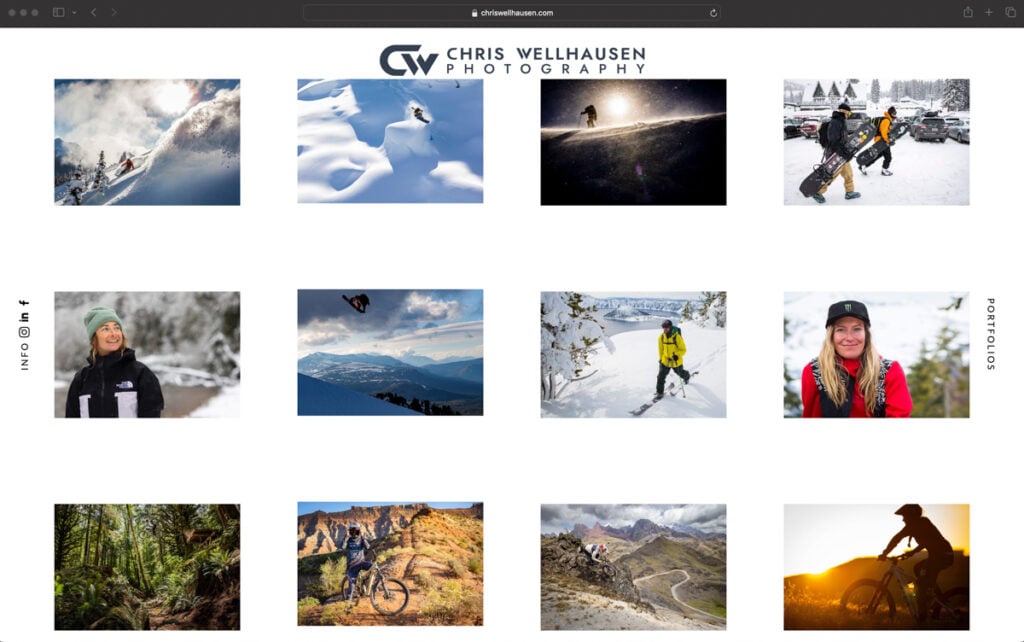
Chris wanted a bold and memorable logo that paired well with the aesthetic of his images. Chris usually captures action images of adventure sports athletes like snowboarders and mountain bikers careening in midair off of cliffs or hurtling down steep mountainsides. Behind all of the action and adventure are vast mountainous landscapes often in remote places. After using the same logo for many years, Chris was ready for a fresh new design that was a more current representation of his work.
During our first round of designs, Chris wanted to incorporate outdoor elements of his work. He suggested the form of a mountain could be integrated into the aesthetic of his brand’s logo. Chris also entertained the idea of using his personal signature in the logo. The design of vintage sports logos appealed to him as a framework of fonts and colors to orient our approach. Although he had plenty of strong ideas, Chris wasn’t completely sure which ones he wanted to use in the final design.
As we were working on the initial designs, Chris and I met to refine our direction. Together, we looked through the large collection of photographer logos that Wonderful Machine maintains on Pinterest. When working with photographers on logo designs, I find that this step helps us to establish a solid aesthetic orientation. This is an opportunity to clarify what we want to achieve and glean useful design elements for our own purposes.
During the meeting, Chris selected a few logos that he liked most. These helped guide the first round of logos. As I do with all new logo designs, I began the design of this first round of logos with hand-drawn sketches. Although I work extensively in the digital format, I always start my designs with preliminary sketches. After many years of designing logos for clients, I have found that working by hand gives me freedom to explore and develop my ideas more organically.
In the first round of designs, I wanted to offer Chris as much variety as possible without losing focus. We needed to form the many rough ideas into a unified concept. I knew that presenting Chris with multiple design options was the best way to be sure we found the right one.
Option 1 — This is the signature logo. The horizontal version has his signature as part of the frame around the wordmark. On the rounded version, I kept the signature in the center and made the wordmark in a circle shape surrounding it. I also made a variation in which the logo is slightly smaller, with dots as separation elements in the wordmark.
Option 2 — The initials CW were made into a triangle, which represents a mountain. I kept Chris, Wellhausen and Photography in three different lines with the same width (in a simple sans serif font). The wordmark position would rule if it’s a horizontal or vertical version of the logo.
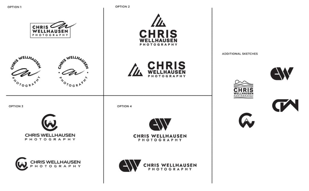
Option 3 — C and W were combined to show the W with a mountain on it surrounded by the letter C. The wordmark is in a sans serif with generous width proportions and loud curves.
Option 4 — I initially made CW into a single block and then started deconstructing (cutting and filling) them into different geometric shapes. The typography is the same sans serif font used in the first option but having letters spaced out.
In the first round of designs, I also included some additional sketches that didn’t make it into a concept. In the spirit of casting a wide net, I felt that these could also help us brainstorm and clarify new ideas.
I’ve gone back and forth contemplating what could work best and of these options, I think Option 3 represents my brand best.
I like how easy it is to read, it looks iconic, it means something about who I am, where my photography came from, mountains are connected to nature, it’s the roots in my inspiration in photography, and my photography covers from the top of the mountains to everything below them.
There are two curiosities floating around my mind.
One is simple. What could the C in Option 3’s icon look like if it matched the length & tilt of the “C” in the title CHRIS? Does it come too close to closing? If you like how it is or had other ideas in mind for this logo in general, please lmk.
The other is, if my photography brand is looking to expand outside of the action/adventure sports into a new direction from what I am most known for, and using “Positivity” or “Positive Vibrations” as an idea for the inspiration, what could that kind of logo look like as 1. an initial icon, and 2. as a shape icon? This could be a play off of what is designed in Option 3, if you’d like to try that.
After receiving Chris’s feedback on the first round of logos, he and I scheduled another meeting to move forward in the design process. We both agreed not to use the signature and mountain design in Option 1 and 2 respectively. We decided that we needed to focus on shapes that conveyed his photographic style and that could grow with the new scope of his photography business.
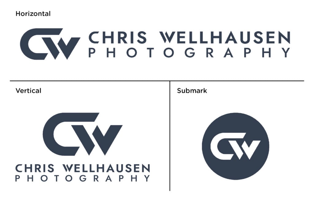
Overall, Chris liked the direction in which we were going. He asked for color suggestions and selected cyan, silver or gold. I then developed a color palette suggestion based on his selection and the logo design. Ultimately, we decided on a dark grayish-blue for the logo. The other changes he requested were insignificant and we decided on the finished product in the second round of logo designs.
Chris was very happy with the final product.
Love the logo package you’ve presented here! Thank you!
I was traveling across the country Friday for a shoot I am on when I received it. Excited as soon as I saw it. Still on location but will let you know if I have any questions.
I think this is the first logo I have made in a long time and def the first one I intend using on everything.
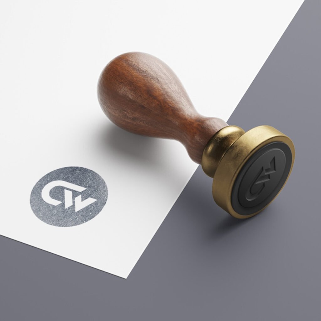
The new logo proudly adorns the banner of his website and his business cards. Although there are no mountains in the final design, the bold lines and dark colors preserve some of that feeling of movement and the mountains without binding him to a particular specialty or style. Although Chris faced some uncertainty initially, he was an excellent and memorable collaborator who was motivated and open-minded. The design process requires time, good communication, and the patience to try out all the possibilities — not to mention, an excellent designer. When all the pieces come together, however, I’m consistently amazed by the results I achieve with photographers.
Further Reading
Case Studies: Logo Design
Expert Advice: Photographer Logos
Expert Advice: Visual Identity for Photographers
Need help with a logo design? Reach out!