Please enter your email and website or LinkedIn to receive more information about our free and paid accounts.
Please enter your email address below and we’ll send you instructions on how to change your password.
Frantic Studio, a production company based in Brooklyn, N.Y., primarily shoots motion and still photography. In an effort to take their brand to the next level, they recently approached our marketing specialist Alexandra Ostebo. After a few conversations, the kind folks at Frantic decided to work with Alexandra on a Branding and Marketing (BaM!) Plan, which, as she explains, is essentially an analysis of their branding and marketing tools along with a road map of how to reach their goals. After this, they took the next step to put that plan into action with a Branding Overhaul. But what is the first move towards a revamped brand? The answer: a sleek, professional logo.
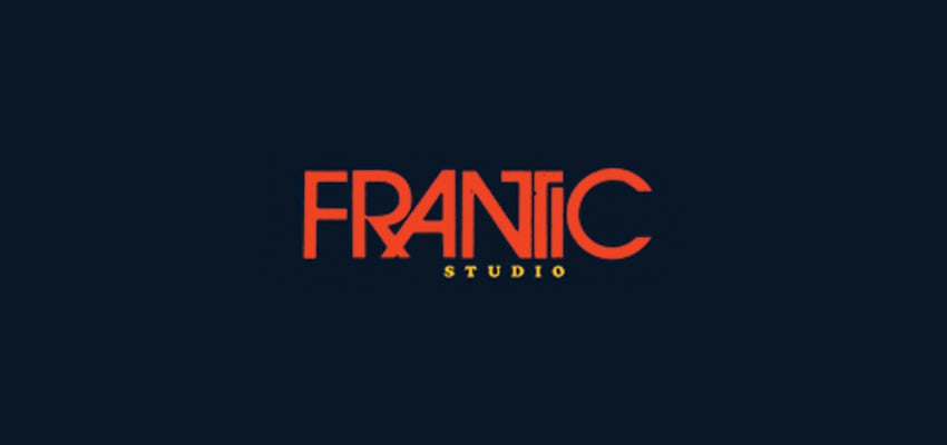
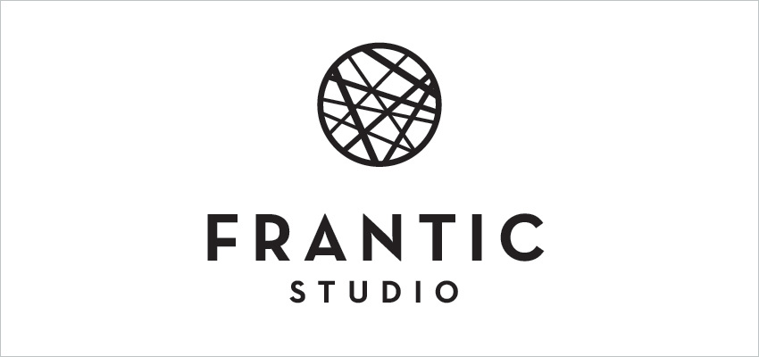
Frantic Studio’s original logo had the potential to be a great eye-catcher but needed a few tweaks. The main aspect of their wordmark was attractive but had a few spacing issues while the text below the logo was too small, making it difficult to read. In this logo refinement, we aimed to fix those issues and greatly improve Frantic Studio’s mark.
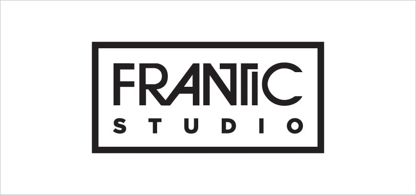
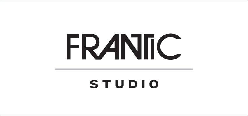
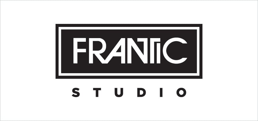
When we first sat down to come up with a few options, we had an idea that was a little off the beaten path, yet one that seemed perfect for them. While wanted to include some simpler marks as well, we threw this idea in as a wildcard of sorts. Here are a few of the options from the first round, along with the wildcard at the end.
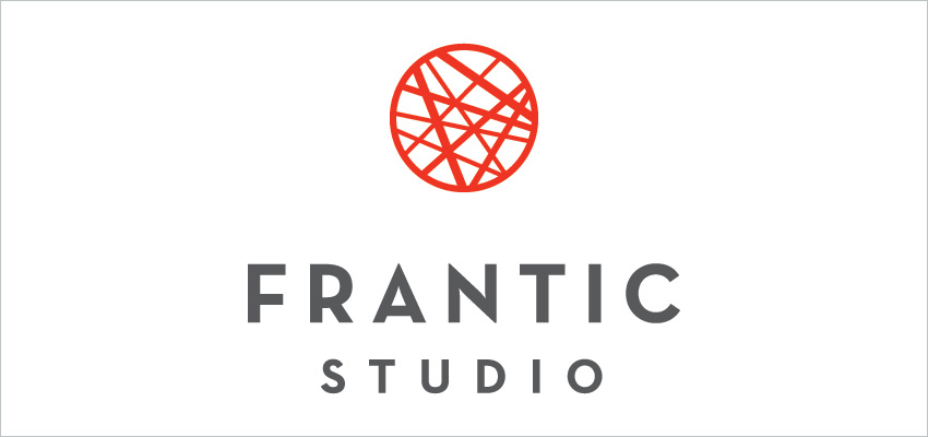
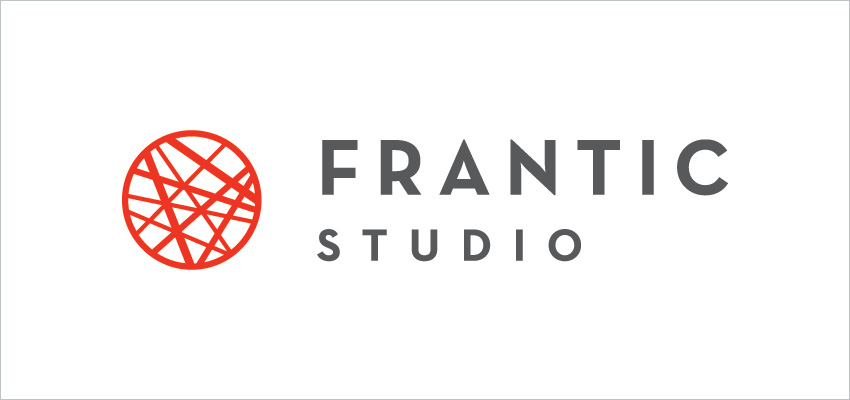
The wildcard option immediately caught the attention of David Sutton (Frantic Studio’s Principle/Director) and Julie Hassett Sutton (Frantic Studio’s Photographer/Producer). They decided on that mark and we jumped right in to make a few adjustments and explore some color options. After a few tries, we decided on this color scheme and landed on a winning design.
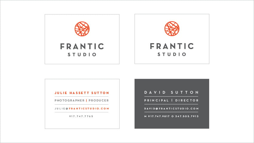
David and Julie were so pleased with the mark, they decided to start designing business cards right away. We knew their new modern mark would look great on Moo’s Luxe Business Cards. This line offers Moo’s Quadplex Technology, which takes four layers of Mohawk superfine paper and sandwiches them together to create a thicker, more tactile card. With this process in mind, I got to work creating some choices using a bold red, which is now part of their new brand’s color palette. Here are a few of our favorites:
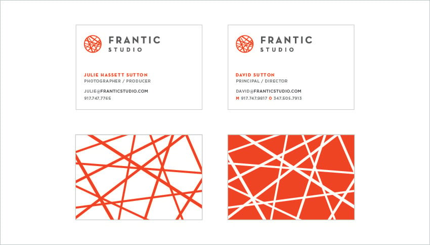
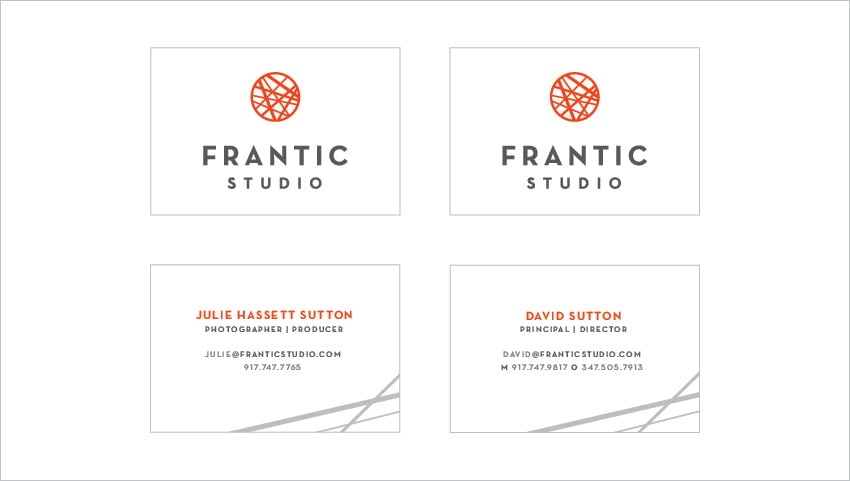
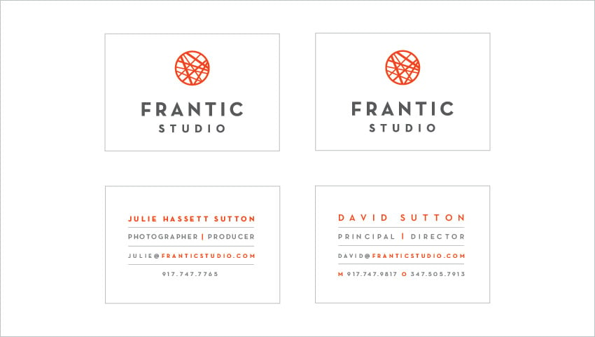
Julie and David loved all of the options and said, “it was difficult making a decision because we liked them all.” In the end, they agreed on the same design, but with different colored backs. Here are their final cards:
Julie and David were both thrilled with how their logo and business cards turned out. Hear it straight from them below:
Wonderful Machine is a unique group of talented people. They took the time to understand who we are as a company and artists, delivered beautiful design based on strategy and brand development. I can’t wait to see what Wonderful Machine has next for us!
For more information about our design services visit our consulting page.
Need help with an effective logo design? Reach out!