Please enter your email and website or LinkedIn to receive more information about our free and paid accounts.
Please enter your email address below and we’ll send you instructions on how to change your password.
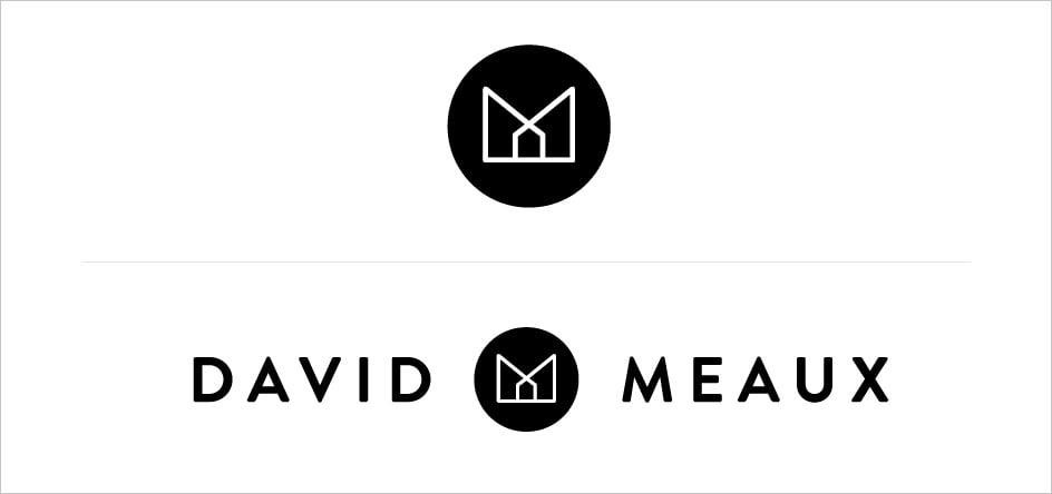
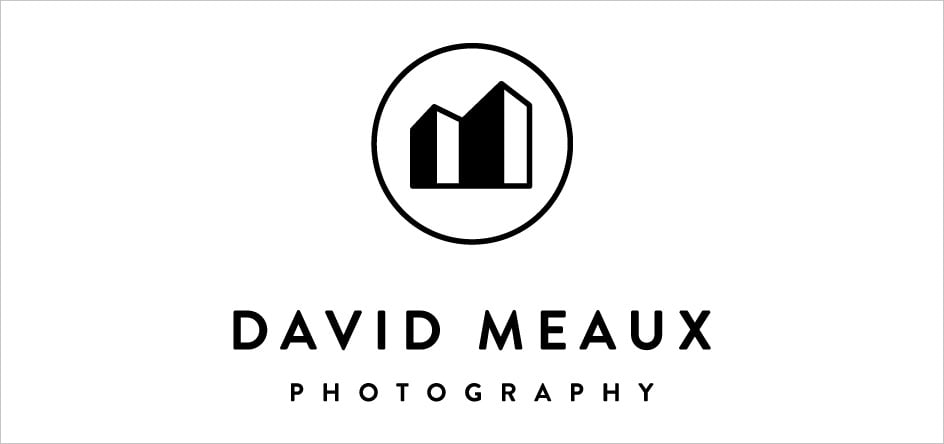
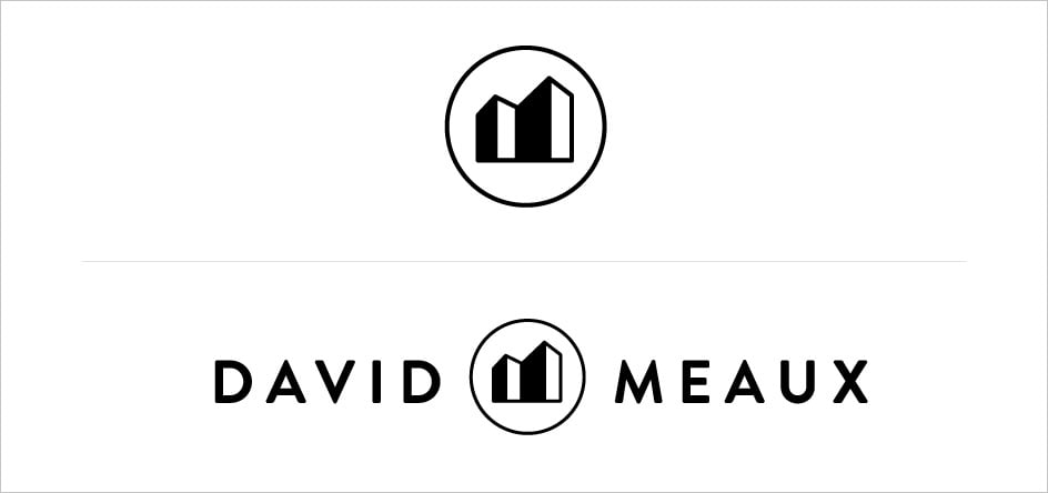
Recently I had the pleasure of working with both Melanie and David of David Meaux Photography, a DC based photography team. After switching from shooting primarily food to focusing more on architecture and interiors the Meauxs were looking for a new updated mark that spoke more to their new body of work. Before we start working with a photographer, we have them answer a series of branding questions. I knew after reading their questionnaire and talking with both Melanie and David they were looking for a classic, clean mark that would stand the test of time. With this in mind I got to work on the first round of options. I knew from the get go that the M initial was one I just had to use and I knew I could bring in the architectural elements from their work into their Logo. Here are a few options from the first round.
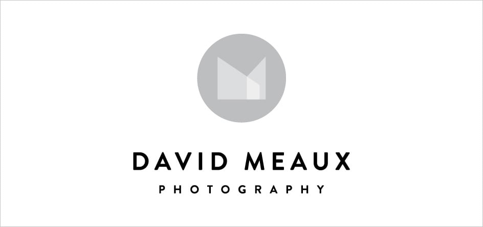
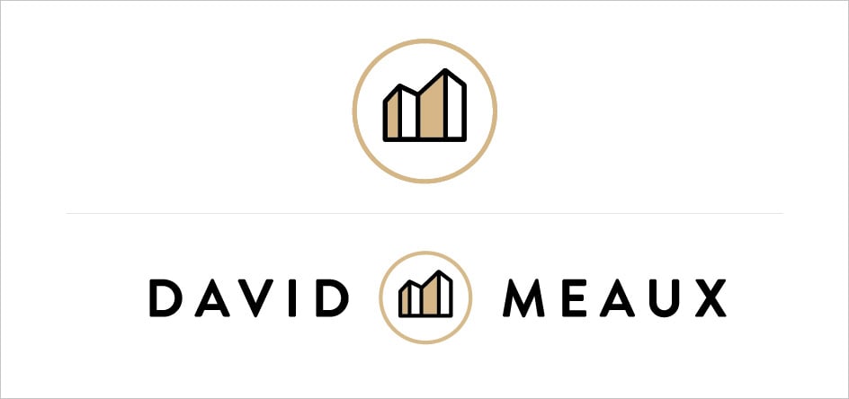
After the first round, the Meauxs liked the options but wanted to go in a direction that offered a sense of more depth. They also loved the idea of having a mark that they could use secondarily in a couple of different ways. With that feedback in mind here are a few options from the second round.
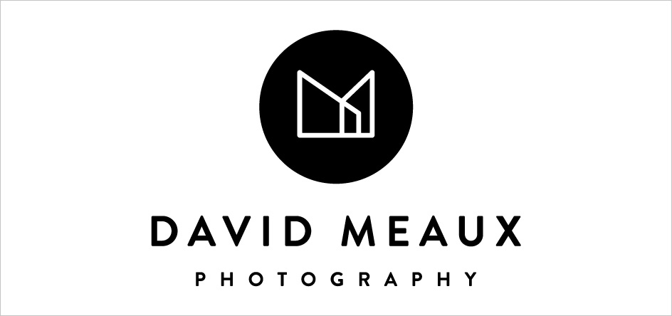
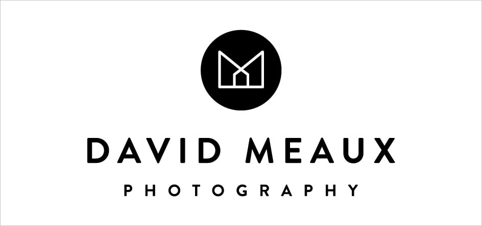
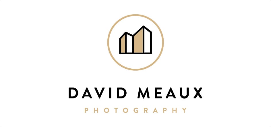
David and Melanie selected this as the final mark, they knew from the start that they wanted to use black and gold as their primary color palette.
So after a round or two of refining the color we came to the final mark:
Both the Meauxs and I were thrilled with how the final logo came out, but I will let them speak for themselves.
We wanted our logo to be a representation of our photographic style, which is minimalistic, centered on geometry, color, light and texture. Samantha was wonderful to work with. We love our new logo, it not only represents what we do but also has both style and simplicity.
Further Reading
Wonderful Machine: Expert Advice: Photographer Logos
Wonderful Machine: Logo Design: Authentic Charm for Sway Chavez
Wonderful Machine: Brand Identity: A New Graphic Identity for Matthew Carden
Need help with your Design? Reach out!