Please enter your email and website or LinkedIn to receive more information about our free and paid accounts.
Please enter your email address below and we’ll send you instructions on how to change your password.
Photographer Mark Menditto and I very quickly developed a rapport after I helped him avoid a wordmark that was already being used by another colorful character. Mark was looking for a new graphic identity to match his photographic identity that was as modern and chic as it was inviting and friendly. After some friendly phone conversation and witty banter, I got to work on some options for Mark.
Looking at Mark’s old logo, I couldn’t help but notice a missed opportunity. Mark was in the unique category of people who shared the same letter for their first and last name. Because M is a symmetrical letter, this creates the opportunity to play with the letterform and create some options that capitalize on this.
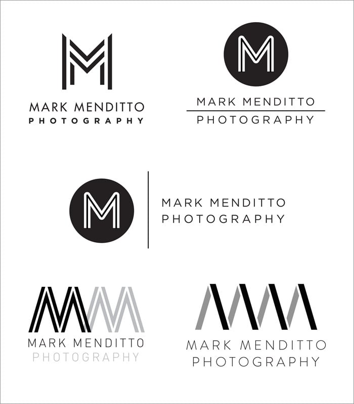
After a bit of back and forth, we found a logo that seemed to be exactly the type of branding Mark had been wanting.
We then began working on trying to find the correct color palette to compliment the logo.

We experimented with several options but ultimately we decided on something subtle with just a single splash of color (below). We felt this would not only serve his brand, but best compliment his work.
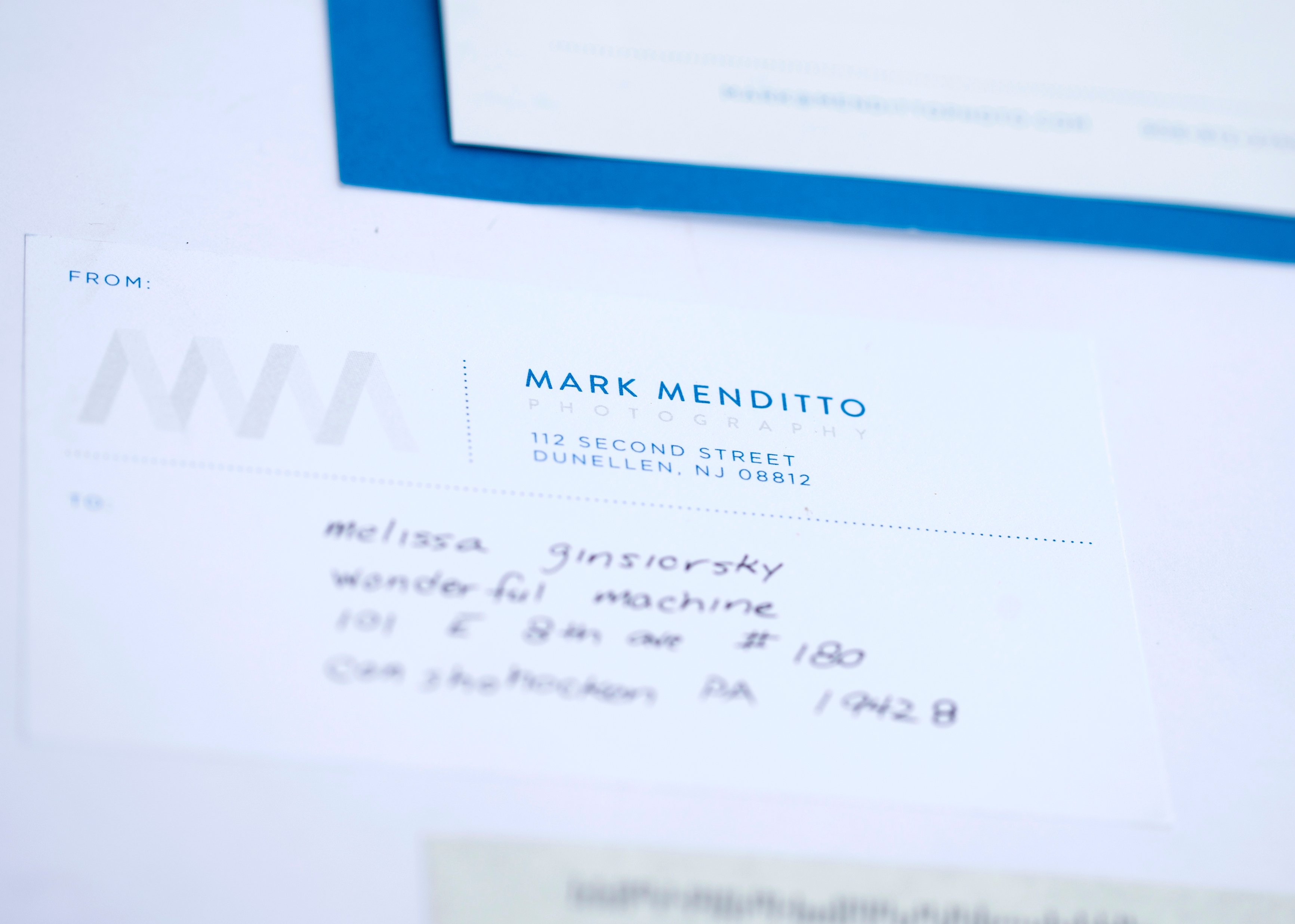
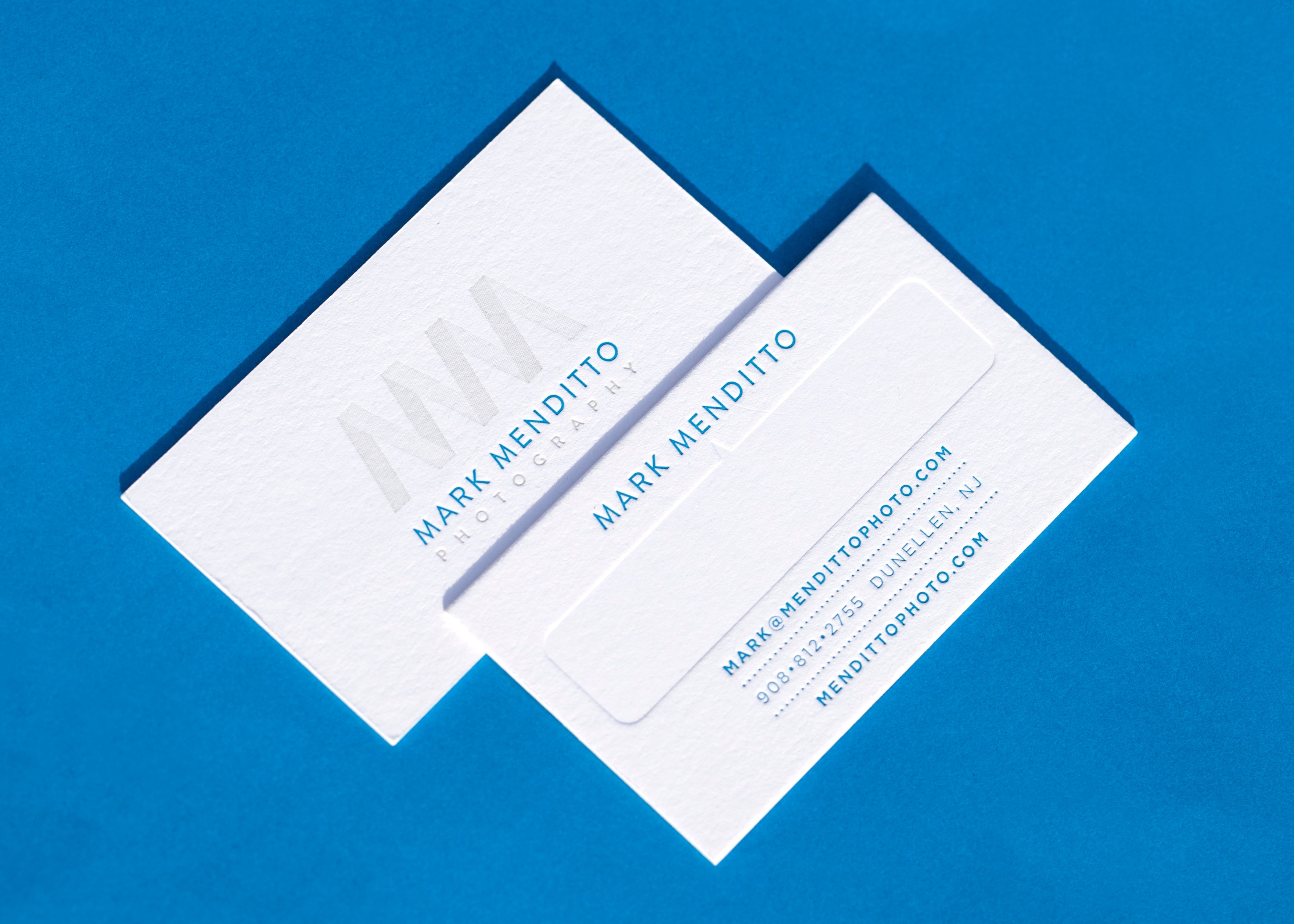
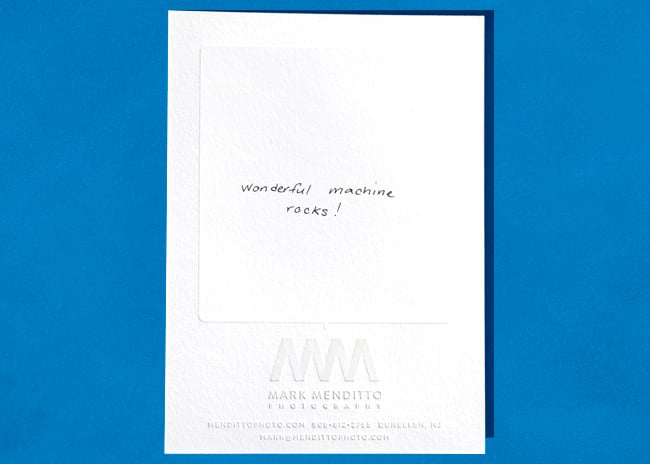
Mark was so pleased with the impressive results, that we began working towards creating a full stationery set with one goal in mind…letterpress. When all was said and done, Mark was kind enough to send us here at WM a note along with some of his fantastic letter-pressed stationery. Check out the final results below:
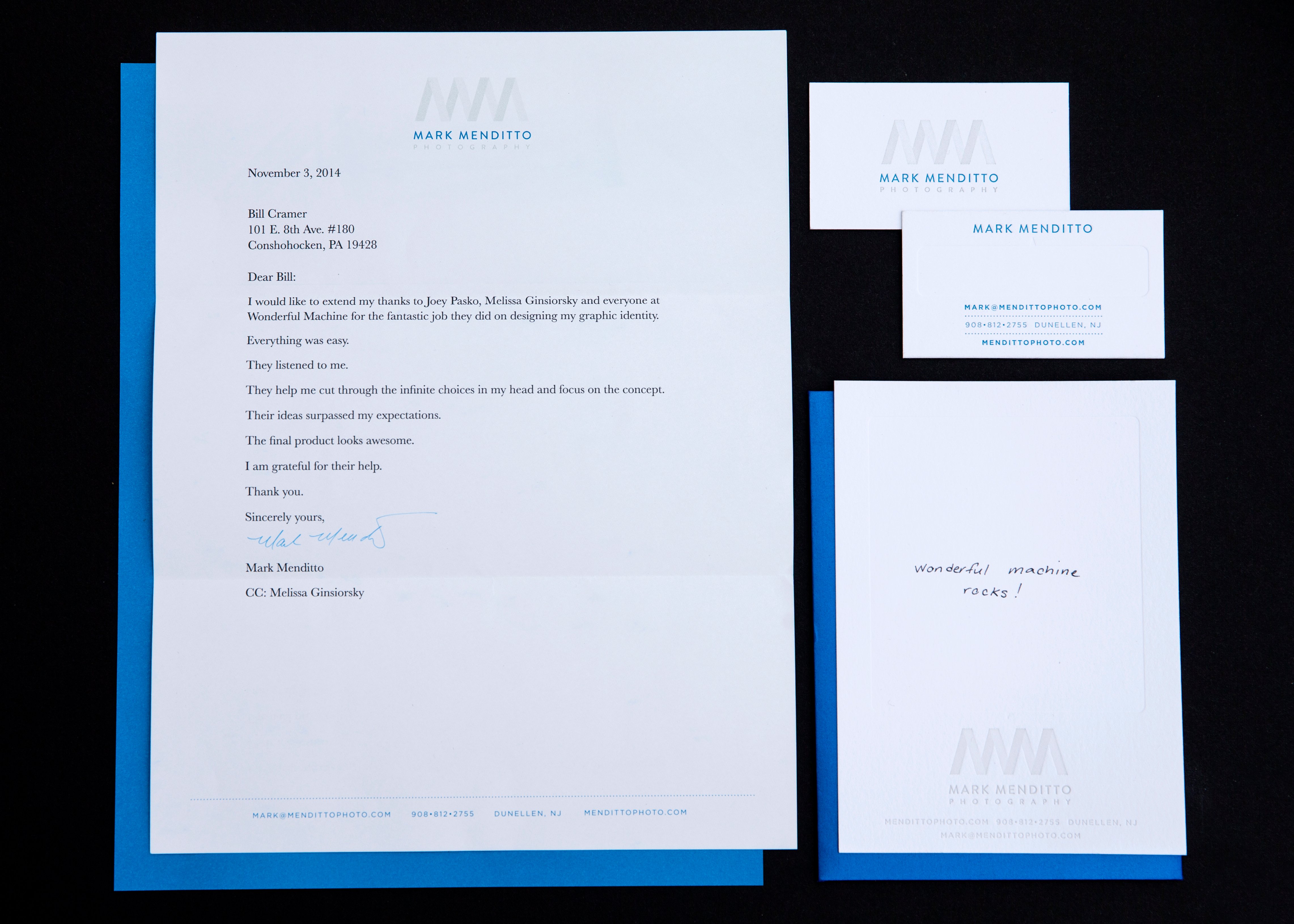

See more of Mark’s work on his website.
Further Reading:
Expert Advice: Visual Identity for Photographers
Expert Advice: Photographer Logos
Specialty: Underwater Photography